11:58:00 PM
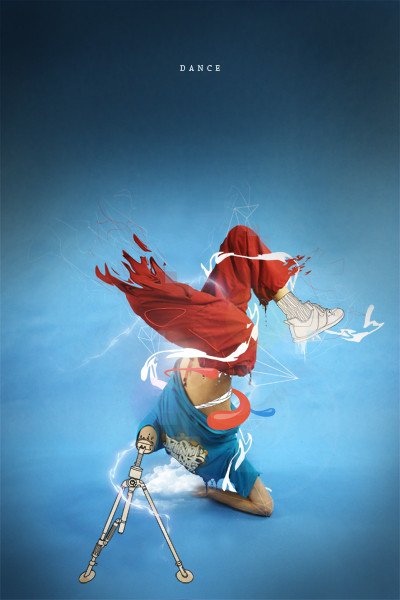
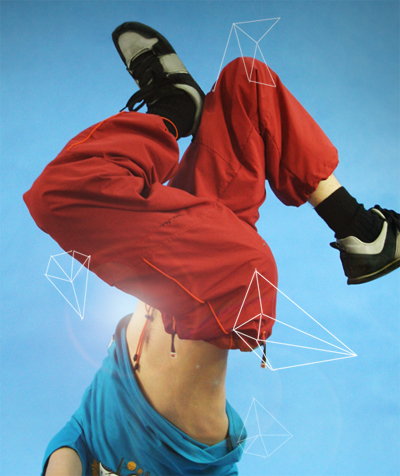
I wanted to write a tutorial showing how to reproduce some of the really common elements, regularly found in graphic design these days, almost cliche elements. In doing so you’ll produce a stunning piece of art. This will be a two part tutorial and part two will be up within the next few weeks. This is a useful tutorial for users of all levels.

Step 1
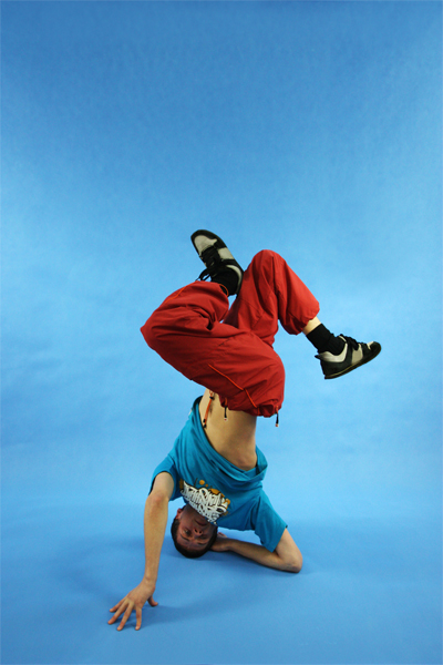
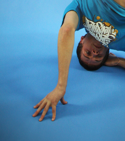
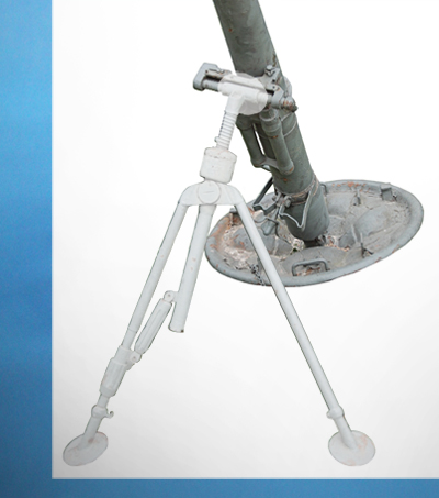
Start by finding an image you want to edit, the one I used can be found here. Open this image in Photoshop and we’ll get to work on it.

Step 2
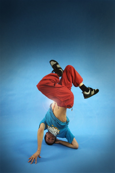
Create a new layer then select the brush tool and grab a large soft round brush and with the foreground color set to black add some vignetting to the image. This is where you darken the corners and edges of the image to enhance the focal point of the image. Lower the opacity of this layer to about 70%. You should now have an image that resembles the one below.

Step 3
Create a new layer then fill the layer black then go Filter>Render>Lens Flare and place it somewhere in the center of the image. Change the blend mode of this layer to screen then lower the opacity until it looks right, maybe around 70% again. YOu may want to move the lens flare, do this by selecting the move tool and dragging the layer.

Step 4
The first common element that I’m quickly going to show is the ‘diamond wireframes’, these have been popping up everywhere. First create a new layer then select the line shape tool. Choose a suitable weight, around 2px for this image then on the left side of the main toolbar there is three buttons so push the one on the right, hovering over it should read ‘Fill Pixels’. Now set the foreground color to white, this can be done quickly by hitting ‘D’ then ‘X’. Now just draw lines similar to the ones here, as if your drawing a diamond.

Step 5
Now to have these go behind the subject we are going to mask them. Add a layer mask to this layer by pressing the layer mask button in the layers panel. Now select the layer mask then the brush tool and choose a hard round brush at a medium size, change the foreground color to black then brush over the parts of the diamonds that you dont want seen so here I brushed over his legs.

Step 6
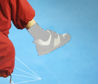
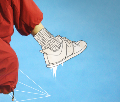
Create a new layer then select the pen tool and those three buttons again, make sure the middle one is pressed this time, this will create paths with the pen tool. Now zoom in on the shoe and using the pen tool draw a path around the shoe and the sock. After you’ve closed the path right click and select ‘Fill Path’ then choose white as the fill color. Lower the opacity of this layer to about 50% just so you can still see the details on the shoe because we need to trace them.

Step 7
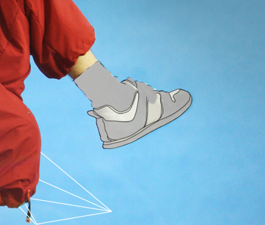
Create a new layer, with all these layers make sure you name them and even arrange them into groups or things are going to get complicated. Select the brush tool and choose a 1px hard round brush and set the foreground color to black. Now choose the pen tool and and trace over one of the lines on the shoe then swap to the brush tool and hit Return and this will stroke the path. Change back to the pen tool then hit esc. a couple of times to get rid of the path. Now just repeat this for all the lines and details on the shoe.

Step 8
In a new layer repeat this process for the sock and the laces and you should be left with something like in the image below.

Step 9
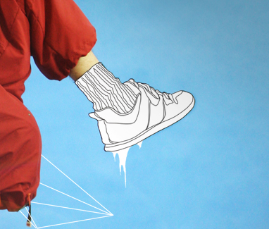
Remember the layer we made in step 6 where we filled the shoe white, change the opacity of this layer to 100%. Create a new layer directly above this one and with a hard white brush draw some drips from the shoe, there isn’t really a technique to this, just zoom in loads and try and make it look smooth, I usually just use the brush tool only but if you feel confident you could try using the pen tool.

Step 10
I felt the shoe looked to clean and flat so I downloaded a light brown paper texture, these can be found everywhere so just give it a google. Paste it into your document, the positioning doesn’t matter as long as it covers the shoe. Now Ctrl+click on the shoe layer (the one that we set to 100% in the last step) then select the paper layer and press the layer mask button then hit Ctrl+D get rid of the selection. In the layers panel place the paper layer between the shoe and the lines so above the shoe and the drip but below the lines. Now lower the opacity of this layer to around 30%.

Step 11
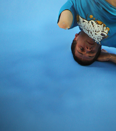
We’re going to now try and replace this guys arm with a tripod because I thought it would look cool. Select the clone stamp tool and in the main toolbar set the sample to all layers. Change the brush to a medium soft brush then create a new layer.

Step 12
Now you have to remove the arm by sampling the background the cloning it on top of the arm. Do this by holding Alt and clicking where you want to sample then brushing over that area. Keep doing this until the arm is removed like in the image below.

Step 13
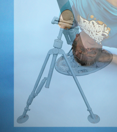
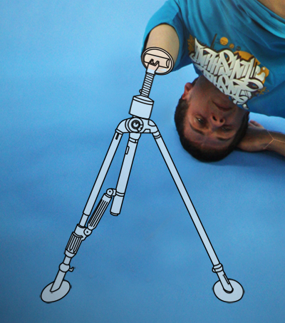
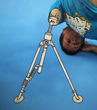
We now need a reference image of a tripod so search the internet until you find a good one tha would fit the arm then past it into the document, I lowered the opacity of this layer so I could position it accurately.

Step 14
Now you have to use exactly the same process as we did for the shoe so first trace round the object and fill it white, you’ll notice that at the top I haven’t followed the reference image, this is because I wanted it to connect to the arm,

Step 15
Again use the same technique to add the lines, I added some extra line and made some bits up to make it look better.

Step 16
Raise the opacity of the filled layer then copy the paper texture and place it over the tripod in the same way as we did with the shoe

Step 17
I added a few drips on the arm, these should be easy for you to work out how to do. Thats us done for part 1 but check out part 2 here. I hope you found this part useful.

11:37:00 PM
This is part two of the Dance Photo Manipulation tutorial, this part follows on from part 1 but shows some more advanced techniques and makes use of some of the skills you learned in the first part. This time we’ll be making use of the liquify tool, some brushes and some vector shapes to finish of the image and give an awesome result.

Step 1
We need to remove the right leg so create a new layer and use the same technique we used to remove the arm in part 1. You should be left with something similar to below.
Step 2
Create a new layer then select the clone stamp tool again but shange the brush to a hard one and clone some parts of the leg randomly to give the effect shown below.
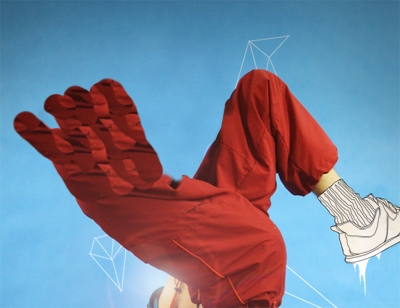
Step 3
Now go Filter>Liquify a play around with the liquify controls and dragging until you you get something that looks good. You should now try and blend it into the leg ny either using the erasor tool or with a layer mask.
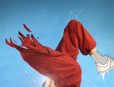
Step 4
Create a new layer then select the brush tool and choose a hard round brush of about 15px diameter. Now select the pen tool and draw a path that winds round the subject then sstroke it by selecting the brush tool and hitting Return.
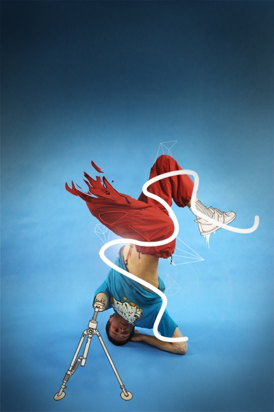
Step 5
Now use the liquify tool to distort this line.
Step 6
We want this to wrap around the guys body so use the technique we used in part 1, step 5 to mask this layer.
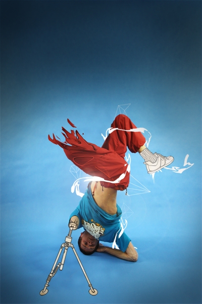
Step 7
We’re going to add some random lines in now, these are easy, just select the brush tool and choose a 1px hard brush. Set the foreground color to a whiteish color then in a new layer draw some jagged lines freehand. Lower the opacity of this layer to suit.
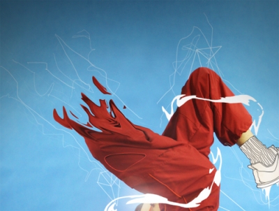
Step 8
Now do the same in a new layer using a red color similar to that of the trousers.
Step 9
You can now use either the eraser tool or a layer mask, both with a low opacity brush to hide parts of the lines.
Step 10
Another design element which has became popular are thes colored blobs. Create a new layer then select the pen tool and draw a path in the shape of the blob you want then fill it with a color, create a few of these.
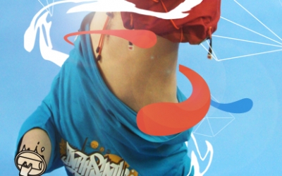
Step 11
Now for the highlights create them in a new layer using the same technique but with a fill color of white. Lower the opacity of this layer to around 30%.
Step 12
Now to remove the head, use the same technique as with the arm and leg and don’t worry if it looks messy because we’ll cover it up in a minute.
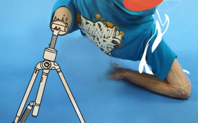
Step 13
You will nee some cloud brushes now which you can download here. Set the forecround color to white then in a new layer add a cloud, you will then need to use a layer mask or the eraser tool to make the cloud go behind his body. You can alter the opacity of the layer too if need be.
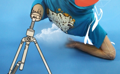
Step 14
Add another cloud to the image then either copy the layer mask from the first cloud or use the eraser tool again to make the cloud appear behind the guy.
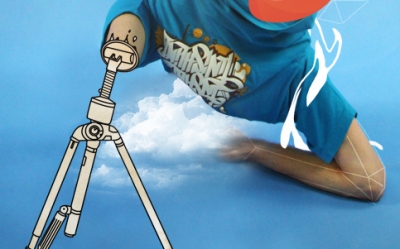
Step 15
Now that I’ve shown you all the techniques you can go back in and use them them again to add more elements to the image for example I added another flame style thing to his left ankle and another white swirl round his body which I blurred and added a glow. Other things you can do to this image are to smooth out the top and put in some text. Some more drips and lines will add more depth as well, keep it subtle and keep building it up layer by layer and you will get a good result.
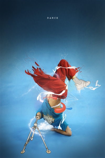
Conclusion
I hope from this tutorial, you’ve learned something new that you’ll be able to take away and apply to your own peices and you’ve also seen that creating impressive peices of art in Photoshop really isn’t that hard if you just build it up layer by layer.
10:45:00 PM
This Photoshop tutorial, you will learn how to use a variety of color, lighting, and cut and paste techniques to create a surreal photo manipulation. Combine your creativity with these Photoshop techniques to create your own photo manipulation artworks.
Combine Photo Elements to Create a Surreal Photo Manipulation
Preview of Final Results

Step 1 - Place the background
The first step it’s to place the sky, our background, into the image. As you can see, we have changed the color of it. We’re going to create a half of the image with a warm tone and another with a cool tone using the color balance tool. To do this, select the sky and then choose Image > Adjustments > Color Balance. Adjust the input sliders to add red and yellow. Select “highlights” and “shadows” then try adding more of these colors until you like the tones in your image.
Step 2 - Coloring the sky
Duplicate the layer with the sky. Now we are going to repeat the previous step with the color balance tool (Image > Adjustments > Color Balance) but this time adding blue and cyan tones. Remember to add some color to highlights and shadows as well.
Select the eraser tool then, in the option bar, select a blurred brush like shown below:
Now use the eraser tool to erase the left side of the sky in the top layer. This will make the warm tones from the layer below appear wherever you paint. When using the eraser, create curved strokes rather than a straight cut. When you have finished this step, you can reduce the opacity of the current layer to make the color more subtle.
Step 3 – Add the model
Now let’s open picture of the model. Use the magic wand tool to create a selection of the model then click on the add layer mask button in the layers palette to create a mask of the model. Refine the mask by painting in the layer mask using a brush with a harder edge. When you’re done, position the woman in the centre of the image.

Step 4 - Coloring the model
As you can see the lighting of the model isn’t blending in well with the background. We’re going to fix this with the levels tool. Choose Image > Adjustments > levels and move the input sliders to add contrast that matches the contrast of the background
Now choose Image > Adjustments > Hue/Saturation and reduce the saturation to reduce the saturation created when we used the levels tool. For the image used in this tutorial, the saturation was reduced by –24.
The next step will be exactly the same that in step 2 (when we used the color balance tool) except we’re going to use it on the model. First, duplicate the layer with the model so that you have two layers. Select one of the layers with the model then, like step two, use the color balance tool (Image > Adjustments > Color Balance) to add some red/yellow tones.
As you can see, it looks blended better with the left half of the background. Now, select the other layer of the model then choose Image > Adjustments > Color Balance and add some blue and cyan tones.
Now, as you did before with the sky, use the eraser tool with a soft edge to remove the left side of the layer with the girl in blue tones. Reduce the opacity on the current layer to reduce the strength of the color effect.
We’ve done the hardest part matching the lighting of the model with the background. Merge the layers of the model into one layer. Now you can play again withthe levels, color balance, and saturation (found in the Image > Adjustments menu) to make further adjustments.
Step 5 - Lightning the model
For the image used in this tutorial, the light comes from the background left. And to make the lighting match, we’ll have to darken the back of the model. To begin, select the burn tool.
Use a soft brush, edit the midtones, and set the exposure to around 30%.
Now use the brush over the models back. Try not make it too dark, just a little. Use this tool in the skirt too.
After that, select the dodge tool and paint the outline of the model (especially in her hair and her left arm).
Step 5 - Roots
Now we are going to add some roots and branches to the body of the model. It’s not difficult and you just need some images of trees and roots. We will be cutting parts of the root and tree and giving them some color like we did earlier with the color balance tool.
First step will be to look for a beautiful root and select it with your favorite tool (Magnetic lasso or quick mask mode for example). Don’t worry if it’s not a perfect selection, we will modify it later. Copy it and paste in our image.
As you can see the new image has not the same light and colors that the others, it looks out of place. What we have to do it’s the same that we did with the sky and the girl. Choose Image > Adjustments > Levels and adjust the input sliders. If you move the one in the center to the left the image will be brighter. If you move it to the right the image will be darker. In our case we are going to move to the right.
Now choose Image > Adjustments > Color Balance and add color depending of the place where you are going to put the root. If the root it’s on the left arm of the girl, for example, it will need red and yellow. But if it is on the right arm you have to add blue and cyan. This time we are going to add yellow and red. This is how it looks with the modifications:
When you have the root ready, just place it where you think that it will look good and select the eraser tool with a focus brush. Erase all the part that you don’t need and give the correct form to the root, now it’s when you have to improve the selection root.
The final step will be to use the burn tool in the areas where we should see shadows. For example, in the image below, it was used over the arm or in the bottom. I have added a little of blue using Image > Adjustments > Color Balance too. The last step is to erase the upper part of the root to create the look of a crease.
All the roots are added using the same process. The biggest impact to your results is choosing the photos. Once you have good photos to work with, you’ll have no problem getting good results using this technique.
There is just one last detail to explain. Sometimes, to get a more realistic feeling you can add a shadow to the root that falls over the skin or the dress. Take a look to this picture:
The only difference it’s the shadow on the right arm. To make this shadow just need to make double click over the root layer and the layer style menu will be open (or choose Layer > Layer Style > Drop Shadow). Select Drop Shadow and then use the arrow to move the shadow with freedom. When you have putted the shadow in the correct place just use the opacity bar in the drop shadow menu to add more or less intensity.

Step 6 - Ground and grass
Now we’re going to add the ground. The first picture used it’s a simple ground with sand taken from a photo of a beach.
The grass is taken from different photographs. First, create a new layer for the grass and position it behind low the layer with the model. Select and cut different parts of grass then mix them to create a field of grass like the image below.
This layer with the grass should be positioned between the layer with the model and the layer with the ground. Create a new layer and position it above the layer with the model and add some grass to cover the back of the models feet.
Finally, carefully add some grass and stone over the edge of the grass and the ground to hide the hard edges. It’s important that you inspect the edges thoroughly to hide any imperfections.
Step 7 – Add more roots
Now we’re going to add roots and flowers in the close-up. If you have read all the previous steps, you’ll have no trouble doing this. As mentioned before, it is very important that you choose good photos to work with. The photos should be high quality and in focus from foreground to background. If you use low resolution images, the finished results will look poor.
With this in mind, use a variety of photographs of flowers, roots, and trunks. Cut them out carefully with the lasso or quick mask tool and paste in the photo manipulation. Use the same coloring technique with the color balance tool (Image > Adjustments > Color Balance) that we used several times earlier.
To complete the blending of these images, we’re going to add to the ground. There are two ways to do this:
- This is the one that I explained at the end of step 5. Using the drop shadow in the layer style menu (Layer > Layer Style > Drop Shadow).
- Selecting the layer with the ground and using the burn tool in the areas where the shadows fall.
Step 8 - Dust
Now we are going to create some dust next to the feet of the girl. Use a picture with a cloudy sky then select one cloud using the lasso tool.
Copy it and paste in our document then choose Image > Adjustments > Levels. Move the middle input slider to the right to darken the cloud.
Then use the eraser tool in the edge of the cloud with a soft edge brush. Finally, choose Filter > Blur > Motion Blur and add the blur from left to right about 7 or 8 pixels. Position this layer behind the layer with the model. Duplicate the layer then move the new layer above the layer with the model. On this new layer, use the levels tool again but this time move the central input slider to the left to brighten the cloud.
The last retouching work will be to add red and yellow tones by using the color balance tool (Image > Adjustments > Color Balance).
Step 9 - Final Roots
We’re going to add the final roots. We need them to be positioned in a zigzag shape on the body of the model. To make this effect, we will need a combination of root photos like shown in the image below.
As always, the first step will be to select and match the different colors and lights of the roots using the levels tool (Image > Adjustments > Levels) and the color balance tool (Image > Adjustments > Color Balance). use the eraser with a soft edge to erase all that you don’t need and to give the ends of the roots a faded effect (so that they can be connected easily afterwards). Here is an example of combining different roots to create a large root:
It’s less difficult than it looks. Just be patient to find good images of roots and combine them using the same technique.
Step 10 - Some details
To make our photo manipulation more attractive we are going to add more details like flowers, petals, and a bird. I chose photos with objects that are easy to isolate. This will speed things up and ensure good results.
Step 11 - Adjustments Layers
To complete the photo manipulation, we’re going to add some adjustments layers. Select the upper layer then choose Layer > New Adjustment Layer > Hue/Saturation. Reduce the saturation by about –10 or to your likings. Experiment with using other adjustment layers to alter the color and effect of the final image.
Final Result
Making a complex photo manipulation like this is not difficult if you follow the a few principles of photo manipulation. Some important principles are:
- Choose good photos to start with.
- Make sure that the lighting and color of the objects in your composition match.
- Don’t rush. Take your time to find good images to work with and carefully blend them together. Ensure that there are no artifacts or unclean edges.

ReadMore...
10:26:00 PM
Learn how to create a suspenseful photo manipulation in Photoshop. You will learn how to create realistic distortions with the displace filter and apply photo effects to give it a cold look.
Gunshot Through a Glass Photoshop Tutorial
Preview of final results
Rollover the image below to see the before and after effect. It may take a few seconds for the image to load when you first rollover the image.
Stock photos
You will need a photo of a person pointing a gun and a photo of a window with a bullet hole on a dark background. The images used for this tutorial are stock photography from Dreamstime but you can use your own. If you like to use the same images used in this tutorial, click on the image below to purchase them.
Step 1 – Open the image of the shooter
Begin by opening the photo of the agent with a gun.

Step 2 – Place the photo of the bullet hole on a glass
Choose File > Place, browse for the image of the bullet hole on a glass, then click OK. The image is now placed onto your current document with the transform tool activated.
Rotate and enlarge the image like shown in the image below. The bullet hole should be positioned near the gun. Press enter on your keyboard to apply the changes.

Step 3 – Set the layer blend mode to Screen
In the layers palette with the top layer selected, change the blending mode to screen.
The image looks complete already but we’re not exactly done yet. When zoomed in, you can see that the glass doesn’t distort the image behind it. In the steps ahead, we’ll use the displace filter to create a distortion.
Step 4 – Prepare the layer for the displacement map
To distort the image behind the glass, we’ll be using the displace filter. Before we can use the displace filter, we have to create a displacement map which will tell the displace filter how to distort the image. First, we’ll prepare a new layer to create the displacement map on. Select the top layer then press Ctrl+J or select Layer > Duplicate to duplicate the layer.
If you are using Photoshop CS2 or newer, your layer should be a smart layer. You can tell if it’s a smart layer by looking for the
icon on the bottom right corner of the the layer thumbnail. If your layer is a smart layer, right click on the layer then choose Rasterize Layer. You can also access this from the Layers > Rasterize > Layer menu item.
Now that your layer is rasterized, you won’t see the
icon in the layer thumbnail. And because it is rasterized, we can apply filters and adjustments that aren’t available for smart layers.
Step 5 – Create the displacement map
First we’ll use the levels tool to add contrast to the layer. With the top layer selected, press Ctrl+L or choose Image > Adjustments > Levels to access the levels tool. In the levels tool, drag the black input slider towards the right to increase the contrast until the background is black like the image below.
Now we are going to use the emboss filter to turn it into a displacement map that can be used with Photoshop’s displace filter. Choose Filter > Stylize > Emboss and use the settings as shown in the image below.
Here’s what the displacement map looks like:
Step 6 – Clean the displacement map
The displacement map looks great so far, but there are many errors on it. Shown in the image below is one of those areas where the bump map created a bump for a smudge that isn’t a bump on the glass. In this step, we’ll clean up those areas.
Start by changing the blending mode of the displacement map layer to overlay. This will let you see both the displacement map and the layers behind it and give you a slight preview of what the results will look like.
Set the foreground color to a 50% gray. Start by clicking on the foreground color in the tools palette. A color picker window will appear. Enter in 808080 in the # field to get a 50% gray.
Select the brush tool and paint over the areas that you want to remove the bumps from. The bumps in the areas you paint will be removed.
Here are the before and after results.

Step 7 – Save the displace map as a file
Change the blending mode of the current layer to normal.
Choose File > Save As and save the file as “displace map” on your desktop.
Step 8 – Delete the displacement map layer and convert the background layer into a smart object
Before we use the displace filter, delete the layer with the bump map texture then select the background layer.
If you are using Photoshop CS3 or newer, convert the background layer into a smart object. This will let you
apply filters as smart filters so that you can go back and adjust the filter settings anytime. To convert a layer to a smart layer, right click on the layer then choose Convert to Smart Object. You can also do this by choosing Layer > Smart Objects > Convert to Smart Object.
Step 9 – Apply the displace filter
Choose Filter > Distort > Displace and start with the default settings shown in the image below. Click OK.
Browse and select the displacement map file that you saved earlier then click Open.
Your image should be displaced. Here’s what mine looks like so far. It is not strong enough but we’ll edit this in the next step.
Step 10 – Readjust the displace filter
Because the displace filter doesn’t give us any live preview feature, you’ll find that you need to readjust the settings once or more to get the results that you like.
- Photoshop CS3 or newer: If you’re using Photoshop CS3 or newer, you can easily readjust the displace settings.

- Photoshop CS2 or older: If you’re using Photoshop CS2 or older, you’ll need to undo and use the displace filter again. Choose Edit > Undo to undo then choose Filter > Distort > Displace to use the displace filter again.
This is what our image looks like after using better displace settings.
Here’s a comparison of the before and after effects of using the displace filter.

Step 11 – Add a reflection in the sunglasses
Select the layer with the bullet hole and duplicate the layer.
Choose Edit > Transform > Scale and resize the layer by clicking and dragging on the corners of the transform box. Make the layer a lot smaller like shown in the image below. Press enter on your keyboard to apply the changes.

Step 12 – Rasterize the layer with the reflection
We’ll be using the levels tool next but before we can access that tool, the layer needs to be rasterized. If you are using Photoshop CS2 or older, your layer is already rasterized and you can skip this step. If you are using Photoshop CS3 or newer, your layer is currently a smart layer. The levels tool doesn’t work on smart layers so we need to rasterize it. Right click on the layer (not the layer thumbnail) then choose Rasterize Layer. You can also do this by choosing Layer > Rasterize > Smart Object.
Your layer should be rasterize and you can tell it’s rasterized because it does not have the
icon in the thumbnail.
Step 12 – Blend the reflection into the sunglasses
Now that your layer is rasterized, you can access the levels tool by pressing Ctrl+L or choosing Image > Adjustments > Levels. Use the levels tool to make the glass blend into the frames behind it. To do this, drag the black input slider towards the center until only the cracks are visible.
Select the eraser tool from the toolbar. Right click anywhere in the document window to bring up the brush settings for the eraser tool. Set the hardness to 0%. This will give you a soft edge as you erase.
Erase around the bullet hole so that only the cracks from the bullet hole are showing.
To complete the reflection, reduce the opacity to about 30%.

Step 13 – Prepare a new layer for a vignette
Add a new layer (Layer > New Layer) then position it as the top layer.
Fill the layer with white. To do this, choose Edit > Fill, apply the settings shown below, then click OK.
Your layer should now be a blank white layer.
Change the blending mode of the layer to Multiply.
Step 14 – Add a vignette
Instructions for Photoshop CS2 or newer
If you are using Photoshop CS2 or newer, you can easily apply a vignette by using the lens distortion filter. Choose Filter > Distort > Lens Distortion. Adjust the two vignette settings (amount and midpoint) to your likings then click OK. If you don’t get the effect that you like, you can undo and use the lens distortion filter again with different settings.
Instructions for Photoshop CS or older
First, make sure that you have snapping and rulers enabled. Open the view menu then ensure that the snap and ruler features are enabled.
Click and hold on the left ruler then drag your mouse towards the center. A cyan guide will appear. Drag the guide near the center and it should snap into the center. Drag a second guide from the top ruler towards the center to create a crosshair like the image below.
Choose View > Snap To and ensure that the guides option is enabled.
Zoom out so that you can see the entire image. Select the circular marquee tool. While holding the alt and shift keys, click and drag from the center where the guides intersect then drag out until your circular marquee is the length of your image.
You should now have a selection like the image below.
Choose Select > Inverse to inverse the selection.
Choose Edit > Fill and fill the area with black. Now choose Select > Deselect to deselect the selection. Your vignette should look like the image below.
We’re done using the guides. You can remove them by selecting the move tool and dragging the guides back to the ruler. Choose Filter > Blur > Gaussian Blur to blur the edges. If you are working with a high resolution document and the gaussian blur filter isn’t strong enough, you can apply the filter again until you get the results that you like.
Here is what my vignette looks like after applying gaussian blur filter with a radius of 250 pixels two times.

Step 15 – Position the vignette layer below the glass layer
If you like your vignette to be softer, you can reduce the opacity of the layer with the vignette or you can position the layer below the layer with the bullet hole for a unique effect.
Here’s what the image looks like so far.
Step 16 – Cool the image with a photo filter
Select the top layer then choose Layer > New Adjustment Layer > Photo Filter. Set the filter to cyan and density to 100%.
Change the blending mode to soft light. If you find that the photo filter is too strong, you can reduce the opacity of the photo filter adjustment layer.
Final results and PSD
Rollover the image below to see the before and after effect. It may take a few seconds for the image to load when you first rollover the image.

ReadMore...
9:46:00 PM
Learn how to create this photo manipulation by Oliver Cereto. Some of the techniques you will learn in this Photoshop tutorial are how to give a person a cute doll-like face, how to extend backgrounds, and how to apply a moody photo effect.
The Maiden and Hummingbird Photo Manipulation Photoshop Tutorial
Preview of Final Results

Stock Photos
These are the images used to create this artwork. You can click on the images below to go to the web page where you can download the images.
Step 1
Begin by opening the photo of the of the model into Photoshop. Because we are giving this image a dark feeling, we’ll use the levels tool to reduce the brightness and increase contrast. Choose Image > Adjustments > Levels and adjust the settings like shown in the image below.
Step 2
While increasing the contrast, we also increased the saturation. Choose Image > Adjustments > Hue/Saturation to reduce the saturation.
Step 3
Choose Image > Adjustments > Color Balance. With the color balance tool, we’ll reduce the reds and yellows in the image and add a bit of green. Adjust the settings like shown in the image below. This will give it a strange color effect that is slightly similar to the color effect of lomography. This is just a simple first edit on our image and later we’ll add different color and lighting effects.
Step 4
Now let’s play now with the powerful liquify filter. Choose Filter > Liquify. In the Liquify window, you’ll find the tools on the left and the settings on the right side.
In the center of the window is the workspace and preview. Working with the liquify tool is like working with clay. Imagine that you are creating a clay figure that you can smudge and distort it in the way that you want. This is how it works, more or less.
I recommend you that you play with this filter some minutes before to start to work. It’s easy to use but you need practice to get realistic results.
Press B to select the bloat tool. The bloat tool will expand the area that you paint. It’s important that use it carefully by clicking little by little in slightly different areas rather than holding the mouse button on one area.
Now select a brush size about 260 and brush over one of the eyes. Use it carefully in the center of it and make it bigger. Do the same for the other eye.
Press W to select the forward warp tool. It’s like a finger that push pixels. This tool is really useful and can help get better results after using the bloat tool. Use it to fix some types of distortions. For example, if the pupil is not a perfect circle after using the bloat tool, you can use the forward warp tool to correct the imperfections to make it a perfect circle.
Keep the liquify window opened.

Step 5
Now let’s work on the nose. Press S to select the pucker tool. The pucker tool is the opposite to the bloat tool. The technique we’ll be using with the pucker tool is the same that the previous one but using a smaller brush size (about 190). Use it on the tip of the nose to make it smaller. Switch to the forward warp tool (w) and, using a smaller brush (about 120), push the sides of the nose towards the centre to get a smaller and thinner nose.
Step 6
Next step is to use the liquify filter over the mouth of the girl. Select the Pucker Tool (S) with a brush size about 280 and press in the center of her lips. Be subtle, we don’t want to erase her mouth. Then use the Forward Warp Tool to correct and line up correctly her smile, you can make her smile bigger if you press over the corner of her mouth and drag it carefully.
Step 7
Because we have done so many modifications to the eyes and nose, her face still looks a little too big. We are going to correct this with the forward warp tool. Select the forward warp tool and push the edge of the face and chin to make her face look slimmer. Use a brush size about 190 for the large areas and a smaller one for the smaller details.
I modify other places like the hair, pushing down it a little and then I retouch the nose, mouth and eyes. Feel free to modify everything to get the best surreal portrait as possible.
Ensure that you don’t distort the areas that you don’t want. This usually happens when you’re using a big brush. In these cases it’s useful to use a mask. Select the freeze mask tool (F) then paint the zones that you don’t want to modify (for example the neck of the model). Once you have painted the mask, you can feel free to edit without worrying about modifying the areas that you don’t want to.
Step 8
Click OK to close the liquify tool then select the burn tool. We are going to darken some of the shadows on the face. Change the brush size to about 257 px and the exposure about 25 %
![]()
Use the burn tool to darken some areas on the hair and nose.
Step 9
Now with the same tool and a brush about 60 px and 50% exposure, shape the edge of the eye to make it darker. Try not to leave it too much from the eye line. Then, with a bigger brush add more shadows over the eyes to make it even darker.
Step 10
Select now the blur tool (R) with a brush about 60 px and a strength around 71%. Paint over the face and neck to make the skin smoother.

Step 11
Now select the healing brush tool and correct the imperfections on the skin. Be sure that you erase the smudged texture created from the Liquify filter (in my sample they’re visible next to the nose).

Step 12
Now we’re going to paint the models lips to make it more striking. Create a new layer on the top and select the brush tool (B). Use a small brush (about 30) and select a dark red color. On the newly created layer, paint over the lips with the selected red color. You don’t have to be too careful because we are going to fix this later.
Change the layer mode to Soft Light and the opacity to 62%. Finally use the eraser tool to erase any painted areas that are not on the lips.
Step 13
Now select the smudge tool (R) with a small brush (about 8 px) and strength at 80 %. We are going to add some hair. in quick downward motions, smudge on the areas shown in the image below to create the hair. Alternate the size of the brush to get shorter or longer hair. You can quickly change the brush size by pressing the [ and ] keys on your keyboard.
After you created the hair, you’ll notice that the background has been blurred from the smudge tool. We’ll fix this later.
Step 14
Choose Image > Canvas Size. Enter 1840 px as the width. We are going to add the background now. Usually you would select the girl and cut and paste her over the background, but we are going to try another technique that can be helpful sometimes.
Select the texture for the background and copy it over our main image. Resize it to cover all the figure and then change the layer mode to Multiply. Now use a layer mask or the eraser tool to delete the area from the model. It’s easy and we don’t have to fight with the complicated hair selection.
Anyway, if you prefer the other way, just use the quick mask mode or lasso tool to select the girl and paste over the background.
Step 15
Flatten the image. We’re almost done this photo manipulation but let’s try something a little more difficult. We want to make the image bigger and add some elements to the right of the girl. In this step, we’ll show you two methods of doing this.
First method
The first method is to simply duplicate the background texture and place it on the right. Use the levels and color balance tools to blend it with the original texture.
Then, position the texture so that the circles match up. Use the eraser tool (E) to erase the edge of this layer. Merge the two layers then use the healing brush tool (J) to correct any mistakes.

Second method
The second way it’s copy one of the circles from our background and paste it in the empty background. Repeat this step as much times as you need to cover the background. Use the same technique with the spaces between the circles but copying the green wall.
This will be more complicated than previous idea but you will not have brightness and color matching problems.

Step 16
Open the hummingbird image into Photoshop and create a selection of the hummingbird. Choose Edit > Copy to copy the selection onto a clipboard.
Switch back to the image with the model then choose Edit > Paste to paste the hummingbird into the document. Select the move tool and move the hummingbird next to the models face. To match the contrast of the current image, we’ll use the Levels tool. Choose Image > Adjustments > Levels. Adjust the settings like shown in the image below.
Step 17
Select the wings of the hummingbird and then choose Layer > New > Layer Via Copy. With the new layer selected, apply a Motion Blur (Filter > Blur > Motion Blur) with a setting that will blur the wings slightly like shown in the image below.
Change the opacity of the current layer to 80% then use the eraser tool with a soft edged brush to delete part of the wing in the original hummingbird. Finally use the blur tool to blur some parts of the hummingbird to make it look like it’s moving.
To finish, we’ll refine the edge of the hummingbird. Erase the edges and add gaussian blur filter (Filter > Blur > Gaussian Blur) of 0.5 pixels to the hummingbird layer.
Step 18
Now we just need to add shadows and our personal tone to the image. Select the Burn Tool (O) and burn different areas (ex. next to the girl, in the upper part of the image and in the edges).
Step 19
Now let’s go to our upper layer and select Layer > New Adjustments Layer > Levels. Modify the settings like shown in the image below.
This will modify all the layers under this new adjustments layer. Let’s add one more; go to Layer > Adjustments Layers > Hue/Saturation and set the saturation to -20.
Finally, go again to Layer > Adjustments Layers > Color Balance and modify the colors like shown in the image below.
Step 20
Press Shift+Ctrl+Alt+E to create a new merged layer. Apply a gaussian blur filter (Filter > Blur > Gaussian Blur) with 2,5 pixels on the new layer then change the layer mode to Soft Light with about 28% opacity

9:40:00 PM
Floating Clothes
design
fun way to learn the Clone Stamp tool (as well as adding a virtual drop shadow) is to create an invisible man or woman. We can transform an ordinary portrait or action shot to make the person disappear, leaving floating clothes around a space. Adding shadowed wrinkles also adds realism.Preview of Final Results

Floating Clothes Photoshop Tutorial
Step 1
Open a photo of a person, preferably one that includes the entire body. Choose one with a simple background that can either be cut out or cloned for a more realistic look. For each step, work on a separate layer to reduce the risk of having to start over.

CREDIT: ©ISTOCKPHOTO/TYLER STALMAN
Step 2
Zoom in to the areas of the person where their skin is showing (Hold down the Cmd and then press + or - (PC: Hold down the Ctrl and then press + or -)). Select the Clone Stamp tool and use it to erase the areas not too close to the clothing. To do this, hold down Option (PC: Alt) and click an area to clone, then release the key and click-and-drag over the area to paint, replacing the pixels with the source pixels. If you have a completely solid background, just select the areas with a Selection tool and press Delete (MAC: Backspace).

Step 3
Once the pixels behind the hands, feet and head that would normally be the background are replaced using the Clone Stamp tool or the Selection tool, we need to redraw what the inside of the clothes would look like. Using a Selection tool, draw around each area and fill it using the Paint Bucket tool. Rarely does a solid color look real, so add shadows by keeping the area selected and using a large, soft brush with the Brush tool, click-and-drag around the edges to create shadows for depth.

Step 4
For the areas that need deeper shadows, first start by filling the area on a separate layer as usual with a solid color, perhaps taken using the Eyedropper tool from nearby areas. Then, add some noise to this layer, at a very low setting such as 1 (Filter>Noise>Add Noise). This adds to the realism and makes it less sterile looking. Then using the Clone Stamp tool, Alt-click (MAC: Option-click) in a nearby source area and then release and click-and-drag in the new area to create the correct look. Use the same technique as earlier to create shadows on some of the edges (use a large, soft brush on the edges of the selection).

Step 5
Use the Clone Stamp tool again to extend any areas of clothing that would naturally move that way. For this example, I used the Clone Stamp tool to extend the collar to meet in the back.

Step 6
The clothing opening that face the front would have a different shadow than the pant legs and sleeves. Instead of having a shadow on the bottom or on the sides, the shadow would be along a large portion of it to show depth. You can optionally add some noise to make it more realistic. Here I added a shadow while the area was selected by using the same technique (painting with a large, soft brush) to give the sweater some depth. The illusion is that the sweater is still filled out but empty.

CREDIT: ©ISTOCKPHOTO/john rawsterne (DECORATION)
Final Results

9:36:00 PM
Sometimes a print or online project needs an outline-type silhouette instead of an actual photo, in order to illustrate a project. By using the Threshold tool and the Gradient tool, we can make a few unique effects to complement a print of online design.Preview of Final Results

Silhouettes and Gradients Photoshop Tutorial
Step 1
Open up an image that has a clearly-defined outline that differentiates elements within the photo. Download one of these two support files to follow along with these examples, which are in the public domain.

Support Files
Step 2
Go to Image>Adjustments>Threshold.

Step 3
Drag the arrow so that the subjects in the photo and other areas we want to be visible are black. For the helicopter photo, place the arrow between the two areas of pixels. For this example, I set it to 90. Press OK.

Step 4
We need to make the Background layer a normal layer in order to remove the white pixels. Double-click the Background layer and click OK to name it its default name, Layer 0.

Step 5
There are many ways to select the white pixels, but let’s just use the simple Magic Wand tool.

Step 6
Set the Tolerance to 0 and make sure Contiguous is unchecked. This will ensure that the white pixels that are not adjacent to, or contiguous to, the white area of pixels that we click will still be selected.
![]()
Step 7
Click somewhere in the white pixels and press Backspace to delete them

Step 8
Next, click on the New Layer icon on the bottom of the Layers palette to create a new layer. Click-and-drag this layer so it’s below Layer 0.

Step 9
With the Marquee Selection tool, click somewhere on the image to de-select the pixels, if they are still selected. Select the Gradient tool.

Step 10
With Layer 1 selected in the Layers palette, and the Gradient tool selected, double-click on the Foreground Color selector near the bottom of the toolbar. Set it to White. Double-click the Background Color selector and set it to an orange hue. I set mine to #ffa800. This sets the color of each side of the gradient.

Step 11
Click-and-drag from the top of the image to about a fourth from the bottom. Press Shift to maintain a straight vertical line.

Step 12
It should look something like this.

Step 13
For another example, repeat steps 1-11 but with the photo of the soldiers. But before going to step 11, set the gradient type to Radial.

Step 14
Switch the orange and white by clicking double-sided arrow near the bottom of the toolbar. Click-and-drag from behind the second soldier to simulate an area of sunshine. Crop out the extra black pixels we don’t need.

Now we can use this technique to create illustration-like outlines and silhouettes for print and online designs.
9:10:00 PM
Fashion Lomo
design
You may have noticed that many clothing stores use images with the same photo effect that looks somewhat like Lomography. In this Photoshop tutorial, we'll show you how to add the washed out Lomo effect to your photos using all adjustment layers.
Preview of Final Results

Fashion Lomo Photoshop Tutorial
Step 1
Open any photo into Photoshop.

Step 2
First, we'll compress the histogram in the red channel to add more contrast to the reds. Choose Layer > New Adjustment Layer > Levels. In the Channel drop down menu, select Red. Drag the black and white input slider towards the middle to increase the contrast in the reds.

Step 3
Now we're going to add a green tint to the shadows and red tint to the highlights. The Color Balance tool is the perfect tool for this. Choose Layer > New Adjustment Layer > Color Balance. In the Tone Balance option, select Shadows then enter in 0, 25, 0 in the color levels settings.

Now select Highlights on the tone balance options and enter 25, 0, 0 in the color levels settings.

Step 4
We now have the lomo effect completed and to finish it off, we'll add a Brightness/Contrast adjustment layer to add the washed out look. Choose Layer > New Adjustment Layer > Brightness/Contrast. If you are using Photoshop CS3, checkmark the "Use Legacy" option. Set the brightness to 25 and contrast to -25 then click OK.

Final Results

Other Examples


Fashion Lomo Photoshop Action
The Fashion Lomo Photoshop action lets you apply this semi-lomo photo effect to your photos with a single click. To use the Photoshop action: - Download the Fashion Lomo Photoshop action and save it to your computer.
- Run Photoshop and choose Window > Actions. Click on the Actions palette menu near the top right of the Actions palette and choose "Load Actions".
- Browse for the file you downloaded then click OK.
- In the Actions palette, open the "PhotoshopTutorials.ws" folder and select "Fashion Lomo". Click on the play button near the bottom of the Actions palette and watch Photoshop apply the Fashion Lomo effect.
8:57:00 PM
Old Printouts
design

Make your photos look like old printouts with washed out colors and stained paper. This photo effect is a great way to add a unique twist to your photos. Click to find out how to apply this photo effect with Photoshop.
Preview of Final Results

Old Printouts Photoshop Tutorial
Step 1
Begin by opening any photo into Photoshop.

Step 2
To create this photo effect, we'll be using two Photo Filter adjustment layers. One will alter the color in the shadows and the other in the highlights. First, we'll start off by creating a Photo Filter adjustment layer that will affect the highlights of the image. In the Layers palette, click on the New Adjustment Layer button then choose Photo Filter.

Step 3
In the Photo Filter settings, use the same settings as the image below.

Step 4
Make sure that you have the Photo Filter adjustment layer selected then choose Image > Apply Image. We will use the Apply Image tool to copy the image into the layer mask. This technique makes the layer only visible in the highlights and produces better results than altering the Blend If options in the layer style settings.

Step 5
We're done creating the first Photo Filter layer for the highlights. Now we'll create one for the shadows. To do this, select the Photo Filter adjustment layer and press Ctrl+J to duplicate the layer. Then, select the new layer (should be the top layer), and choose Image > Adjustments > Invert to invert the layer mask. Inverting the layer mask will make this layer affect only the shadows.

Step 6
Double click on the top Photo Filter adjustment layer icon to edit the settings. Change the filter to Cooling Filter (80). This will give the shadows a blue tint.

This is what the image looks like so far. It looks like an old printout now, but the effect isn't very desirable. In the next step, we'll adjust the blending mode of the two adjustment layers to create an image that is more useable.

Step 7
Change the blending mode of the middle layer to Multiply and the top layer to Screen.

Final Results

Other Examples
If you would like to know how to create the photo collage like the image below, please read the Glossy Photos Photoshop tutorial.

8:44:00 PM
Overlay diffusion is one of the most popular photo effects used. It makes photos look dreamy and vivid but it can also hide details in the shadows and highlights. In this Photoshop tutorial, you will learn how to apply overlay diffusion without losing details.
Preview of Final Results

Masked Overlay Diffusion Photoshop Tutorial
The overlay diffusion photo effect is a problem for wedding photographers. It hides the details in the groom's tuxedo and bride's dress. Losing detail in the groom's tuxedo may be fine sometimes, but the photo should always show the details in the wedding dress. In this tutorial, we'll show you how to apply overlay diffusion without affecting the highlights and shadows. This Photoshop technique can also be used on other photo effects to protect the highlights and shadows.

Step 1
Open a photo that you would like to apply the overlay diffusion effect to. It is best to try this with a wedding photo because you will be able to see how this technique protects the deep blacks in the tuxedo and bright whites in the wedding dress.

Step 2
To begin, we'll prepare the layers for the overlay diffusion effect. For Photoshop CS3 users, you can utilize Smart Filters to practice non-destructive editing and to keep the file size small. For Photoshop CS2 or older, you will need to create a duplicate layer.
- If you are using Photoshop CS3, right mouse click on the layer in the Layers palette then choose Convert to Smart Object.
- If you are using Photoshop CS2 or older, choose Layer > Duplicate then change the blending mode of the new layer to Overlay.

Step 3
Apply a Gaussian Blur filter. Choose Filter > Blur > Gaussian Blur.
- Photoshop CS3 users: Leave the default settings then click OK; we'll go back to editing the settings after we change the blending mode of the Smart Filter. Double click on the blending options icon in the Layers pallete then change the blending mode to Overlay. Click OK and double-click on the Gaussian Blur smart filter (the Gaussian Blur text) to readjust the Gaussian Blur settings.

- Photoshop CS2 or older users: Adjust the settings to get the results that you desire.
Step 4
Now you'll learn the Photoshop technique that will protect the details in the shadows and highlights.
- Photoshop CS3 users: Click on the Smart Filters layer mask in the layers palette.
- Photoshop CS2 or older users: Click on the add layer mask button in the layers palette. You should now have a layer mask. Make sure that the layer mask is selected by clicking on the layer mask thumbnail in the Layers palette.

Step 5
Choose Image > Apply Image. With this tool, we'll paste a copy of the image into the layer mask. Use the default settings, which should be the same as the settings in the image below.

Your layer mask thumbnail should be an black and white copy of the image you're working on. This layer mask means that the layer is masked out where the shadows in the images are.

Step 6
With the layer mask still selected, choose Filter > Stylize > Solarize. This will seem to darken the image in the layer mask. What the Solarize filter did was make the highlights in the image black as well so that the highlights are masked out as well. This leaves only the midtones white so that the layer only affects the midtones.

The problem now is that the overlay diffusion effect is hardly visible. In the next step, we'll make the effect more visible by increasing the contrast and brightness in the layer mask.

Step 7
With the layer mask selected, choose Image > Adjustments > Levels. Using the Levels tool, move the white input slider towards the left. This will increase the contrast and brightness in the layer mask. The more you move the slider to the left, the more visible the effect will be. Click OK when done.

Final Results
Here is the final result. The image now has the overlay diffusion photo effect but the shadows and highlights are still detailed. You can preview the effect by holding the Shift key on your keyboard and clicking on the layer mask thumbnail in the Layers palette.

Here is a comparison of the overlay diffusion effect without and with a layer mask. With the layer mask that we applied, the details in the dress is visible and the groom's hair doesn't blend into the background anymore.

And finally, here's the before and after results.

ReadMore...
8:30:00 PM
Learn how to make photos more dramatic with calm puddles. In this Photoshop tutorial, you will learn how to work with layers, transform tools, and layer masks to create photorealistic puddles.Preview of Final Results

Photorealistic Puddles Photoshop Tutorial
Step 1
Open an image that you would like to add puddles to. Of course, the picture needs to have to have a floor.

Step 2
First, we'll need to create a duplicate of the layer. This layer will be used to apply the puddles and reflections.

Step 3
Create a selection of the floor. If you are using Photoshop CS3, you can use the quick selection tool to quickly create the selection. Otherwise, you can use the magic wand, magnetic lasso, or other selection tools.

Step 4
In the Layers palette, click on the add layer mask button. You should now have a layer mask with the shape of the floor as the white areas in the mask. If you got it backwards (shape of floor is black), you can choose Image > Adjustments > Invert to invert the layer mask.

Now unlink the layer with the layer mask. To do this, click on the
button beside the layer thumbnail and the layer mask thumbnail.

Step 5
Now we'll create a reflection on the floor. This is a very simple trick and will make the floor look like a mirror. Currently, you should have the layer mask selected. Click on the layer thumbnail in the layer mask to select the layer (and not its layer mask).

Choose Edit > Transform > Flip Vertical. Your floor should have an effect like the image below.

The floor looks a little bit awkward because it isn't aligned properly. To fix this, choose the move tool from the tool bar and move the layer so that the horizon of the current layer meets the horizon of the original image.

Step 6
We got the mirror floor, but there seems to be a problem with the reflection of the bride and groom. To fix this, we'll create a separate reflection for them.

First, press Ctrl+J to duplicate the layer. It should only duplicate the layer without the layer mask. If you get another layer with another layer mask, click on the new layer mask then click the trash button in the layers palette to delete it. With the new layer selected, hold the Alt key on your keyboard and click between the top two layers. This will create a clipping mask. A clipping mask uses the layer below as the layer mask.

With the top layer selected, choose the move tool from the toolbar and position the layer so that the reflection matches the foreground objects. In the image below, the layer was positioned so that the bottom of the bride and groom in the two layers meet.

Step 7
Use one of the selection tools, such as the quick selection tool, to create a selection of the object's reflection.

Click on the add layer mask button and you should now get a proper reflection like the image below.

Step 8
Now we'll need to create a mask for both the layers. You can only add one raster layer mask per layer, but here's a trick to add more than one layer mask. First, select Layer 1 and choose Layer > Group Layers. This will put the layers inside a folder. Now, select the group and choose Layer > Layer Mask > Hide All. Now you have another layer mask. Your layers should look similar to the image below.

Step 9
Your image should look like the original image without any puddles. In the Layers palette, click on the group layer mask to select it. Now we'll start painting the puddles. Select the brush tool from the tools palette. First, select any soft round brush with a hardness of 0% (you can change the brush size later). Then, change the opacity to 25%.

Paint the puddles on the floor. Basically, anywhere that you paint, the puddle will appear. If you make a mistake, you can always press Ctrl+Z to undo.

If you want to add more depth to the puddles, continue painting additional layers until you get the results that you desire.

You can also switch to the eraser tool to erase the areas that you want to remove the puddles from. For example, in the image below, I erased the middle and left areas to make the puddle not seem so large.

Final Results


8:18:00 PM
Vintage Clouds
design
Learn how to make ordinary blue skies look dramatic with a simple and easy color and contrast adjustment.
Preview of Final Results

Vintage Clouds Photoshop Tutorial
Step 1
As usual, start by opening any photo into Photoshop. Of course, the photo should have a sky with some clouds.

Step 2
Create a selection of the sky. To do this, you can use any selection tools such as the Quick Select tool or the Magic Wand tool.

Step 3
With the selection still active, in the Layers palette, click on the
button and choose Levels.
This should bring up the levels tools. You should also see in Levels adjustment layer that the selection applied to the layer mask.
Step 4
In the Levels tool, select Blue from the Channel drop down menu. Then, move the black input slider towards the right until the skies start turning yellow. Don't click OK yet!

Step 5
Then, select the Red channel from the Channel drop down menu and move the white input slider towards the left just a little. Don't click OK yet!

Step 6
Finally, select back the RGB channel from the Channels drop down menu. Move the black input slider towards the right to increase the contrast of the clouds. Now you can click OK when you're done.

Step 7
If you want, you can also add a lens flare. Select the Background layer then choose Filter > Render > Lens Flare.
Final Results

Before and After

7:58:00 PM
High Clarity
design
Learn how to apply this abstract photo effect with Photoshop CS3. Your photos will have a high impact look and stronger focus.
Preview of Final Results

High Clarity Photoshop Tutorial
Step 1
Open an image into Photoshop. This effect works best for portraits rather than landscapes.
Step 2
First, to practice non-destructive editing, we'll convert the layer to a Smart Object. Doing this will allow us to use Smart Filters that let you change the filter settings at any time.
Step 3
Choose image > Adjustments > Shadows/Highlights. Adjust the Shadows slider to about 50% so
that the shadows are more visible.
Step 4
Now we are going to add a harsh lighting photo effect. In the Layers palette, click on the
button then choose Black & White.
In the Black & White settings, click on Auto then click OK.

Step 5
Change the blending mode of the Black & White adjustment layer to Overlay. You should now get a high-contrast photo effect.
Step 6
Duplicate Layer 0. To do this, select Layer 0 then press Ctrl+J or choose Layer > Duplicate Layer.
Step 7
Select the new layer (Layer 0 copy) then choose Filter > Sharpen > Smart Sharpen. With the Smart Sharpen tool, we'll increase the local contrast to make the edges look very sharp. Set the Amount to 100% then adjust the Radius setting until you start to see very slight halos around the edges. Read our Local Contrast Photoshop tutorial for more information about this technique.

This is what the image looks like after increasing the local contrast with the Smart Sharpen tool.

Step 8
Add a blank layer mask to the current layer. To do this, choose Layer > Layer Mask > Hide All.

Step 9
First, press D to reset the foreground and background colors to black and white. Then, select the
tool and paint in the layer mask over the subject. This can be a person, foreground object, or anything that you want to apply the Smart Sharpen filter effect to. If you want to erase any areas, use the
tool. Try to be precise with the painting because any inaccuracies will be visible later when we reuse the layer mask for another adjustment layer.
Step 10
Hold the Ctrl key and click on the layer mask thumbnail in the Layers palette. This should create a selection based on the layer mask.
With the selection activated, click on the
button and choose Brightness/Contrast. This will create a new Brightness/Contrast adjustment layer and apply the selection to the layer mask.
Step 11
In the Brightness/Contrast settings, set the Brightness to -50 then click OK.
Final Results
Here's the final results of this photo effect. If you didn't do a good job painting the layer mask earlier, you can use the
or
tools to refine the layer mask.
Before and after:
100% crop:

7:39:00 PM

Give your photos a unique look with this retro effect that's super easy and fun. You will learn how to create this effect with just one layer and three colors.
Preview of Final Results
Rainbow Light Painting Photoshop Tutorial
Step 1
Start off by opening any photo into Photoshop. This effect works best with isolated objects on black backgrounds such as the image below.
Step 2
To begin, we'll desaturate the image. This step isn't necessary to get the effect, but it will be helpful when we're painting. In the Layers palette, click on the
button and choose Hue/Saturation.
In the Hue/Saturation tool, set the Saturation to -100 then click OK.
Step 3
Now we'll create a new layer. This is the layer where we will be painting the colors on. Click on the
button in the Layers palette. This will create a new layer called "Layer 1".
Change the blending mode of Layer 1 to Color.
Step 4
The primary colors that we'll be using are yellow, magenta, and cyan. Before we start painting, we'll use the Swatches palette so that we can quickly select those three colors. In the Swatches palette (Window > Swatches), click on the
icon then choose one of the PANTONE CMYK swatches.
When it asks if you want to replace or append the swatch, choose replace. Your swatch palette will now have yellow, magenta, and cyan as the first three colors. Now you can select one of these three colors quickly.
Step 5
Select the
tool from the toolbar. Right mouse click on the image and the brush options will appear. Set the hardness setting to 0%. Don't worry about the master diameter setting yet.

Step 6
Begin by selecting either yellow, magenta, or cyan from the Swatches palette and painting anywhere in the image with a large brush size. You can adjust the brush size by pressing the [ or ] key on your keyboard.
Select a different color and paint the rest of the image.
Final Results
Now that you're done, you can delete the Hue/Saturation adjustment layer.

ReadMore...
7:29:00 PM
Half Sepia 2
design

This is a new version of our previous half sepia tutorial. This version of the half sepia photo effect has higher contrast and works better for more photos.
Preview of Final Results

Half Sepia 2 Photoshop Tutorial
Step 1
Open a photo inside Photoshop. The half sepia photo effect works on most photos but is most useful for images with high saturation.
Step 2
In the Layers palette, click on the
button and select Hue/Saturation.
The Hue/Saturation tool will appear. First, checkmark the Colorize option near the bottom right corner. Copy the settings from the image below then click OK.
Your image should now have a bright sepia tone.
Step 3
We will now work on the layer mask of the Hue/Saturation adjustment layer. Make sure that you have the layer mask selected by clicking on the layer mask thumbnail in the Layers palette.
Choose Image > Apply Image and use the default settings. The only setting that you may need to adjust is the Invert setting. If you leave the Invert option unchecked, the sepia tone effect will only be visible in the brighter areas of your image. If you enable the Invert option, the sepia tone will be visible only in the darker areas of the image.
Step 4
Now we'll add a black and white adjustment layer. In the layers palette, click on the
button and choose Black & White. If you are using Photoshop CS2 or older, you will not have the Black & White menu option. Instead, choose Channel Mixer.
The Black and White or Channel Mixer (If you're using Photoshop CS2 or older) settings will appear. Simply click OK with any settings. We'll go back to edit the settings later.
Change the blending mode of the new Black & White or Channel Mixer adjustment layer to Soft Light.
Double click on the Black & White or Channel Mixer adjustment layer thumbnail to bring back the settings. Adjust the settings while looking at the preview to get the results that you desire. If you are using the Channel Mixer tool, checkmark the monochrome option.
Half Sepia 2 Final Results

7:07:00 PM

Create this beautiful navigation module with Photoshop. This Photoshop layout tutorial will show how simple shapes and gradients can create elegant designs.
Preview of Final Results
![step9[4]](http://photoshoptutorials.ws/images/stories/ModernisticNavigationModule_18DD/step94.jpg)
Modernistic Navigation Module Photoshop Tutorial
Step 1
Firstly create a new document (File > New) 540 by 440 pixels. Fill the background with the colour #1b1b1b by going Edit > Fill.
![step1[7]](http://photoshoptutorials.ws/images/stories/ModernisticNavigationModule_18DD/step17.jpg)
Step 2
Secondly we are going to be creating the background of the navigation box. Create a new layer, you can do this by going Layer > New > Layer or using the short cut Ctrl + Shift + Alt + N. Select the rounded rectangle tool and set the radius to 5 pixels. Make a selection of 250 by 300 pixels.
![step2a[4]](http://photoshoptutorials.ws/images/stories/ModernisticNavigationModule_18DD/step2a4.jpg)
We are now goingt to be filling this selection with a red gradient. Select the gradient tool and set it to radial. Fill the selection with a gradient from the top center (#bc0303) to the bottom center (#3f0000).
![step2b[4]](http://photoshoptutorials.ws/images/stories/ModernisticNavigationModule_18DD/step2b4.jpg)
Step 3
Thirdly, we are going to be adding an outer glow to our navigation background by going Layer > Layer Styles > Outer Glow and enter the settings below.
![step3a[4]](http://photoshoptutorials.ws/images/stories/ModernisticNavigationModule_18DD/step3a4.jpg)
Now it should be looking like this.
![step3b[4]](http://photoshoptutorials.ws/images/stories/ModernisticNavigationModule_18DD/step3b4.jpg)
Step 4
Select the text tool and add in some text for the title of the navigation box. The font I have used is Verdana, Regular, 22pt, Strong, #ffffff.
![step4[4]](http://photoshoptutorials.ws/images/stories/ModernisticNavigationModule_18DD/step44.jpg)
Step 5
Create a new layer and using the rounded rectangle tool again make a selection of 230 by 250 pixels at the bottom of the navigation background (with 10 pixel spacing on the sides and bottom).
![step5a[4]](http://photoshoptutorials.ws/images/stories/ModernisticNavigationModule_18DD/step5a4.jpg)
Fill this selection with a dark grey colour (#111111).
![step5b[4]](http://photoshoptutorials.ws/images/stories/ModernisticNavigationModule_18DD/step5b4.jpg)
Step 6
We are now going to be adding a shine effect to the new layer. So on a new layer (keeping the selection that you had before) go Select > Modify > Contract by 10 pixels.
![step6a[4]](http://photoshoptutorials.ws/images/stories/ModernisticNavigationModule_18DD/step6a4.jpg)
Fill the selection with a radial gradient from the top left (#ffffff) to the bottom right (transparent) using the gradient tool.
![step6b[4]](http://photoshoptutorials.ws/images/stories/ModernisticNavigationModule_18DD/step6b4.jpg)
Lower the opacity of the layer to 5%.
![step6c[4]](http://photoshoptutorials.ws/images/stories/ModernisticNavigationModule_18DD/step6c4.jpg)
Step 7
Now for the text links, using the text tool add in some text to act as links. The font that I have used for this is Verdana, Regular, 12pt, None, #5a5a5a (#ffffff for the hover effect). Set the line height to 30 pt.
![step7[4]](http://photoshoptutorials.ws/images/stories/ModernisticNavigationModule_18DD/step74.jpg)
Step 8
Next up is adding in dividers to go between each text link. Make selections of 210 by 1 pixel using the rectangular marquee tool between each line and fill with the colour #1e1e1e.
![step8[4]](http://photoshoptutorials.ws/images/stories/ModernisticNavigationModule_18DD/step84.jpg)
Step 9
The last step is to add in a background colour behind the active link (in my case I've made the Photoshop Tutorials link active) so create a new layer behind the text layer and make a selection of 210 by 30 pixels and fill with #171717.
![step9[4]](http://photoshoptutorials.ws/images/stories/ModernisticNavigationModule_18DD/step94.jpg)
6:47:00 PM
Clean White Navigation Bar
design
Simplicity is the key to beautiful web layouts. Learn how to draw a beautiful navigation bar in Photoshop.
Preview of Final Results

Clean White Navigation Bar Photoshop Tutorial
Step 1
To start off with, create a new document, for the purpose of this tutorial I have chosen 500 by 200 pixels. Fill the background with a radial gradient from a medium-dark grey to a darker grey. You can do this by selecting the gradient tool from the tool box and setting it to radial. Set your foreground colour to #45443f and your background colour to #31302c. Left click in the middle of the document, drag to the right and release.

Step 2
Create a new layer (Layer > New > Layer) and select the rectangular marquee tool. Make a fixed size selection of 440 by 50 pixels in the middle of your document.

Step 3
Fill the selection with a linear gradient from #f4f4f4 at the top to #d9d9d9 at the bottom.

Step 4
We are now going to be applying a couple of layer styles to this layer.
Layer > Layer Styles > Drop Shadow

Layer > Layer Styles > Outer Glow

Result:

Step 5
Now using the text tool add in some text links. The font settings I've used are Verdana, Regular, 13 pt, Sharp, #686868 (and #ac0000 for a hover effect).

Step 6
Lastly, we are going to be adding some dividers between the links. Firstly, create a new layer and select the rectangular marquee tool again. Make a selection of 1 by 50 pixels between the first two links. Fill (Edit > Fill) the selection with the colour #b4b4b4.

Step 7
Now move the selection across to the right by one pixel (left arrow key on your keyboard). Fill this selection with the colour #d9d9d9.

Step 8
Duplicate this layer and move the duplicate layer along to the right so it is between the next two links (hold down the shift key while moving the divider to the right to keep it in-line. Repeat this process for the rest of the links and you are finished. I've also lowered the opacity of the layers by 50% so they don't stand out so much - but that's up to you ;-)

6:38:00 PM
Web Photo Gallery
design

Photoshop makes it very easy to create customized galleries from scratch. The Photo Gallery wizard is a automated task and it does not require you to have any prior knowledge of HTML coding, in fact it does all the HTML coding for you & within the moment the required files are generated by Photoshop & readies it for you to upload on your websites!
Preview of Final Results

Web Photo Gallery Photoshop Tutorial
There are variety of settings that allows you to customize the style & looks of your photo gallery which includes colors, text, security features etc. It also allows you to add sound to your gallery to give it a more personalized feel.
In the following tutorial, I will guide you through the steps by which you can create a photo gallery for web.
Step 1
When you enter the Web Photo Gallery wizard you will be prompted to select the source folder from where your images will come from. So the first step obviously will be organizing all the photos that you want to include in your gallery in a folder & giving it a appropriate name. For this tutorial, I have placed all my images in a folder named “Flower photos”.
Alternatively, instead of making a folder you can select individual images from various locations in your computer to include in the gallery. To do that open up Adobe Bridge & choose the folder you want in the Folder window on the top left and then Ctrl/Cmd click to select the images you want.
Step 2
After you’ve selected & organized the images in a folder, you will decide whether you want the title & description of each of the images to be included in the photo gallery. Open your photo in Photoshop, go to File>File Info & enter the text in the Document Title, Author, Description etc. boxes.

Step 3
Alternatively, if you’re using Adobe Bridge, you can enter the file info as mentioned in Step 2, by opening up your Bridge, selecting a image & choosing File>File info, now you can enter the Document Title, Description etc. as mentioned in Step 2.

Step 4
Now that we are done with initial preparatory stages of selecting, storing, naming & adding description & stuffs to the images, it is time to open Photo Gallery wizard to automate the task for creating a web gallery. For this, go to File>Automate>Web Photo Gallery.

Alternatively, if you’re using Adobe Bridge, you can access it via Tools>Photoshop>Web Photo Gallery.

Step 5
Now with the Web Photo Gallery dialog box open click the Styles drop down menu for various gallery template styles. I select, Flash Gallery Style, you can select any of them you like.

Step 6
Now, if you wish, you can add your Email address, it will appear below the title of you web photo gallery to enable people to contact you. It will become a active link through which people can email you directly.

Step 7
As mentioned in Step 1, whether you’ve made folder or you’re using individual images via Adobe Bridge, choose the suitable option for your Source Images clicking the Browse button. Since, I have made a folder named, “Flower Photos”, I choose that. Also, if your folder contains subfolders, which you want to include in your gallery, click the checkmark ON for Include All Subfolders.

Step 8
Since, Web Photo Gallery is an automated task, you need to tell Photoshop where you want all the files generated by Photoshop to be stored on your computer, so click the Destination button & select the location.

Step 9
In this & in the next few steps, I will give you a brief explanation as to what various Options Menus (which are basically the coding options) stands for. Some of the options will be grayed out or unavailable depending on the style of gallery you have selected.
General: It gives you a option whether you want to save your files as .htm or as a .html coding extension. It also gives you a option whether you want to preserve all metadata (as determined in Step 2).

Step 10
Banner: In the Banner option menu, the information that you enter in the Site Name box will appear as the title of your gallery. You can also add more personalized information as you name in Photographer box, Contact Info, Date etc.

Step 11
Then, Large Images: This gives you the option to customize the appearance of your main image, when the user clicks on the thumbnail in your gallery. You can resize the images, constrain its proportions, determine the quality of image, give a border to images etc. Also, by checking the corresponding boxes, you can choose which parts of information are to be displayed from the metadata you added earlier in the File Info window as in Step 2 above.

Step 12
Next, option is for Thumbnails: Which is quite similar to Large Images as mentioned above.

Step 13

Now, the Custom Colors: Here you can customize the colors used for background, banner, text & links by clicking the color swatch to bring up the color picker, choose the colors that matches your gallery.
ReadMore...5:24:00 PM

Learn how to use the 960 Grid System to design a website template in Photoshop. You will be practicing layer styles to for effects and positioning elements based on the 960 Grid System.
Preview of Final Results

Design a Web Template using the “960 Grid System” Photoshop Tutorial
Step 1
Whenever I'm mocking up a web template in Photoshop I use a generic grid called the '960 Grid System'. This grid system has become very popular in web design, however I still believe that grid systems like this shouldn't be followed too strictly so the main reason I use this system is because the PSD files come with lots of guides set up already which saves a lot of time. So I'd advise downloading the grid system free from here. Once you've downloaded it open the 12 column PSD file in Photoshop and you should have something that looks like the image below.

Step 2
Try turning the guides on if they aren't already; do this by going View>Show>Guides and View>Snap_To>Guides. Below you'll see that I've drawn a rectangle showing the container where all the content will go, you don't need to draw this rectangle as the background will be whit anyway but if it helps then go for it.

Step 3
Create a new layer then select the gradient tool and choose a gradient going from white to black. Holding shift drag horizontally to get a gradient looking like the image below, you may have to try a few times to get it right.

Step 4
Select the rectangular marquee tool and drag from the top left corner down to the bottom and snapping to guide which was at the left side of the box shown in step 2. Now go Layer>Layer Mask>Reveal Selection and you should be left with something that resembles the image below.

Step 5
Repeat the last two step again for the other side and make sure its symmetrical.

Step 6
Create a new layer group by clicking the folder icon in the layers panel. Then drag both these gradient layers within the group then change the opacity of the group to 10%.

Step 7
Next I added some rectangles that look a bit like stitches, If you were doing this in CSS then you could use a dashed border so you don't really need to do this step too accurately. I've got a good tip for doing this; first create a new layer then make one small rectangle then duplicate this layer. Now hit Ctrl+T and move the rectangle down slightly then just hit Ctrl+Shift+Alt+T a few times. What this does is remembers the first transformation then the key combination mentioned duplicates the layer then applies the same transformation. If this seems a bit complicated then just create each one manually. Afterwards merge all the rectangle layers by selecting them then hitting Ctrl+E. You can now just duplicate this layer then move each layer to either side.

Step 8
Now add a title and a tagline, the one that I've used was created using only text and the font, 'Rockwell'. I used the same blue here as the stitches and if you are familiar with swatches then a good idea would be to set a blue and grey swatch that you can use again.

Step 9
Now create the menu by using a sans serif font like Helvetica or Tahoma. Now just type a few words in uppercase using the same blue color. Another thing that I tend to do especially when using all uppercase is to increase the tracking (horizontal letter spacing) of the letters, to do this go Window>Character then highlight the word and change the tracking. I did each of the menu items in a different layer.

Step 10
Now duplicate all these words and change the color of each of them to the grey color. So now you have a set of layers with the menu items in blue and a set of the same menu items in grey. This is just so that you can see what the words would look like if you were to hover over them in the real site. Only make one of each menu item visible at a time.

Step 11
Next I made a custom RSS feed icon which you only really need to add if you were planning to have RSS feeds available on the site. First I drew a rectangle using the blue color then I added the word 'RSS' using the font, 'Rockwell' in white. For the actual feed icon you can download it from here in the 'Developer Kit' and place it into your document. I then put the icon in a new layer group then duplicated the group then changed the blue rectangle to a grey rectangle, again to show what it would look like when hovered over.

Step 12
I thought that a kind of slideshow element would look good on the homepage so to figure out what it would look like I copied in a stock image which matched the color scheme, if you;re interested the image can be downloaded from SXC here. Paste the image into your document then scale it down and position it like so.

Step 13
Select the rectangular marquee tool and drag a selection box over the image (the part which you want to keep) then select the layer with your image in it then go Layer>Layer Mask>Reveal Selection and you should be left with something that resembles the image below.

Step 14
Using the font 'Rockwell' again type a wee caption with the text tool. Next create a new layer and drag the layer below the text then draw two white rectangles behind the words then change the text color to the same blue that we used before.


Step 15
To the right of the slideshow image I left a space for a small quote or maybe a 'welcome to our site' thing. I put in the quote by drawing a text box then typed a a few words in a sans serif font in the grey color. Next I added some oversized quote marks by doing each one in a separate text layer and boosting up the pt size and positioning them accordingly.


Step 16
In the middle of the page I wanted to display some news items in a sort of blog format. First I typed 'news' using the grey color and 'Rockwell' as the font. Next I created a new layer group called 'Item 1' where I would put in all the the elements that make up the first news item. Type the title of the first news item and place it within this group.

Step 17
Next I added some text which would make up the news item then a date at the top right. I put all this within the same news item group.

Step 18
Using a light grey color draw a rectangle around the first news item like shown in the image below.

Step 19
Now right click on the layer group and duplicate it then move it down and change the title. Now do this again so you have three news items then delete the rectangle layer from the second news item.

Step 20
I thought a good use of space in the sidebar would be a Flickr group display which is quite popular in design sites now and can be seen on sites such as psdlearning and Fuel Your Creativity. Firstly put in a suitable title in the same style as the news title. Now add some images with dimensions; 75x75px, If you want you can copy the thumbnails from the sites I mentioned above then paste them in. Now just arrange them like I've shown below.

Step 21
Select all of the thumbnail image layers then hit Ctrl+E to merge them. Now right click on this layer then go to the blending options and add the styles shown below then with another line of text you should have something similar to the bottom image.


Step 22
I added an advertising space box using a simple rectangle with a stroke applied then some text within it. You can personalize this advertising box if you want so I've not gone into much details her.

Step 23
Next I added a footer area which gives some extra information like external links, clients etc. as well as a copyright notice. By know you should know exactly how to put this together so I've just shown a couple of images of it.


Step 24
The last thing I did was to add some thin lines that would act as dividers and make the page look more organized. Create a new layer. Select the line tool and set the weight at 1px and the foreground color to a medium grey. Now draw some lines in the same places that I have, using the image below as a reference, remember to hold shift to get horizontal and vertical lines.

5:05:00 PM
My wife and I went to Crested Butte, Colorado, recently for spring break. We snowboarded for a few days and enjoyed the outdoors, taking a few photos along the way. One sure thing to do when enjoying the outdoors is to take panoramic shots. You don’t need a wide-angle lens to capture the vast expanse of outdoor landscapes photography. A technique I and many other photographers utilize is to take overlapping shots of a landscape and merge them later in Photoshop. Photoshop CS3 has a few new features and options to consider. First, let’s go over some tips for when shooting these types of photos. Before we start, download this file that contains six images that you will use to follow this tutorial. Now let’s get started. For this example, I didn’t use my SLR camera, because I didn’t feel like lugging up the bigger Canon Rebel while snowboarding, especially since it’s more expensive than the one I brought, a Canon Powershot. I can put the Powershot in my pocket while snowboarding, so it was more convenient. But using an SLR is ideal for the reasons listed above. Go ahead and start up Photoshop CS3. Here’s there six images that we’ll be using from the support files. Go to File>Automate>Photomerge. A dialog will open that lists a few different options. “Auto” tells Photoshop to choose the best setting and apply it. It has less flexibility, but is quick and to the point. “Perspective” sets the image in a perspective that includes less barrel distortion, while “Cylindrical” has more barrel distortion. “Reposition Only” simply does that—repositions the images but doesn’t change the perspective. “Interactive Layout” allows a few more options, so let’s choose that. Click Browse and select the images from the support files by clicking-and-dragging over them in the dialog. Click OK and the images will now be listed in the dialog. If we had already had the files open, they would already be listed there. Click OK to merge the photos. The Reposition Only option shows how the photos would look like if they were just copied and pasted next to each other. Clicking the Perspective option on the right adds perspective to the photo, rather than a “flat” look. The tools on the left side let you select and move the photos (the selection tool), move the view around (the move view tool), and the rotate and zoom tools let you rotate and zoom into the photos. The other one is the set vanishing point tool, which can be used when perspective is selected. Click somewhere to set the vanishing point. This example shows moving the vanishing point to the side of the photo. I pressed Ctrl-Z (Mac: Cmd-Z) to undo that tool. Select either perspective or reposition only and press OK to merge the photos. Notice how each layer is a partially-masked photo. Select the crop tool and crop out the empty pixels. Using the photomerge tool is a great way to create breath-taking landscape photos. Here’s a few more examples (Click on images to enlarge).
Photoshop features a powerful stitching tool to create panoramas from a series of photographs. In this Photoshop tutorial, you will learn how to use the Photomerge tool in Photoshop CS3 to stitch a series of photos into a panorama.Photomerge Photoshop Tutorial
Support Files
Step 1:
Step 2:
Step 3:
Step 4:
Step 5:
Step 6:
Step 7:
Step 8:
Step 9:
Step 10:
ReadMore...
4:34:00 PM

Explore high dynamic range imaging in Photoshop. This Photoshop guide will show you how to photograph for HDR, view 32-bits/channel HDR images, and compress them into 8- or 16-bpc images. More about HDR and Photoshop after the click.
High dynamic range
In the real world, the dynamic range far exceeds what our eyes are capable of seeing and what our monitors and printers are capable of displaying. With high dynamic range (HDR) images, you can create images that can store a larger dynamic range.
In the example below, a single exposure photograph doesn't capture enough dynamic range to display all the details; no exposure setting could display the correct dynamic range. Photoshop was used to merge three exposures to capture more dynamic range.
Unlike 8 bits/channel or 16 bits/channel images, HDR images in Photoshop contain 32 bits of data per channel; more than what can be displayed on your monitor. In the latest version of Photoshop, you can create layered documents and several tools, filters, and commands for 32 bits/channel. Many of those tools, filters, and commands you normally see when working on 8-bits/channel images will be unavailable.
Most likely, your camera cannot capture 32 bits/channel images. However, with Photoshop, you can use the Merge to HDR command to combine photos with different dynamic range into a single HDR photo. For example, you can shoot a landscape three times with three different exposure to capture a wider dynamic range and merge them into Photoshop to create a single HDR photo.
Photograph for HDR
If you want to shoot photos and use the Merge to HDR command in Photoshop to create a HDR photo, remember the following tips:
- The images must be of the same scene. Place the camera on a tripod before shooting.
- Shoot at different exposure settings to capture the full dynamic range in the scene. You will need at least three photos to use the Merge to HDR command but we recommend at least five for best results.
- Set your camera to Manual mode and adjust the shutter speed to create images with different exposure. You can sometimes get away with using the auto-bracket in your camera but the exposure changes are usually too small. Do not adjust the aperture or ISO because those will alter the depth of field, noise, or vignette in the photo.
- The exposure difference between the photos should be at least one or two EV steps apart. If you are using a camera with low dynamic range, such as a point and shoot camera with a small sensor size, the photos should be one EV step apart. On higher quality cameras such as DSLR's with larger sensors and wider dynamic range, the images can be two EV steps apart. There is usually no benefit to using smaller EV steps.
- The scene in all the images should be identical. Do not photograph moving objects such as cars, people, or landscapes on a windy day. If you use flash, make sure that you use the same flash output for all the images.
- Shoot in RAW mode instead of JPEG for better dynamic range.
Merge to HDR command
The Merge to HDR command in Photoshop lets you combine several of the same scene with different exposures into a single HDR 32-bpc (bits-per-channel) image. First, you'll need to have three images taken at different exposures. Run Photoshop and choose File > Automate > Merge to HDR.

In the Merge to HDR window, click the Browse button and browse for the the three images with the same exposure. If the Attempt to Automatically Align Source Images option is enabled, Photoshop will try to align the image in case the images are not perfectly aligned. Usually, you would leave this option enabled and only disable it if misaligns or causes artifacts. Click OK when you are ready.
After you click OK, Photoshop will process the images and after, you should see a window that looks like the image below.

In the second Merge to HDR window, you need to choose the bit depth to use: 32 bpc, 16 bpc, or 8 bpc. If you want to capture the entire dynamic range, choose 32 Bits/Channel. The other options almost always do not have enough room to store the entire dynamic range but you will have access to more tools, filters, and commands. You can uncheck the checkbox below the thumbnails on the Sources filmstrip to choose which image you want to include in the final merged image. The Merged Results shows a preview of the final output with the current settings. Adjust the slider in the Set White Point Preview histogram to get the exposure that you desire. Click OK and Photoshop will create a HDR image based on your settings.
Viewing HDR images
When you look at a HDR image in Photoshop, the colors can look dark or washed out. This is because 32 bits/channel images have a dynamic range that monitors are not capable of displaying. If your monitor was capable of displaying such range, the image would look a lot more dynamic. Currently, there are no consumer-grade monitors that can display the dynamic range of 32 bits/channel image.
In Photoshop, you can adjust the preview to see the details in the highlights or shadows that are washed out on your monitor. The preview does not affect the image information; it is only used for previewing. To adjust the preview, choose View > 32-Bit Preview Options.
Choose one of the two methods:
- Use the Exposure and Gamma method to adjust the brightness and contrast. Adjust the sliders to adjust the image brightness and contrast then click OK.
- Use the Highlight Compression method to compress the highlights so that they do not look overexposed. There are no settings to adjust with this method. Simply click OK.
You can also adjust the exposure quickly using the slider on the status bar of the bottom of the document window.
Remember, while your image may look different after adjusting the 32-bit preview options, the image information has not changed. It only looks different to aid you in editing because your monitor cannot display the dynamic range of 32-bits/channel images.
Converting an image to an 8 or 16 bpc workspace
For photography purposes, most of the time you will want to tone map your 32-bpc image into a 8- or 16-bpc image. This lets you create a 8- or 16-bpc image with details that would normally be hidden. For example, an overexposed sky can be restored by tone mapping.
First, make sure that you have a 32-bpc image opened then choose Image > Mode > 16 Bits/Channel or 8 Bits/Channel.
In the HDR Conversion window, you can choose one of four different methods to convert the image into a lower bit depth:
- Exposure and Gamma lets you adjust the brightness and contrast. To use Exposure and Gamma, adjust the Exposure slider to get the correct brightness then adjust the Gamma slider to get the correct contrast.
- Highlight Compression will compress the highlights to prevent overexposed areas. For example, if you had a bright sky that looked white on your monitor, the Highlight Compression method will make the sky darker to reveal the details. There are no settings to adjust in this method.
- Equalize Histogram compresses the entire image (both highlights and shadows) to reveal the maximum details. There are no settings to adjust in this method.
- Local Adaptation is the most popular method to use to reveal hidden details in high-contrast images. This method uses a special algorithm to adjust the tonal values so that the most details can be seen. To use Local Adaptation, adjust the Radius slider to adjust the size of the local brightness regions to get the correct contrast between the edges. Then, adjust the Threshold slider to specify the sensitivity of the Radius setting. You can also expand the Toning Curve and Histogram area to adjust the toning curve.
Click OK and your image will be converted to the bit depth that you chose earlier.
3:53:00 PM

Combining two photos to create a new look is a fun way to learn various techniques. We’ll learn how to use the Circular Marquee tool from the center, adjusting the opacity of a layer, creating a path from a selection and adding text along it in the process. Let’s get started.
Preview of Final Results

Combining Two Photos Photoshop Tutorial
Step 1
Open the support file in Adobe
Step 2
Open an image of a person holding a circular object, such as a ball. This one is by Ronald Bloom and available through iStock at http://www.istockphoto.com/file_closeup.php?id=277310.
Step 3
Now in the earth photo, click-and-drag a ruler guide from the top and bottom, halfway across so it’s in the middle. In the earth photo, subtract the entire length by 2 to get where the cursor needs to be exactly. Note: if rulers aren’t showing, press Command-R (PC: Control-R).

After drawing the ruler guides, hover the cursor over the center of the photo, where the two guides cross. Hold Option (PC: Alt) and click-and-drag the mouse. Hold Shift to maintain proportion. Once the Elliptical Marquee tool is around the earth, release the mouse button then the keys.
Step 4
It should look like this.

With the Move tool, click-and-drag the earth photo selection onto the other photo.
Step 6
Click-and-drag a corner of the earth layer. If there's no transform controls on the corners, make sure Show Transform Controls is checked in the Control palette. Lower the opacity of the earth layer in the Layers palette to be able to make it the correct size.
Step 7
The earth needs to be a little bit bigger than the red ball here, since the ball isn't completely round.
{mospagebreak} Step 8
Raise the opacity of the layer back to 100% in the Layers palette.
Step 9
Click and Eye icon next to Layer 1, the earth layer to turn its visibility off for now. Use the Quick Selection tool and select the area that overlaps the earth and where we'll need to bring in front of the earth.
Step 10
Click the Eye icon next to Layer 1 again to make it visible. Go to Select>Inverse.
Step 11
Now we need to mask out the area of the earth photo where the arm is. We mask out the area instead of erasing so that if we mess up, the pixels can be brought back instead of removing them. With Layer 1 selected, click the Add Layer Mask icon on the Layers palette.

Step 12
The mask automatically masked out where we had a selection.
Step 13
Now for a few touch-ups. The levels seem off on the photo of the girl, so go to Image>Adjustments>Levels. Drag the black arrow to 34 as shown here.
Step 14
Now the color levels are a bit richer and better adjusted.

Step 15
Now let's add a text on a path to the photo. Command-click (PC: Control-click) the thumbnail preview of the Layer 1 on the Layers palette. This will create a circular selection around the pixels in the earth layer.
Step 16
Click the Paths palette tab and click the Make Work Path from Selection icon on the bottom of the Paths palette.
Step 17
With the Text tool, click on the left top side of the path we just made.
Step 18
Type in some text that matches the photo.
Step 19
With the Move tool, click-and-drag a corner of the text area and expand it so there's some room between the earth and the text. Now we have a combined photo with some text.

ReadMore...
3:45:00 PM

Want to save some time so you’re not doing repetitive things in Adobe Photoshop? Look no further than the Actions palette. Let’s say you to need to adjust settings, add a filter, resize, or any of the other many options in Photoshop to a large number of photos. Instead of having to go through each photo one at a time, applying effects, resizing, or adjusting levels for example, it’s much easier to edit one photo and record the actions. Then, we can apply that action to an entire folder of images.
Preview of Final Results

Automating Actions Photoshop Tutorials
Step 1
Go ahead and get a bunch of photos and place them into a folder. Open one of the photos in Photoshop. Select one which we’ll edit and record the changes for the action. Go to Window>Actions to open the Actions palette.
Step 2
Click the Create New Action icon on the bottom of the Actions palette.
Step 3
Name is “Black and White Thumbnail” and click Record. There are some other options, such as assigning a Function Key or changing the set of actions it’s placed, but leave those for this example as we don’t want to assign a function key and want to keep it in the default actions set.
Step 4
Everything we do next will be recorded as a step in the action. While there are many ways to convert an image to black and white, such as going to Image>Adjustments>Black and White, let’s do a simple desaturation for this example. Go to Image>Adjustments>Hue/Saturation and drag the saturation to the left and click OK.

Step 5
Go to Image>Image Resize and change the Height to 200. As long as the Constrain Proportions is checked, the Width should resize automatically. Click OK.
Step 6
Now that it’s black and white and resized to a thumbnail, we need to add a border. Double-click the Background layer in the Layers palette and click OK to make it a normal layer that we can apply layer styles to. Go to Layer>Layer Style>Stroke. Change the Position to Inside, the Size to 2 and click OK.
Step 7
Now we need to save it with certain settings. Go to File>Save As and save it as a JPEG to a new folder named Thumbnails. Finally, click the Stop Playing/Recording icon on the bottom of the Actions palette. Now we have created an action that converted a color image to a black and white, resizes it to a thumbnail, adds a 2-point interior stroke, and then saves it as a JPEG. Close the file and don’t save changes so we don’t erase the original file.
Step 8
Now that we’ve created the action titled Black and White Thumbnail, go to File>Automate>Batch. Set the Action to Black and White Thumbnail. Click the Choose button near the source folder setting and find and select the folder of images to apply the action to. Click the Choose button near the Destination folder setting and find and select the folder to save the thumbnail images to. I set the source folder to one called Photos and I set the destination folder to one called Thumbnails. Also make sure to check Override Action “Save As” Commands since we already have a save command in the action.
Step 9
Now all seven photos from the source folder, originally full color and large size, have been saved as black and white thumbnails with a border in a separate folder. Remember, instead of editing photos one at time, when we want to edit many of them with the same effects, try actions instead.

ReadMore...
3:38:00 PM
Exotic Fashion
design

Find out what Photoshop techniques were used to create this painting. In this Photoshop tutorial, we will walk you through several painting techniques to get you started with painting.
Exotic Fashion Photoshop Tutorial
Setting the canvas
The first step is to create a new canvas; most important and overlooked. Choose what you want your output size to be. The larger the canvas dimensions, the more time and effort will be required to complete the painting. If you're not entering the width and height in pixels, make sure that you set the resolution to 300 pixels/inch. If you plan on printing this, make sure that you have the color mode set to CMYK color. You should also choose to use 16 bit color if you will not be using many filters and if your computer can handle it.
Creating the layers
Before you paint anything, you'll need to create two additional layers with the blending mode on Multiply. One of the layer will be used to hold the drawing or sketch and the other will be used for the color and painting. This is the most basic layer setup and is recommended for beginners who just want to get started with painting in Photoshop. More advance users will have groups of layers for each part of the painting.
Painting
When painting, it is very helpful to have a pen tablet such as the Wacom Bamboo. A pen tablet will allow you to create brush strokes that are pressure sensitive.
Enable Pen Pressure
First, select the Brush tool and click on the "Enable Airbrush Capabilities" button in the option bar near the top of your Photoshop window. In the Brush palette, set the control to Pen Pressure or Pen Tilt (if you have a tilt sensitive pen tablet). If you're using a mouse, set the control to Fade. Fade will simulate natural brush strokes by making the brush size smaller as according to the stroke length.
Face
Painting the face is a simple process using the brush, dodge, and burn tool.
First, use the brush tool to paint a base color. Then, use the burn tool to burn the edges. Finally, select the dodge tool to dodge the highlights.

When you're done, you can use the Smudge tool to refine the edges between the highlights and shadows. In the option bar, you can specify if you only want to smudge the shadows, midtones, or highlights.
Hair
The hair can be created with almost the same technique as the one used for the face. Except this time, you'll be using the smudge tool to create the texture of the hair.
Feathers
Creating the feathers is more complicated. Begin by choosing a base color for the feather. Then, draw the shape of the feather. Using the Smudge tool at 80% strength, smudge from the center out to create the individual feathers. Finish it with the Dodge and Burn tool to create shadows and highlights.

Dress pattern
To create the pattern for the dress, draw a design on a separate layer. Then, duplicate and rotate the pattern to form other shapes.
Twigs

Creating the twigs is simple. Draw the twigs with the brush tool then apply bevel and drop shadow layer styles make it look three dimensional.

Final Results
ReadMore...
3:28:00 PM
Scrapbook Cover
design

Learn how to use the tools of Photoshop to create a scrapbook cover. In this beginner Photoshop tutorial, you will learn how to draw scrapbook elements such as tapes and thumbtacks.
Scrapbook Cover Photoshop Tutorial
Step 1: The Background
Open a wallpaper or image that resembles a book or report cover. Make sure to choose one that will look good with text and images stuck on to it.
Step 2: Creating a Title
Type out a title, make it a big text size, I used 60pt. The font I used was Pristina. Now create a new layer called ‘background’ and in the layer panel move it below the text layer you just created. Change your foreground colour to a colour that contrasts the title’s colour. I used #d9d3c1. Using the Rectangular Selection Tool create a selection that fits behind the title. Now right click inside the selection and click Fill. Select ‘Foreground Color’, then Ok. Give this layer about a 75% opacity. It should now look something like this:

Step 3: Creating the Tape
Create a new layer called ‘tape’. Change your foreground colour to #f1e5a9, you may have to tweak it to look good with your background. Using the rectangular selection tool make a long rectangle shape. Right click in the rectangle selection and click Fill. Select ‘Foreground Color’ and then Ok. Now make cuts into the top and bottom of the rectangle using the Polygonal Lasso tool. To finish it off give the layer 60% opacity. It should now look some what like a piece of tape.

Step 4: Mount the Title using the Tape
Rotate, move, and resize the ‘tape’ layer until it looks like it is holding the left side of the title up. Duplicate the ‘tape’ layer and do the same process but so the tape is holding up the right side.

Step 5: Creating the Thumbtack
Now we are going to create a thumbtack. Select a foreground colour for the colour of the thumbtack. I used #94938f. Now create a small circle using the Ellipse Tool.

Now make another smaller darker coloured circle and move it to the upper right corner of the first circle. Next make circle a bit bigger than the previous one and the same colour as the first one. Move this circle so it is overlapping the previous circle.

Change the foreground colour to #e1e1e0 and the background colour to #94938f. Now bring up the layer effects window for this layer (The last circle you created). Go down to ‘Gradient Overlay’ and input the following settings.

Once you are happy with the shape and colours of the thumbtack layers merge the layers and call the layer ‘thumbtack’. Next bring up the layer effects window for this ‘thumbtack’ layer and apply a drop shadow with these settings.

Step 6 – Creating the Peeling Image
Open an image that you would like to be pinned to the book. Name this layer ‘photo’. Now to add some depth to this image, warp it so it looks like it is bending off the page. Edit > Transform > Warp. Pull the bottom corners out a bit

Step 7: Adding the Drop Shadow
Go to the layer effects window and add a drop shadow to the ‘photo’ layer. Adjust it until you think it looks good, I used these settings.

Make sure this ‘photo’ layer is below the ‘thumbtack’ group. Now drag the thumbtack overtop, it should now look as if the thumbtack was holding the image on.
Final Result
With my final result I tweak the colors in the ‘photo’ layer to bring out more of the orange in the picture. Image > Adjustments > Color Balance. This effect may not apply to your image.

3:05:00 PM
When you think of creating custom brushes in Adobe
Preview of Final Results

Create Custom Photo Brushes Photoshop Tutorial
Step 1
Open Photoshop and open a photo to use as a brush. It should be something that would work in a pattern, where the content of the photo is obvious as various sizes. I'm using this "blue angel wing" I found on iStockPhoto. IT should be relatively large, perhaps 1000 pixels for both width and height. If you create a brush at a small size, setting the brush to a larger size than originally created will cause it to lose resolution. But making it smaller is no problem, just like resizing a photo.
© ISTOCKPHOTO/DON WILKIE
Optional: You can download this file to use at http://www.istockphoto.com/file_closeup.php?id=130023 or use a similar one.
Step 2
To first define a brush, we need to select the area. Click the Rectangular Marquee tool on the toolbar.
Step 3
Click-and-drag a selection around the photo. We don't need to remove the white pixels first because they will be transparent in a brush.
Step 4
Go to Edit>Define Brush Preset.

Step 5
Name the brush something that matches the image, and click OK.
Step 6
Now that we have the brush defined, go to File>New and create a new file at 1024 x 768. Click OK.
Step 7
Click the Brush tool on the toolbar.
Step 8
Click the arrow on the Options palette which will bring down the brush styles and size options. Scroll down and click the brush we just created. You can change the size here, or change it by pressing the left and right brackets to make the size smaller or larger. Bring the size of the brush to something much smaller, such as 100.
Step 9
Go to Window>Brushes to bring up the Brushes palette. This palette has a lot of options for the Brush tool. Change the Shape Dynamics to these settings by clicking on Shape Dynamics then sliding the sliders. The brush can rotate to a certain degree as we brush. Try various settings as the preview shows how the brush will look.
Step 10
Change the Scattering to the settings shown here. Scattering does just that—scatter the brush as we brush. Try various settings as the preview shows how the brush will look.

Step 11
Change the Hue Jitter to 12%, because we want to somewhat adjust the hue as the brush is clicked-and-dragged, but within a certain range. Setting it to 100% would cause it to include the entire color range.
Step 12
Now for the fun part: click-and-drag with the Brush tool in a curve.
Step 13
Whatever color is selected in the Foreground in the toolbar is the color of the brush. You can have a jitter between the foreground and background color as well as hue jitter from the foreground color.
Step 14
If you create a second curved brush path like this, click on New Layer on the Layers palette first, so that we can adjust the layer blending mode on the Layers palette. In this example, I adjusted the top layer blending mode to Multiply.
Step 15
Try various photos and converting them to brushes using the same steps here. Brushes with added Shape Dynamics and Scattering can help create a unique background, such as this one created with a photo of Polaroids.
Step 16
This one was created with a scan of tape. Besides creating unique paths, backgrounds are often created with such brushes.
ReadMore...
2:32:00 PM
Learn step by step how this painting was created. You will get a good understanding of how to create anime images with beautiful lighting and learn techniques that will help you in many types of drawings.
Preview of Final Results
How to Create an Anime Artwork in Photoshop
Step 1 – The Outline
Most people draw the outline on paper then use a scanner to load the outline into Photoshop.Begin by opening the outline image into Photoshop.

- Use the Levels tool (Image > Adjustments > Levels) to correct the contrast of the outline. You can do this with the Levels tool by moving the black and white input sliders towards the center of the histogram. Make sure that the background is 100% white and the outline is 100% black with smooth edges.
- To begin, you’ll need to unlock the Background layer. To do this, double-click on the Background layer in the Layers palette and click OK in the New Layer window.
- Now that the layer is unlocked, you can change the blending mode to Multiply. This will make the white background in the layer transparent.
Tip: Ensure that there are no broken lines. You will be using the Magic Wand tool often and broken lines will slow you down.
Step 2 – Separating the Outline
In this step, you’ll learn how to separate the outline and the background into two layers. This will also make the outline slightly thinner. You’ll also learn how to dissect the outline without any jagged edges using the Load Selection from Layer command.
In the above image, you can see the difference between using the Magic Wand tool and the Load Selection from Layer command. The Magic Wand tool produces jagged edges that become apparent when placed on a colored background. Instead of using the Magic Wand tool, use the Load Selection from Layer command to produce smoother outlines that blend well with any background.
- In the Channels palette (Window > Channels), click on the
button. This will create a selection using the tonal information from the layer. Press the Delete button on your keyboard to delete the white background. - Add a new layer below the outline layer and fill the layer with white.
- Change the blending mode of the layer to Multiply.
Step 3 – Base Color
Now that we have the outline and white background separated, we can add the base color.

- Add a new layer below the white layer.
- Select the Magic Wand tool and, in the option bar, set the Tolerance to 50.
- In the option bar, checkmark the Contiguous and Sample All Layers options.
- With the Magic Wand tool selected, click where you want to add color.
- Expand the selection by 3 pixels using the Expand command (Select > Modify > Expand). If you are using Windows, you can press Alt, S, M, E on your keyboard to quickly access this menu item.
- Use the Paint Bucket tool to fill the selection with a color of your choice. Use the same technique (Create a selection with the Magic Wand tool then fill with the Paint Bucket tool) for the entire image.
Step 4 – Adding Shadows
In this part, you’ll learn how to add shadows to the image. One important technique from this step is how to select the correct color.
- Create a new layer and position it between the white layer and the base color layer.
- Select the Magic Wand tool and set the tolerance to 1 (so that it will only pick one color) and uncheck the Contiguous and Sample All Layers options.
- Select the Brush tool and set the hardness to 100%. This will give the brush a sharp edge.
- In the Tools palette, click on the foreground color. This will bring up the Color Picker window. Select the base color from where you want to start. This will give us the hue of the color. Move the slightly off the area to change the saturation and brightness of the color.
- Paint the shadows. Be sure to pay attention to where the light is coming from to get proper looking shadows.
Step 5 – Dodge and Burn
The Dodge and Burn tool will be used to give a gradient tone effect to the solid colors.
- Duplicate the layers with the base color and shadow then position them above the original base color and shadow layers. The new layers will be used for dodging and burning while the old layers will be used to load selection with the Magic Wand tool. Select the layer with the base color and use the Magic Wand tool to create a selection of an area that you want to edit. In the image above, we created a selection of the hair.
- When using the Dodge or Burn tool, turn on the “Other Dynamics” option in the Brushes palette (Window > Brushes).
- Also, in the Dodge or Burn tool options, set the range option to Midtones.
- When using the Dodge or Burn tool, set the hardness to 0%.
- Select the top shadow layer (shade 2 in the screenshot). You will be using the Dodge and Burn tool to create a gradient in the shadows. Start with the Burn tool to darken the areas in a smooth motion on the lower part of the shadow.
- On the same layer, select the Dodge tool and lighten the upper part of the shadow.
- Select the duplicated layer with the base color. Use the Dodge tool to lighten the upper area of the base color.
- Use the Burn tool to burn the lower area of the base color.
Step 6 – Adding Reflected Light
In this step, you’ll learn how to add light reflected from the ambient light.

- Use the same setting as previously used for the Magic Wand tool.
- Turn on the “Other Dynamics” setting in the Brush palette (Window > Brushes).
- Set the Brush hardness to 0%.
- For this image, a dark purple color was used to shade the area with no reflected light. The light source is from the left of the image so the right side of the characters were painted with dark purple.
- A light yellow color was used to shade the areas facing the ambient light.
Step 7 – Coloring the Outline
Coloring the outline will add more detail to the final image and it’s easy to do.
- Leave the brush presets on.
- In the Layers palette, select the layer with the outline then lock the transparent pixels by clicking on the
button. - Use the Brush tool to color the outline using a color that is close to the outline.
- Keep using the Eye Dropper tool to select the color beside the outline.
Step 8 – Creating the Smokes
Now you’ll learn how the smoke swirling around the characters were created.

- Create a new layer for the clouds. Use the Brush tool with a hardness of 100% and paint some zigzag shapes for the smoke.
- Use the Smudge tool to smudge it in the motion shown above.
- Use the Dodge and Burn tools to create volume on the smoke so that it looks 3D.
- Load the selection (Select > Load Selection) of your smoke layer. Choose Select > Modify > Contract and enter an amount that will make the selection half its size. You may have to undo and try this several times to get the correct amount.
- Create a new layer for the smoke highlights. Use the Brush tool and paint inside the smoke with yellow orange.
- Select the Move tool and nudge the layer up by pressing the up arrow on your keyboard.
Step 9 – Creating the Cloudy Sky
Creating the cloudy sky uses a similar process as the previous step.
- Create a new layer for the sky and name the layer “sky”. Use the Gradient Tool to create a gradient like the image above (#1).
- Create a new layer above the sky layer and name this “clouds”. Use the Brush tool and paint some lines to create the shape of the cloud.
- Use the Smudge tool to smudge the cloud layer in the motion shown (#3).
- Load the selection of the clouds layer (Select > Load Selection). Choose Select > Modify > Contract and contract the selection like you did when you were creating the smoke. The selection should be close to half of what it was. You may have to try this more than once to get the right value.
- Create a new layer and mane this layer “clouds 2”. Position it above the clouds layer. Select a color that it slightly darker than the color you used to create the clouds. It should still have the same hue and saturation. Paint the selected area with this color.
- Use the Dodge and Burn tools to add volume to the clouds so that they look 3D.
- Use the Dodge and Burn tools on the sky layer to create a light source.
Step 10 – Adding Light
- Create a new layer and name this layer “light”. Move the layer to the very top so that it is above all the other layers.
- Select the Brush tool. In the Brushes palette (Window > Brushes), checkmark the Other Dynamics option.
- Set the brush hardness to 0% for soft edges.
- Select white as the foreground color then paint the areas where you want the light to appear. The image above shows the areas that were painted.
Step 11 – Tinting With a Gradient
This step will show you how to create more realistic colors by warming the areas closest to the light source and cooling the areas away from it.
- Create a new layer and position it above all the other layers.
- Load the selection of the characters then use the Gradient tool to create a orange to blue gradient. Because the light source of the drawing used for this tutorial is from the left side, I will draw a gradient from the left to right. This will make the left side warmer and the right side cooler.
- Change the blending mode of the current layer to Color.
- Lower the opacity to about 10-20%.
Final Results
2:07:00 PM
Exposure Blur
design
Create animated light streaks using special Photoshop techniques.
Step 1
Open an image to edit. Use the Image Size tool to resize the image to the final output size you would like. This Photoshop effect will use a lot of your computers resource so we recommend starting off with a small image, around 300 pixels wide or tall.

Step 2
Duplicate the layer (Layer> Duplicate Layer or Ctrl+J).

Step 3
With the top layer selected, open the Levels tool (Image> Adjustments> Levels or Ctrl+L) and move the middle input slider all the way to the very right. Click OK when done.

Step 4
The light streaks will be created from the light areas in this layer. Use the Brush tool (B) and paint over the areas that you do not want any streaks to be generated from. If there are any light sources that's clipped off by the edge of the image, erase those light sources. If they're not removed, the final result will show light streaks with clipped edges.

Step 5
Change the blending mode to Screen.

Creating the Light Streaks
Now that we have the light sources identify, we can use it to create the light streaks. The streaks will be created by duplicating the layer and moving it one pixel at a time. This might send shivers down your spine; don't worry, it'll be easy and fun. Really!
Step 6
Before we start, we need determine the opacity of the light streaks. Light streaks with a lower opacity setting will be more transparent and is ideal if you'll be creating very long light streaks. If you'll be creating small light streaks, you can use a higher opacity. Instead of guessing, we'll give it a test. Change the opacity of the top layer to 15% and while holding the Alt key, press the right arrow key about 20 times until a streak of light is created. Using the reference below, adjust the opacity to what you think will work best with your image.

Step 7
Delete all the layers that were created so that you have 2 layers remaining. With Photoshop CS2, you can do this easily by selecting the layers the same way you select multiple files (Using the Ctrl or Shift key) and pressing the delete key.

Step 8
You've probably already figured out how to create the light streaks by now. But before I let you experiment, i need you to download a set of Photoshop actions that will let you zoom in/out and rotate left/right. Download and save the controls action to your computer then load it into Photoshop:
Loading the Action
- Open the Actions pallet (Window> Actions).
- Click on the flyout menu located on the top right of the Actions pallet and select "Load Actions".
- Locate and select the action file then click Load.
- The Controls action set should now be visible in your Actions pallet. There should be F keys assigned for each action. If you don't see any F keys assigned, it probably means that you have those keys reserved for other actions. To assign a different key to run the action, select the action, click on the flyout menu, select Action Options and change the Function Key.

The function key is shown beside the action name.
Step 9
Use the images below as a reference to controlling the light streaks.
Tip: This is a CPU & RAM intensive process so we recommend closing any unnecessary programs before proceeding.

Use these commands to control the direction of the light streaks.

Use these commands to control the zoom and rotation of the light streaks.

This is an animated sequence of the light streaks I created.
Animating the Light Streaks: Creating the Frames
To create the animation, we need to create the individual frames as layers.
Step 10
First, we need to determine the amount of frames we want in the animation. More frames will create a smoother and longer animation but will also take longer to complete and create a larger file size. For this tutorial, I will be creating an animation with around 10 frames. Because my animation will only have 10 frames, I can merge the 115 layers into 10 layers.

Step 11
With some simple math, we'll find out how many layers we need to convert to one. To do this, take the number of layers the light streaks was created with and divide it by the number of frames. For myself, this will be around 12 layers (115 layers ÷ 10 frames). Now select the top layer and press Ctrl+E to merge down with the answer to the mathematical equation as the number of times. For myself, I will press Ctrl+E twelve times to convert twelve layers into one. Select the layer below and do the same thing until all the layers have been merged

Step 12
Hide all the layers except for the bottom two layers.

Step 13
Select the second layer and press Shift+Ctrl+Alt+E to create a new layer from the visible image. Select/activate the layer above, click on the eye to make it visible, and press Shift+Ctrl+Alt+E. Repeat this for the rest of the layers above.

Step 14
Delete all the old layers except for Background.

Animating the Light Streaks: Animating with ImageReady
Now that we have the frames created, we're ready to switch to ImageReady to start the animating process.
Step 15
Send the document to ImageReay (File> Edit in ImageReady or Shift+Ctrl+M).
![]()
You may also press the Photoshop to ImageReady button in the toolbox.
Step 16
Open the Animation pallet (Window> Animation). Click the flyout menu on the top right corner and select "Make Frames From Layers". Your animation pallet should now contain frames created from the layers.

Step 17
Save the image. To save the image as an animated GIF file, change the Format in the Optimize pallet (Window> Optimize) to GIF and adjust the settings. Because the animation I created will be used on the web, I used the following properties:
Format: GIF
Colors: 64
Dither Method: None
Use the "Save Optimize As" tool (File> Save Optimized As) to save the image.
Final Results
There are countless effects that can be created with this technique. Experiment with different combination to discover new exposure blur animations.
12:48:00 PM
In this detailed and lengthy Photoshop tutorial, you will learn how to combine photos and add special effects to turn a normal photograph into a stunning artwork. You will also learn several tricks to reduce your Photoshop document file size and number of layers and layer styles.
Dazzling Dance Photo Manipulation Photoshop Tutorial
Preview of Final Results

Stock Photos
Here are the stock photos used for this website. You can purchase the images through Dreamstime by clicking on the image below. We used the highest resolution (unscaled) images available to write this tutorial. If you would like to follow this tutorial using the same settings we used, download the highest resolution (unscaled) images available.
Step 1 – Open the image of the dancer
Load the image of the dancer into Photoshop.
Step 2 – Place the image of the clouds
Choose File > Place, browse for the image of the clouds, then click OK. The image of the clouds will appear in your document window with the transform tool activated. Resize and position the clouds where you like it to appear then press enter on your keyboard to apply the changes. The reason why we use the place command rather than other methods is because the place command will place the image as a smart object (if you are using Photoshop CS2 or newer) to help keep the file size small if you save the document without the maximize compatibility option.
Step 3 – Blend the clouds
Now we’ll make the sky transparent so that only the clouds are visible. Instead of using a mask, we’ll use the blending options. This will help keep the file size small and reduce the number of layers in your document. Right click on the layer of the clouds then choose Blending Options.
In the blending options, move the black input slider towards the right until the sky disappears.
Hold the alt key on your keyboard and drag the black input slider all the way towards the right. The hard edges of the clouds should disappear and the clouds should have some transparency. Don’t click OK yet.
In the same layer style window, click on the Color Overlay option. Choose white as the color then set the blend mode to color. This is a simple non-destructive trick to desaturate a layer using layer styles. Click OK to apply the changes.
Here’s what the image looks like right now. You have just blended the cloud into the background without using any layer masks. We’re not 100% complete with blending the clouds in but we’re going to pause here and continue after we create a mask of the model.

Step 4 – Create an inverse selection of the model
Hide the layer with the clouds then select the background layer.
Select the magic wand tool then set the tolerance to 0 so that the black sweater won’t be included in the selection.

Click on the black area to create a selection of the background. You’ll get most of the background selected.
You can continue to add to the selection using the lasso tool. Or, if you’re using Photoshop CS3 or newer, switch to the quick selection tool, to easily add the bottom of the background into the selection.
If you’re using Photoshop CS3 or newer, you can use the refine edge tool to enhance the selection. Simply select any one of the selection tools then click on the “Refine Edge” button on the option bar.
Step 5 – Create a layer mask of the selection on a group
By applying the mask in a group instead of a layer, we can simply place any layer we want in this group and it will only be visible behind the model. This saves us from having unnecessary layer masks.
Select the layer of the clouds then click on the
button in the layers palette.
With the group selected, click on the
button to add a layer mask. It will automatically apply your selected area into the layer mask. Anything we put inside this group will appear around the model.

Now we’ll check to see if there are any flaws to the mask. Add a color fill layer with a contrasting color such a red. To do this, select the layer with the clouds then choose Layer > New Fill Layer > Solid Color.

Step 6 – Refine the layer mask
Zoom into 100% view to find any flaws such as this one on the shoe.
Select the layer mask in the layer palette then use the brush and eraser to refine the edges. Use the brush tool to erase the background or the eraser tool to add. In the option bar of the brush and eraser tool, you can change the brush hardness. Use a hardness of 50% or more for sharper edges.
When you’re done refining the mask, you can delete the color fill layer and make the layer with the clouds visible.
Step 7 – Complete the blending of the clouds
Add a layer mask to the layer with the clouds. To do this, select the layer then choose Layer > Layer Mask > Reveal All.
Select the eraser tool. Right click anywhere in the document window to bring up the brush options. Use a very large brush size with a hardness of 0%.
Make sure that the layer mask of the cloud layer is selected. To select the layer mask, click on the layer mask thumbnail in the layers palette. It should have a border around the layer mask to indicate that it is selected. With the eraser tool, erase the bottom of the clouds so that it fades gradually.
Select the move tool then move the clouds lower so that it is just above the spotlight.

Step 8 - Place the city background
Before you can use the place command, you need to have the layer mask deselected. Click on the layer thumbnail of the clouds layer to deselect the layer mask.
Choose File > Place. Browse for the photo of the city then click OK. Scale and position the image like shown below then press enter on your keyboard to apply the changes.

Move the layer with the city background below the layer with the clouds.
Step 9 – Desaturate the city background
First, we’ll make the layer grayscale using the same technique we used earlier with the clouds layer. Right click on the layer of the city background then choose blending options.
Apply the settings as shown below then click OK.
Step 10 – Fade the bottom edge of the layer with the city background
If you look closely at the bottom of the city edge layer there is a hard edge. To fix this, we’ll fade the edge with a layer mask.
With the layer of the city background selected, click on the
to add a layer mask.
Select the eraser tool then right click anywhere in the document window. Use a large brush with a hardness of 0%.
Make sure that your layer mask is selected. It should have a white border around the layer mask thumbnail to indicate that it is selected. With the eraser tool, erase the bottom of the edge so that the hard edge is gone.
Here’s the before and after of fading the bottom edge.
Here’s what our image looks like so far.
Step 11 – Add abstract colors to the background
Create a new layer above the clouds layer then set the blending mode to color. Now we can paint in this layer with any color and it will only affect the color of the layers below.
In the swatches palette (Window > Swatches), click on the
menu then choose any one of the PANTONE CMYK swatches.
Now you have the yellow, magenta, and cyan colors easily accessible form your swatches palette.
Select the brush tool. On the option bar at the top, you can select the brush size, hardness, and opacity. I recommend starting with a 50% opacity to paint.
Select any of the first three colors in the swatches palette then begin painting.

You can overlap two colors to create other colors such as teal. Remember that you can adjust the size, hardness, and opacity of your brush for different results. Here is what we ended up with and how we got the results.

Step 12 – Add a swirling beam of light
Create a new layer inside a new group. This group will be used to store all the special effects we’ll be adding on later. Select Group 1 then click on the
button to create a new group above it. Then, click on the
button to add a new layer inside Group 2.
Select the pen tool then apply the settings in the option bar as shown in the image below.
Create a curved path similar to the image below.
Select the brush tool and adjust the settings. Use the settings as shown below but adjust the master diameter setting to change the size of the brush. The size of this brush will determine the thickness of the beam of light. We used a brush size of 30 px on the high resolution file used for this tutorial. But if you are working on a low resolution file (ex. 800 x 600 pixels), then you should use a smaller brush size such as 7 pixels.
Make sure that you have the new layer in Group 2 selected. In the paths palette (Window > Paths), right click on the work path then choose stroke path.
In the stroke path dialog, select brush from the drop down menu and enable simulate pressure.
This is what our image looks like so far with the swirling beam of light. However, it doesn’t look like it is swirling around the model. In the next step, we’ll mask out certain areas to make it look like it is swirling around the model.

Step 13 – Create a mask for the swirling beam of light
Hold down the Ctrl key on your keyboard then click on the layer mask of group one.
Select the layer with the beam of light then click on the
button to add a layer mask. It should apply the selected area as the layer mask.
Make sure that you have the new layer mask selected. Select the brush tool the paint in white over the areas shown in the image below. This will make the beam of light look like it is swirling around the model.
Step 14 – Create a lens flare
Create a new layer as the top layer in Group 2 then fill it with black.
Choose Filter > Render > Lens Flare. Set the brightness to 100% and choose movie prime as the lens type. Adjust the flare center to get a flare that you like then click OK.
Choose Image > Adjustments > Hue/Saturation then apply the settings as shown below. If you are using Photoshop CS3 or older, enable the colorize option first then adjust the hue and saturation settings.
Step 14 – Duplicate and position the lens flare
First, change the blend mode of the lens flare layer to screen.
Select the move tool then reposition the lens flare to models right top hand.
While holding down the Alt key on your keyboard, drag the lens flare to the models left hand. This will create a duplicate of the lens flare.
Step 15 – Mask the lens flare
We want to make the second lens flare appear as behind the models hand. To do this, we’ll mask it out using a layer mask. Click on the
button to add a layer mask.
Select the eraser tool then use a large brush with 0% hardness.
Erase over the hand and arm so that the lens flare looks like it is behind the hand.
Here’s the before and after results.

Step 16 – Merge the lens flare layers
Because we will not need to reposition the lens flare anymore, we can merge them together. If you simply merge the two layers right now, the layer mask will be lost. To preserve the layer mask, move the layer without the layer mask up so that it is on the top. Then, choose Layer > Merge Down or Ctrl+E.
A dialog will appear asking if you want to apply or preserve the layer mask. Select preserve.
Now the two layers are merged and the layer mask is still there.
Step 17 – Import the image of the shattered glass
Choose File > Place, browse for the image of the shattered glass, then click OK. Press enter on your keyboard to exit out of the transform tool.
Step 18 – Add transparency to the glass layer
Using the same technique used earlier, we’ll make the dark area of the layer transparent so that it blends into the photo. Right click on the layer with the glass then choose Blending Options.
At the bottom of the window in the blend if options, drag the black input sliders towards the right until the background disappears.
Hold the Alt key on your keyboard then drag the right black input slider towards the right until the edges are softened.
Change the blending mode of the current layer to luminosity. This will allow the color from the layers below to be seen through the glass.

Step 19 – Prepare the layers
Duplicate the layer with the glass (Layer > Duplicate Layer)
Hide the other layer by clicking on the
icon.
Step 20 – Distort the first glass layer
With the current glass layer selected, choose Edit > Free Transform to use the transform tool. Hold down your left mouse button anywhere inside the boundary border then drag it to the models left ankle.
While holding down the Alt key on your keyboard, drag the upper middle handle downwards so that your shattered glass looks like the image below.
Rotate the layer like shown below. To rotate, position your cursor outside the bounding border then drag to rotate.
While holding down the Ctrl key on your keyboard, drag the bottom left handle towards the bottom left like shown below.
While holding down the Ctrl key, drag the bottom right handle towards the upper left like shown below. Press enter on your keyboard to apply the changes.

Step 21 – Distort the second glass layer
Select the other shattered glass layer then enable back the visibility by clicking where the
icon should be.
Like before, we’ll use the transform tool to distort the layer. Choose Edit > Free Transform then position the center of the shattered glass at the models other ankle.
While holding down the alt key, drag the upper middle handle towards the bottom to shrink the layer like shown in the image below.
Rotate the layer like shown below by clicking anywhere outside the boundary border and dragging.
While holding down the Ctrl key on your keyboard, drag the top left corner downwards. Press enter on your keyboard to apply the changes.
Step 22 – Swap the layers
Switch the position of the two shattered glass layers. Move the bottom one above the top one. This is because the shattered glass on the models left ankle is supposed to appear in front of his left ankle.
Here’s a before and after comparison of switching the layers. You can see that the shattered glass doesn’t appear to be wrapping around the models legs. We’ll fix this with a layer mask in the next step.

Step 23 – Add masks to the shattered glass layers
Select the second layer with the shattered glass then click on the
button to add a layer mask.

Zoom in to 100% and use the move tool to position the center of the shattered glass on the leg.
Select the eraser tool, right click anywhere in the document window, then set the hardness to 100%.
Erase the upper part of the shattered glass that touches the leg and the beam of light like shown below. Now it looks like the shattered glass is wrapped around the leg but not in front of the beam of light.
We’ll repeat this for the other leg. Select the other layer then click on the
to add a layer mask.
Like before, erase the upper area of the shattered glass that touches the leg as shown below.
Step 24 – Make the beam of light glow
To finish this photo manipulation, we’ll make the swirling beam of light glow. Right click on the layer with the beam of light then choose blending options.
Select the outer glow layer style then adjust the size until you see a glow on the beam of light.
Select a color that you like for the glow.
Next, enable the inner glow layer style and zoom in so that you can see the beam of light. Press Ctrl+ to zoom in and drag in the document window to reposition. Set the blend mode to normal.
Set the color to the same or similar color you used in your outer glow layer style then adjust the size so that the inner glow is more visible.
Final Results


