7:17:00 PM
In this Photoshop tutorial, you will learn how to design a simple blue layout with Photoshop by combining shapes and layer styles.
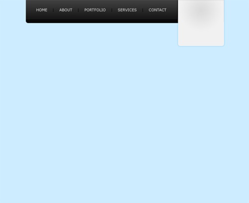
Step 1
First of all create a new document with the dimensions: 1080 by 880 pixels. Now we are going to fill in the background with a solid colour by going Edit > Fill, and use the colour #CDECFF.

Step 2
We are now going to be creating the navigation background. Create a new layer (Layer > New > Layer) and using the rounded rectangle tool make a selection (860 by 120 pixels) in the center, at the top of the document so that only the bottom curves are showing (hide the top ones outside the document by moving the selection up). Fill (Edit > Fill) the selection with the colour #151515 using the same method we used in the first step.

Step 3
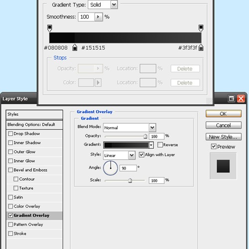
On the navigation background layer go Layer > Layer Styles > Gradient Overlay and enter in the settings below. Clicking on the picture beside "Gradient:" brings up the window on the top.
Now your navigation should be looking like this:

Step 4
Now we are going to be adding in some text links to act as the navigation for the site. Select the text tool from the tool box and add in some names of pages that you'd have for a photography site. I've chosen home, about, portfolio, services and contact. The font I've used is Verdana (16pt) and the colours are #EAEAEA for the links and #010101 for the bars between the links.

Step 5
Next up we are going to be adding in the logo / header for the site. So create a new layer and using the rounded rectangle tool again make a selection of about 200 by 240 pixels (with a radius of 10 pixels) on the right hand side of the navigation, and using the technique we used for the navigation background make it so that only the bottom curves are showing (not the top ones). Select the gradient tool and set it to radial. Set your foreground colour to #E0E1E1 and your background to #F1F1F1, fill the selection with a gradient (left click somewhere near the top center and drag to the bottom and release).

Step 6
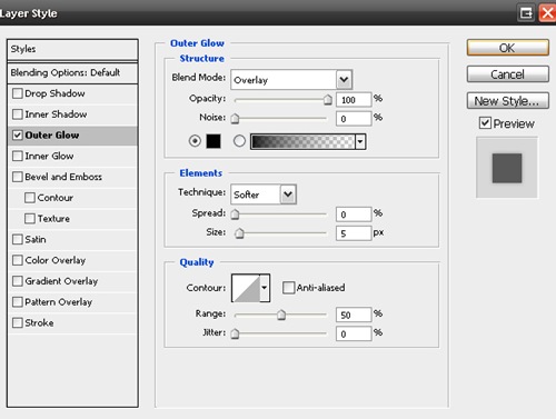
Now we are going to be adding a layer style (an outer glow) to the logo background. To do this we go Layer > Layer Styles > Outer Glow. I've used the settings below.
Your layout should now be looking like this.
Step 7
Using the text tool add the name of the site and a small description underneath. I've made up a name "PhotoSmart" for the site and the description is "Professional Photography" - alliteration :) The colorus I have used are #272727 (for the darker colour) and #7b7b7b (for the lighter colour).

Step 8
Now we are going to be doing the actual logo of the logo ;) If you don't want to make a shape from scratch for your logo, just use a custom shape from Photoshop. I've filled my tick with the colour #85c7ff and added a small white outer glow (Layer > Layer Style > Outer Glow).
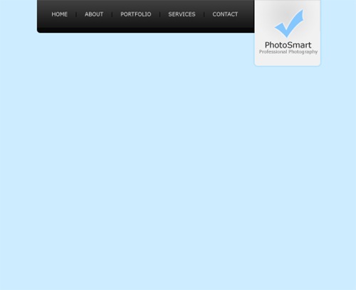
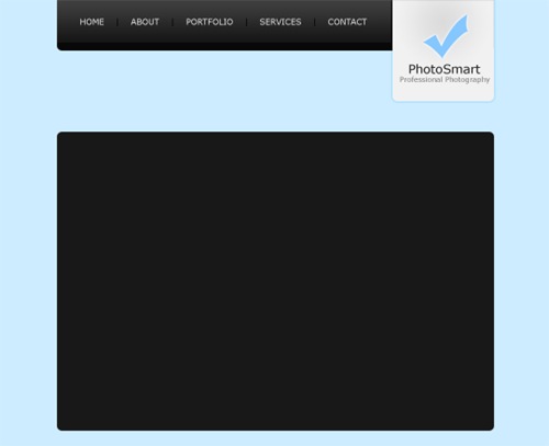
Step 9
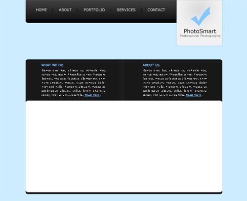
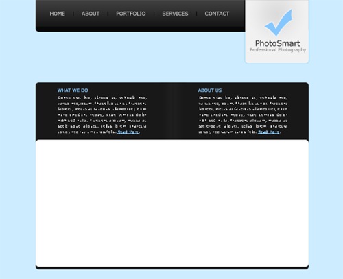
Create a new layer (Layer > New > Layer) for the top content background area. Using the rounded rectangle tool make a selection of 860 by 590 pixels and fill (Edit > Fill) with #181818.
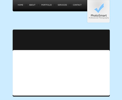
Step 10
Create another new layer and make a rounded selection of 860 by 400 pixels at the bottom of the background (leave a 10 pixel margin at the bottom). Fill this selection with white (#FFFFFF).
Step 11
Add in some fill in text for the top content area. The colour I have used for the titles is #85C7FF.

Step 12
Now we are going to be adding a divider between the two paragraphs. On a new layer make a selection of 40 by 180 pixels (however high it is between the top and bottom of the black section). Fill the selection with a linear gradient from #181818 to #1e1e1e using the gradient tool.
Step 13
Duplicate the divider layer and go Edit > Transform > Flip Horizontally. Move the duplicated layer to the right so there is a one pixel gap between the original and the duplicate.
Step 14
Add in some fill in and footer text in the white content area and you are complete.

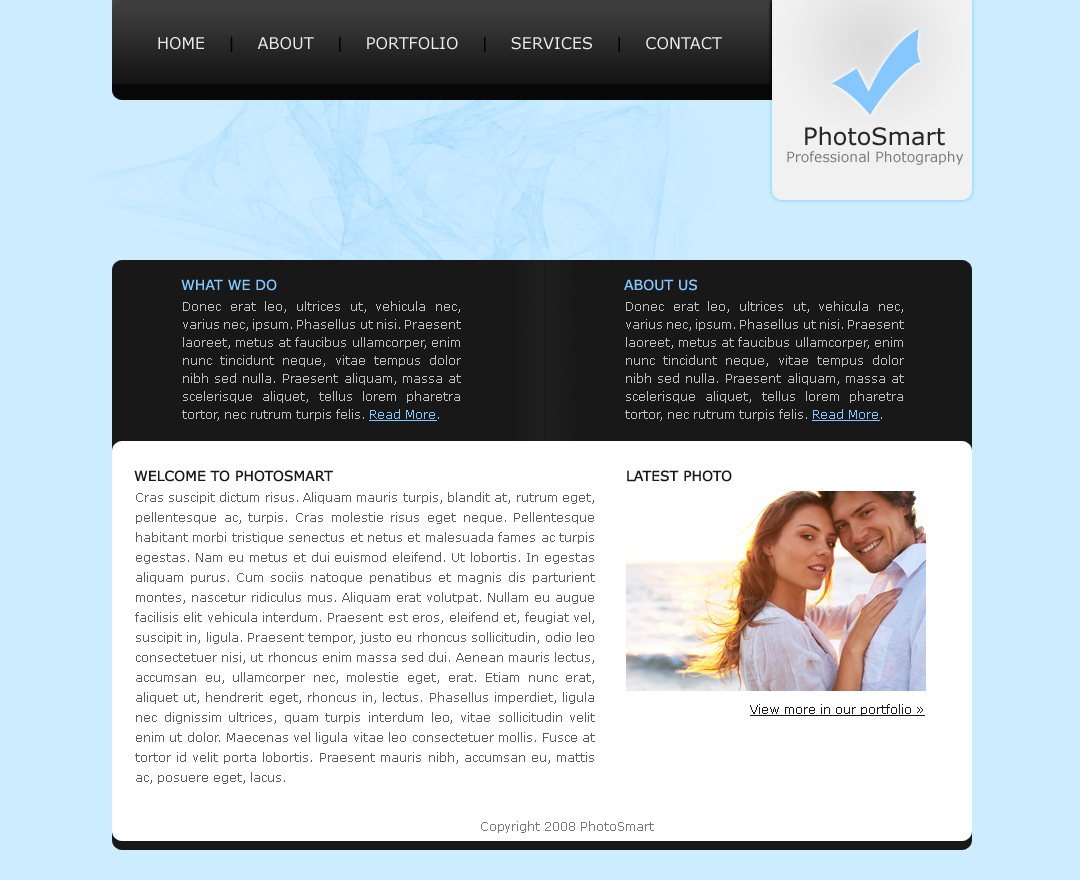
Final Results
Add some finishing touches, maybe a brush in the background underneath the navigation and you're complete. Click on the image below to see the full version.