6:52:00 PM
Design a beautiful navigation bar in Photoshop. This tutorial will teach you how to combine several layer styles to create a beautiful yet simple navigation bar.
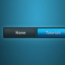
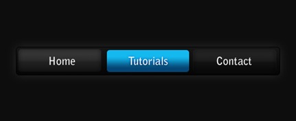
Preview of Final Results
Blue on Black Navigation Bar Photoshop Tutorial
Step 1
Firstly, create a new document - the size I've used is 540 by 220 pixels. Now for the background I've filled it with a black colour. To do this go Edit > Fill with the colour #0d0d0d.

Step 2
Secondly, we'll be making the background for the navigation buttons to go inside. Create a new layer (Layer > New > Layer) and select the rounded rectangle tool. Make fixed size selection of 480 by 50 pixels with a radius of 5 pixels in the middle of the document.
Fill this selection with a linear gradient from the colour #151515 to #050505 using the gradient tool. Deselect - Ctrl + D. Set the fill of the layer to 60% (the setting underneath the opacity in the layers window). The difference between opacity and fill is simply opacity changes the opacity of the entire layer and fill changes the opacity of everything except the layer styles.

Step 3
Now we'll be adding a couple of layer styles to this navigation background.
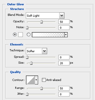
Layer > Layer Style > Outer Glow
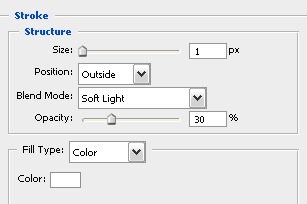
Layer > Layer Style > Stroke
Now your document should be looking something like this.

Step 4
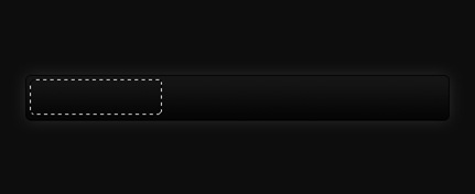
Next up we'll be adding in the buttons. Create a new layer and using the rounded rectangle tool again make a selection of 150 by 40 pixels (with a radius of 5 pixels again) on the left side of the navigation bar.
Fill this selection with a linear gradient from #323232 to #161616 using the gradient tool. Set the fill for this layer to 50%.

Step 5
I've applied three layer styles to this button to give it some depth and make it look cooler.
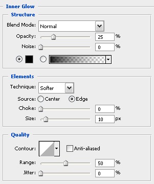
Layer > Layer Styles > Inner Glow
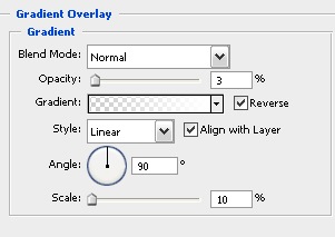
Layer > Layer Styles > Gradient Overlay
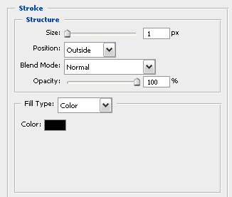
Layer > Layer Styles > Stroke
Your navigation bar should now look something like this.

Step 6
Select the text tool and add in some text - the font styles that I have used for the text are Bell Gothic Std, Bold, 20 pt, Crisp, #ffffff.

Step 7
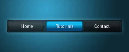
Now repeat the button steps so you have two new buttons - I've decided that I'd make the middle one a different colour to stand out (this can be like a mouse over effect or something if you decided to code this navigation bar for a web layout). The blue colours I used for that are #14b9ef and #054573.
Step 8
Because we have set the fill of the layers to 50-60% we can adjust the background and it can be half see through - below I've put a radial gradient with colours used in the Vista
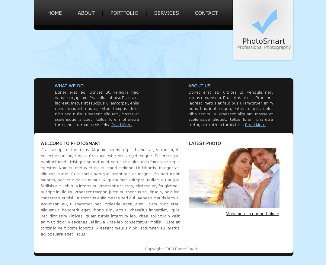
7:17:00 PM
In this Photoshop tutorial, you will learn how to design a simple blue layout with Photoshop by combining shapes and layer styles.
Step 1
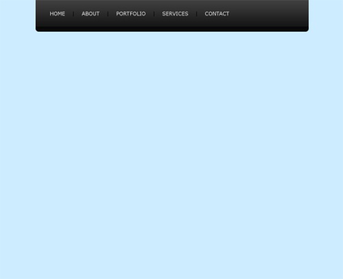
First of all create a new document with the dimensions: 1080 by 880 pixels. Now we are going to fill in the background with a solid colour by going Edit > Fill, and use the colour #CDECFF.

Step 2
We are now going to be creating the navigation background. Create a new layer (Layer > New > Layer) and using the rounded rectangle tool make a selection (860 by 120 pixels) in the center, at the top of the document so that only the bottom curves are showing (hide the top ones outside the document by moving the selection up). Fill (Edit > Fill) the selection with the colour #151515 using the same method we used in the first step.

Step 3
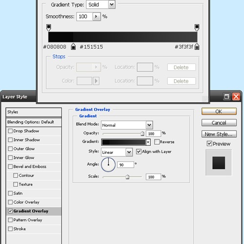
On the navigation background layer go Layer > Layer Styles > Gradient Overlay and enter in the settings below. Clicking on the picture beside "Gradient:" brings up the window on the top.
Now your navigation should be looking like this:

Step 4
Now we are going to be adding in some text links to act as the navigation for the site. Select the text tool from the tool box and add in some names of pages that you'd have for a photography site. I've chosen home, about, portfolio, services and contact. The font I've used is Verdana (16pt) and the colours are #EAEAEA for the links and #010101 for the bars between the links.
Step 5
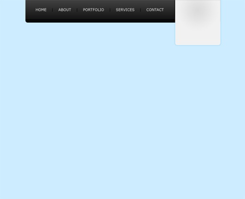
Next up we are going to be adding in the logo / header for the site. So create a new layer and using the rounded rectangle tool again make a selection of about 200 by 240 pixels (with a radius of 10 pixels) on the right hand side of the navigation, and using the technique we used for the navigation background make it so that only the bottom curves are showing (not the top ones). Select the gradient tool and set it to radial. Set your foreground colour to #E0E1E1 and your background to #F1F1F1, fill the selection with a gradient (left click somewhere near the top center and drag to the bottom and release).

Step 6
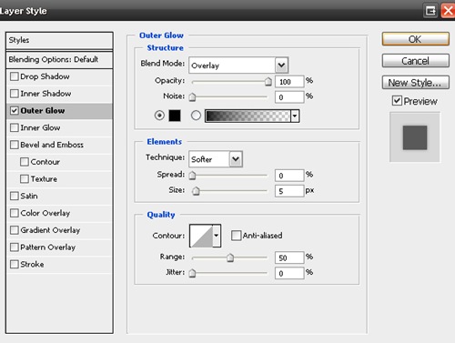
Now we are going to be adding a layer style (an outer glow) to the logo background. To do this we go Layer > Layer Styles > Outer Glow. I've used the settings below.
Your layout should now be looking like this.
Step 7
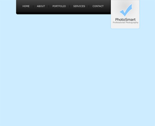
Using the text tool add the name of the site and a small description underneath. I've made up a name "PhotoSmart" for the site and the description is "Professional Photography" - alliteration :) The colorus I have used are #272727 (for the darker colour) and #7b7b7b (for the lighter colour).

Step 8
Now we are going to be doing the actual logo of the logo ;) If you don't want to make a shape from scratch for your logo, just use a custom shape from Photoshop. I've filled my tick with the colour #85c7ff and added a small white outer glow (Layer > Layer Style > Outer Glow).
Step 9
Create a new layer (Layer > New > Layer) for the top content background area. Using the rounded rectangle tool make a selection of 860 by 590 pixels and fill (Edit > Fill) with #181818.
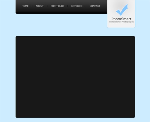
Step 10
Create another new layer and make a rounded selection of 860 by 400 pixels at the bottom of the background (leave a 10 pixel margin at the bottom). Fill this selection with white (#FFFFFF).
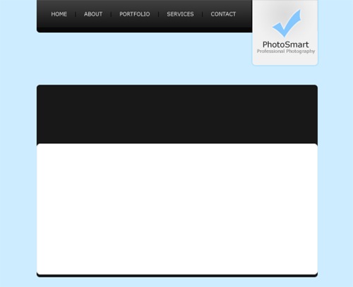
Step 11
Add in some fill in text for the top content area. The colour I have used for the titles is #85C7FF.

Step 12
Now we are going to be adding a divider between the two paragraphs. On a new layer make a selection of 40 by 180 pixels (however high it is between the top and bottom of the black section). Fill the selection with a linear gradient from #181818 to #1e1e1e using the gradient tool.
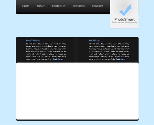
Step 13
Duplicate the divider layer and go Edit > Transform > Flip Horizontally. Move the duplicated layer to the right so there is a one pixel gap between the original and the duplicate.
Step 14
Add in some fill in and footer text in the white content area and you are complete.

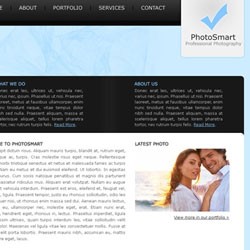
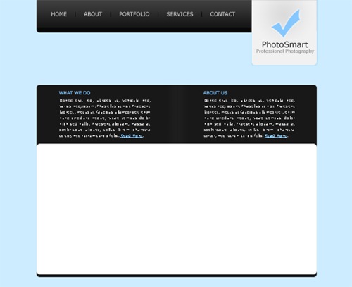
Final Results
Add some finishing touches, maybe a brush in the background underneath the navigation and you're complete. Click on the image below to see the full version.
7:07:00 PM

Create this beautiful navigation module with Photoshop. This Photoshop layout tutorial will show how simple shapes and gradients can create elegant designs.
Preview of Final Results
![step9[4]](http://photoshoptutorials.ws/images/stories/ModernisticNavigationModule_18DD/step94.jpg)
Modernistic Navigation Module Photoshop Tutorial
Step 1
Firstly create a new document (File > New) 540 by 440 pixels. Fill the background with the colour #1b1b1b by going Edit > Fill.
![step1[7]](http://photoshoptutorials.ws/images/stories/ModernisticNavigationModule_18DD/step17.jpg)
Step 2
Secondly we are going to be creating the background of the navigation box. Create a new layer, you can do this by going Layer > New > Layer or using the short cut Ctrl + Shift + Alt + N. Select the rounded rectangle tool and set the radius to 5 pixels. Make a selection of 250 by 300 pixels.
![step2a[4]](http://photoshoptutorials.ws/images/stories/ModernisticNavigationModule_18DD/step2a4.jpg)
We are now goingt to be filling this selection with a red gradient. Select the gradient tool and set it to radial. Fill the selection with a gradient from the top center (#bc0303) to the bottom center (#3f0000).
![step2b[4]](http://photoshoptutorials.ws/images/stories/ModernisticNavigationModule_18DD/step2b4.jpg)
Step 3
Thirdly, we are going to be adding an outer glow to our navigation background by going Layer > Layer Styles > Outer Glow and enter the settings below.
![step3a[4]](http://photoshoptutorials.ws/images/stories/ModernisticNavigationModule_18DD/step3a4.jpg)
Now it should be looking like this.
![step3b[4]](http://photoshoptutorials.ws/images/stories/ModernisticNavigationModule_18DD/step3b4.jpg)
Step 4
Select the text tool and add in some text for the title of the navigation box. The font I have used is Verdana, Regular, 22pt, Strong, #ffffff.
![step4[4]](http://photoshoptutorials.ws/images/stories/ModernisticNavigationModule_18DD/step44.jpg)
Step 5
Create a new layer and using the rounded rectangle tool again make a selection of 230 by 250 pixels at the bottom of the navigation background (with 10 pixel spacing on the sides and bottom).
![step5a[4]](http://photoshoptutorials.ws/images/stories/ModernisticNavigationModule_18DD/step5a4.jpg)
Fill this selection with a dark grey colour (#111111).
![step5b[4]](http://photoshoptutorials.ws/images/stories/ModernisticNavigationModule_18DD/step5b4.jpg)
Step 6
We are now going to be adding a shine effect to the new layer. So on a new layer (keeping the selection that you had before) go Select > Modify > Contract by 10 pixels.
![step6a[4]](http://photoshoptutorials.ws/images/stories/ModernisticNavigationModule_18DD/step6a4.jpg)
Fill the selection with a radial gradient from the top left (#ffffff) to the bottom right (transparent) using the gradient tool.
![step6b[4]](http://photoshoptutorials.ws/images/stories/ModernisticNavigationModule_18DD/step6b4.jpg)
Lower the opacity of the layer to 5%.
![step6c[4]](http://photoshoptutorials.ws/images/stories/ModernisticNavigationModule_18DD/step6c4.jpg)
Step 7
Now for the text links, using the text tool add in some text to act as links. The font that I have used for this is Verdana, Regular, 12pt, None, #5a5a5a (#ffffff for the hover effect). Set the line height to 30 pt.
![step7[4]](http://photoshoptutorials.ws/images/stories/ModernisticNavigationModule_18DD/step74.jpg)
Step 8
Next up is adding in dividers to go between each text link. Make selections of 210 by 1 pixel using the rectangular marquee tool between each line and fill with the colour #1e1e1e.
![step8[4]](http://photoshoptutorials.ws/images/stories/ModernisticNavigationModule_18DD/step84.jpg)
Step 9
The last step is to add in a background colour behind the active link (in my case I've made the Photoshop Tutorials link active) so create a new layer behind the text layer and make a selection of 210 by 30 pixels and fill with #171717.