6:52:00 PM
Design a beautiful navigation bar in Photoshop. This tutorial will teach you how to combine several layer styles to create a beautiful yet simple navigation bar.
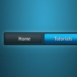
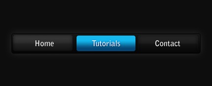
Preview of Final Results
Blue on Black Navigation Bar Photoshop Tutorial
Step 1
Firstly, create a new document - the size I've used is 540 by 220 pixels. Now for the background I've filled it with a black colour. To do this go Edit > Fill with the colour #0d0d0d.

Step 2
Secondly, we'll be making the background for the navigation buttons to go inside. Create a new layer (Layer > New > Layer) and select the rounded rectangle tool. Make fixed size selection of 480 by 50 pixels with a radius of 5 pixels in the middle of the document.
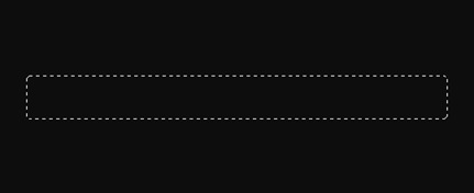
Fill this selection with a linear gradient from the colour #151515 to #050505 using the gradient tool. Deselect - Ctrl + D. Set the fill of the layer to 60% (the setting underneath the opacity in the layers window). The difference between opacity and fill is simply opacity changes the opacity of the entire layer and fill changes the opacity of everything except the layer styles.

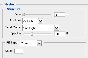
Step 3
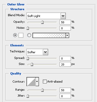
Now we'll be adding a couple of layer styles to this navigation background.
Layer > Layer Style > Outer Glow
Layer > Layer Style > Stroke
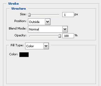
Now your document should be looking something like this.

Step 4
Next up we'll be adding in the buttons. Create a new layer and using the rounded rectangle tool again make a selection of 150 by 40 pixels (with a radius of 5 pixels again) on the left side of the navigation bar.
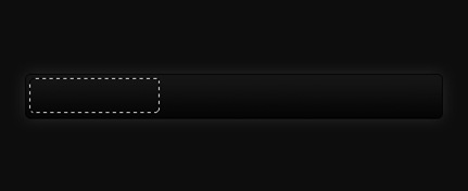
Fill this selection with a linear gradient from #323232 to #161616 using the gradient tool. Set the fill for this layer to 50%.

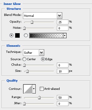
Step 5
I've applied three layer styles to this button to give it some depth and make it look cooler.
Layer > Layer Styles > Inner Glow
Layer > Layer Styles > Gradient Overlay
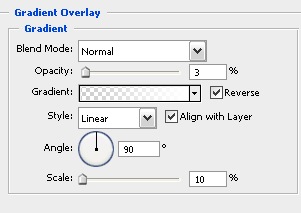
Layer > Layer Styles > Stroke
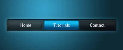
Your navigation bar should now look something like this.

Step 6
Select the text tool and add in some text - the font styles that I have used for the text are Bell Gothic Std, Bold, 20 pt, Crisp, #ffffff.

Step 7
Now repeat the button steps so you have two new buttons - I've decided that I'd make the middle one a different colour to stand out (this can be like a mouse over effect or something if you decided to code this navigation bar for a web layout). The blue colours I used for that are #14b9ef and #054573.
Step 8
Because we have set the fill of the layers to 50-60% we can adjust the background and it can be half see through - below I've put a radial gradient with colours used in the Vista
2:55:00 PM
Turn a woman into an alien by combining two photos. This tutorial will teach you several photo manipulation techniques for creating scary photo manipulations.
Alien Photo Manipulation Photoshop Tutorial
Preview of final results

Stock Photos
For this tutorial, you’ll need a photo of a persons head, octopus, and any grunge texture. If you like to use the same portrait of the face used in this tutorial, you may click on the image below to purchase it. Note that we only have the download link for the image of the woman.


Step 1 – Open the octopus photo
Begin by loading the image of the octopus.

Step 2 – Detach an arm from the octopus
First, delete the white background. To do this, use the magic wand tool to create a selection of the white background then press delete on your keyboard to remove the background. Select the lasso tool and create a selection of one of the arm. Then, press Ctrl+J to create a new layer with the selected areas as its content.

Step 3 – Combine several arms together
Repeat the previous step several times until you get about five arms. They should each be on their own layers. Start by using the transform tool (Edit > Free Transform) to rotate, resize, and position them together like the image below. Add a layer mask to each of the layers then, with a soft brush, erase in the layer mask to blend the arms together.

Step 4 – Combine the octopus arms with the portrait photo
On the document with the octopus arm, copy the entire image into the clipboard. To do this, press Ctrl+A to select all then press Shift+Ctrl+C to copy merged. Open the portrait photo then press Ctrl+V to paste the octopus arms. Position it on the mouth. Add a layer mask to the layer with the octopus arms then, using a brush with a hardness setting of 0%, erase the edge slightly to blend it with the face.

Step 5 – Manipulate the eyes
Now let’s work on the eyes. Start by using the clone stamp tool to distort the eye. Hold the Alt key and click on a white area then click in the colored area.

Use the dodge and burn tools to manipulate the eyes further. Start with the burn tool to create small holes then use the dodge tool to add some highlights. Use your creativity and don’t worry too much about how it looks.

Step 6 – Apply a color effect with adjustment layers
Choose Layer > New Adjustment Layer > Curves to add a new curves adjustment layer. Use the curves adjustment layer to make the image a little darker.

Now add a new Levels adjustment layer by choosing Layer > New Adjustment Layer > Levels. Click on the black point eye dropper tool and click on one of the darkest areas in the image. Select the gray point eye dropper tool and click on the white area of the eye.

Add a new Hue/Saturation adjustment layer by choosing Layer > New Adjustment Layer > Hue/Saturation. Checkmark the colorize option first then adjust the settings as shown in the image below.

Step 7 – Use the burn tool on the face
Use the burn tool to darken some areas using a large brush with a soft edge. This will modify the look of the bone structure. Also spend some time to burn certain areas in the octopus arms to make the jaw look wider. You can make him look like Davy Jones in 'Pirates of the Caribbean: At World’s End.

Switch to a small hard edge brush to burn some scars on the face like shown in the image below.

Step 8 - Add an alien skin texture
Start by opening the photo of a marble texture in Photoshop.

We’re now going to copy and paste the marble texture into the image we were working on. Choose Select > All then Edit > Copy. Close the current image of the marble texture to switch back to the alien image we were working on. Choose Edit > Paste to paste the texture into the current document.
Use the eraser tool with a soft edge to erase the marble texture so that it only covers the fast. Change the blending mode to difference.

Lower the opacity to about 30%. One note to remember is that the difference blending mode will invert the colors of the layer depending on the layer below. So if you want more blue color on the face, you can use the burn tool on the layer with the face.

You can also move the layer with the marble texture below the adjustment layer to get an effect like this image:

Step 9 – Add some abstract lines
Select the brush tool with a 3 pixel brush and 100% hardness. In the brushes palette (Window > Brushes), apply the settings shown in the image below:

Select the pen tool and, in a new layer, create a curved path like the image below. Then, right click and select stroke path. Select the brush setting and enable the simulate pressure option.

Right click again and choose delete path. Repeat this step to add as many abstract lines as you like.

Step 10 – Add highlights to the arms
It is helpful to have a pen tablet for adding highlights but this will work with a regular mouse too. We’ll create highlights by painting a thin white line.

Start by painting a line through the shape of the arm.


Here’s what our image looks like after adding some highlights":

Step 11 – Enhance the arms
Select the burn tool and set the brush to a big and soft edged brush. Change the range in the option bar to highlights then paint the edges of the arms to make it darker.

Now change the range to midtones and paint some shadows.

Now change the range to shadows and burn the areas that you feel needs to be darker to add depth.

Step 12 – Add a rusty grunge texture
Open the image of the rusty texture and place it into the image of the alien. To do this, choose Select > All then Edit > Copy. Close the image of the texture to go back to the alien image. Choose Edit > Paste to paste the texture as a new layer.

Change the blending mode to multiply then use the erase tool to erase the areas around the face so that the texture only affects the background.

Final Results
Here is our completed image. We added more red abstract lines on the eyes using the same technique in step 9.
ReadMore...
12:24:00 AM
 Perhaps all that many people already have PayPal. But many may also verify that belon was needed because PayPalnya credit card to verify. But now the period has changed, the year has been changed .. Everything is now completely automated. wah kok story only .. Simply ..
Payoneer card is able to verify your PayPal for free you have to do that is first in the list friendfinder and you will get a Payoneer debit card you can create a Paypal verification.
You can get a debit card free of a Royal Bank of Scotland. The card is very useful to verified paypal, the money from your earnings at this site or do other affiliates throughout the world, the ATM berlogo mastercard.
You do not need to kwatir! card page legal, safe and reliable, and most importantly free. Now how do I get a card and earn here? Read carefully and follow the steps.
First steps first list: HERE
Then, click Join Now
Fill your data with the full.
I am a: Man if you are men, women, Woman, if you
Interested in a meeteng: Man if you want to explore / dg are male, some female woman, or you can select both of them.
For: Friendship (are), Dating (ketemuan), Serious relationship (serious relationship), Marriage (married), you can select more than one, can also select all.
Birthdate: Date of your birth.
Country: your country.
Zip / Postal code: Leave blank, if you are than in the United States (U.S. only)
Email Address: Fill in your email
Username: your username between 4 to 16 characters
Then click Click Here and Have Fun
After that you enter next ketahap.
City: City where you live
Closest City: Same as above
State: Your Province
Your Height: Your Highest
Your Body Type: Type of your body
Your Race: Race your race or if you usually is Asia
Marital Status:'s your wedding
Your Religion: Religion You
Your Education: Education last you
Your Occupation: Your Employment eg Adiministrasi, if your employees, if you're the Business etc..
Introduction Title: Title about you, eg: I am a Man, or I like Playing Football, it's up to you. Minimum 10 characters
Tell others about yourself: mention about you, for example: I am a good women, I like swimming and my hobby playing football, computer, fitness, and others, i love new friends, minimum 50 characters.
If you already have photos, please in the upload, click browse ago I find the file containing your photo. If you do not have fota you can empty the first, later you can fill it again.
Then click Click to Join. So there will be a incoming email in your email.
After that, open your email, then click Activate Now
So you have activated, if you want to fill some login username and password you have in your email.
After that come out first, with the click log out.
Second STEP: HERE Program Affiliati For You
Affiliate Program menu in the Options
Affiliate Signup click, you have 3 options to select the one, the same three options that
Then you just enter the next menu:
Preferred Program: Choose the no 1
First Name: Your first name
Last Name: Name of your final
URL: Website / your blog, you must fill in, if you have not already, make the first in blogger.com, paing free and easy.
Desired Password: Password you want your
Preferred Newsletter Language: English
Email Address: Enter your email
Secondary Email Address: Email you the other, may also cleared
Checks payable to: Your full name according to your ID card
Street Address: Address your ID card
City: City where you live
State / Province: province where you live
Country: your country
ZIP / Postal Code: Zip your town
What is your business tax Classification? Clear as to United States residents only
Tax ID or Social Security Number: Clear as for United States citizens only
Phone Number: No telp you, for example, you no telp: 021 1234567 and 6221 1234567 or make no hp then you 081xxxxx a 6281xxxxx. (Must use code 62, code that is telphone Indonesia)
Which Instant Messenger do you use? Just select None
Use ePassporte: Select only No
Please give us your comments: Make your comment for example: Heloo. I like it. Thank You, or you want to write up what is important in the English language.
Then click Click Here for the Last Step
Then click the small box you have any posts
Yes, I have read and accepted the Affiliate Agreement, ... ... ..
Then click Submit.
Then click on Account Information
Then I click on the blue any posts Here is your account information. Click here to update your information.
click Payoneer: Signup to be paid by Prepaid MasterCard ®. You will be directed to FriendFinder a page hosted by Payoneer, where you can sign up for a card.
Then fill in the data on your Payoneer page, (to be more easily select only your ID card ID that is). After you watch Fill approximately 20 days until your card in your home, after a debit card until you follow the instructions aktivasilah ago I have sent you disurat dg with your card. Nah gampangkan ..
Only a member of FriendFinder you can be a debit card from payoneer, if you list directly on the payoner You can not get it because the country does not have to Indonesia.
Look at your email again, there you will be given a username and password for the affiliate. Login as a member as affiliate login dg is different.
Join with you in the affiliate FriendFinder is automatically join the network all FrindFinder, byk once was, there adultfrindfinder, asiafriendfinder, etc., the element of this porno site but we only take the benefits only. I did not invite you to berporno ria, but only take the benefits only, which is a debit card and dolarnya.
Friendfinder this we will pay 1 dollar to join the male member and the member for 2 Dollar women who join us through the ad references, why do more expensive it is, may be due to the fact more men are happy to explore haal-sexy things like that
And now a special program to provide adultfriendfinder PPC (pay per click), akan tentunnya increase your earning from every visitor click the banner to the most sexy Pajang on our website-blog. Indeed, it is more so that we make maximum blog or website to install the special adult friendfinder this banner ad, so that visitors click on the opportunities greater.
Payoneer debit cards can be used for this activation paypal, but if the funds have been filled. Minimal funds charged $ 2 so you can wait a commission payment can be used in the new life.
Payoneer card is usually sent to the address to us about 20 hours -1 week and this card is the withdrawal physical mastercard. Please join and happy hunting dollars.
ReadMore...