

11:51:00 AM
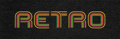
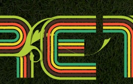
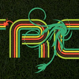
 Retro Text and Video Layers Retro text like this looks great but isn't easy to create in Photoshop alone so here we use a mix of Photoshop and Illustrator, raster and vector to create some unique text. The second part of this tutorial explains video layers, something which is relatively new to most people. The final result will be an animated image that could be used for a web header.
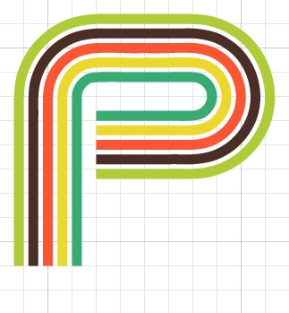
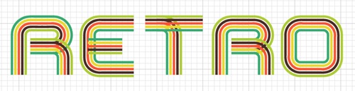
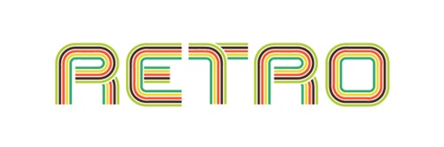
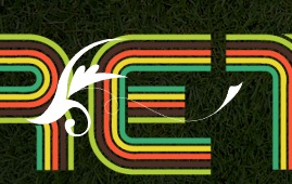
Preview of Final Results
Retro Text Photoshop Tutorial
This tutorial will kind of be split into two parts, the second part starting at step 19.The first part will cover the creation of the text and then editing this text in Photoshop. The first part will require 
Step 1
Start by opening Adobe Illustrator, there are two reasons why we want to use Illustrator here rather than Photoshop, firstly we can create vector files which gives us more flexibility when we export things to Photoshop and secondly there are a few nice things we can do in Illustrator which would take a while in Photoshop. Hit Ctrl+N to create a new document, I used a size of 800x600px but this doesn't matter as we are working with images that can be enlarged infinitely. Now hit Ctrl+' to show the grid. Now the default grid should have 8 subdivisions, if yours is different then go edit>preferences>guides & grid and change it. Next click on the view dropdown and make sure snap to grid is checked. Select the rectangle tool and draw a 2x2 rectangle, we will change the fill and stroke in the next step.

Step 2
With your rectangle still selected, go to the main toolbar and change the fill to one of the colors in your color scheme and set it to no stroke like in the image below. If you were wanting an outline round your text you would have to draw a line only at the left and right side of this rectangle for reasons that will become apparent later on.
![]()
Step 3
Create four more of these rectangles, each with a different fill and a 1 subdivision space between each.

Step 4
Hit V to use the selection tool then drag a box round all five rectangles then hit F5 to bring up the brushes panel. Inside this click the new brush button and select new art brush. Now change the settings to mimic the ones shown below. It should be fairly obvious why we changed it from a horizontal to a vertical direction.

Step 5
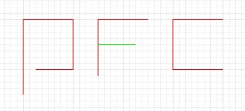
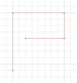
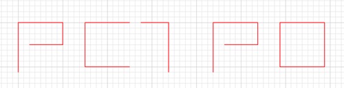
Next I worked out a rough typeface I was going to use, we are not using a real font here but rather, creating a path then stroking it with the brush we created. Below I've shown the path I would make if I wanted to make a P, an F and a C; the red lines being the first path and the green; the second path. From this you should be able to work out roughly how to create any letters. At the moment don't actually do this in Illustrator but maybe sketch out the kind of letters you want. I'll show more details on how I created the letters in RETRO. The main points here were to make most letters 1 major gridline in width and half a major gridline between the letters. Note that on the F, it extends 1 minor gridline below, this is to acount for the extra width from the brush on letters like the C. If this doesn't make too much sense at the moment; don't worry I'll go through a full example in the following steps.
Step 6
First I made a new layer, the plan was to have two layers as I needed two paths for some of the letters. This meant that I could export it to Photoshop as two layers also. We will create all of the first layer (red) then afterwards create the second (green). Hit P to select the pen tool, the pen tool in Illustrator works in the same way as in Photoshop. We don't want any bezier curves so click once at each point and don't drag the mouse. Draw this shape in your document; starting from the lower left point. We have to start at the right end or else the colors wont match up when we add layer 2.
Step 7
Hit V then click on the path and a bounding box should appear. In the main toolbar make sure we have no stroke or fill then just click on our brush in the brushes panel and it should look like the image below. If for example our brush was the wrong size we could click the small button to the left of new brush and change the size but since we set it at 20% already we should be fine.
Step 8
Now for quick bit of maths; go edit>preferences>guides & grid and take note of the 'gridline every:' number, now divide this number by 4, mine was at 72px so I got 18. This number is because we are going to round the corners and want the radius to be equal to two of the minor gridlines; the reason for this is obvious if you look at the examples of the letters I used but if you were to use different letters you could make it more or less rounded. Okay to round the corners, with the leter still selected, go effect>stylize (illustrator)>round corners and set it to the value you calculated.
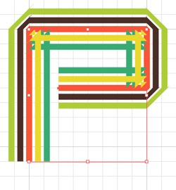
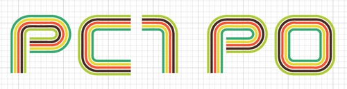
Do the same for the other letters, so all my paths looked like the image below. You can either do the letters one at a time or create all the paths then add the styles to all of them at the same time. The image below that shows the completed first layer of the letters.
Step 10
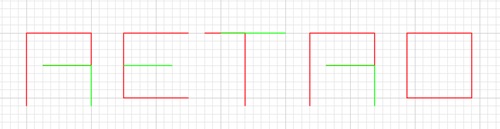
Now for the second layer, do exactly the same as for the first, In green is the paths I used for the second layer, I then added the same styling to achieve a result like the one below. Note that here you could always just copy the R to save creating it again. You should have three layers; one with the brush shape in it, another with the first layer of our text (red) which we'll call T1 and another with our second layer of text (green) which we'll call T2.
Step 11
Create a new document in Photoshop; since these are vectors you can make it any size but I used 900x300px as I envisioned it as a good idea for a website header. Now in Illustrator, hide T2 then drag a selection on over the text then copy and paste it into Photoshop as a smart object if possible, if not then paste it as pixels and ignore the next bit. Hit Ctrl+T then change the height and width to 150%. Now do exactly the same with T1, hiding the T1 in Illustrator, then alaign it with the other layer. Below I've only shown one letter but that's only because I'll be demonstrating the techniques on this letter first.

Step 12
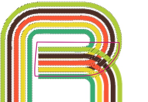
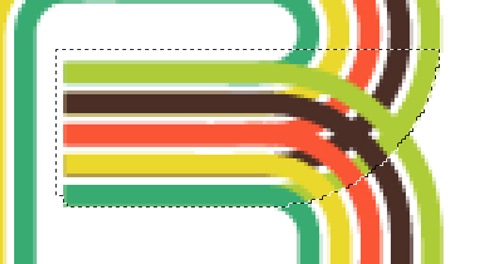
Ctrl+click on T1 to make a selection around it. There is a few steps that aren't required for the text I used but you may need to do all steps If you are doing this to a different shape or size of text so I'll show you all the steps then you can work out the shortcuts if you want. Select the polygonal lasso tool then hold Shift to change it to add mode, this will add to the selection we already have. Now draw around the parts of T2 that you want to hide (purple line), one letter at a time. So here I've made this selection which will keep the same curve at the right part of the R by staying within this line then drawing round everything else. The resulting selection is shown below that.
Step 13
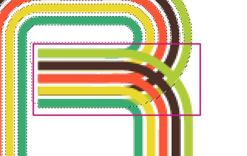
Next, with the either the polygonal lasso or the marquee, hold Alt+Shift to change it to intersect mode which will select only the parts included in both selections. Now draw round the part of T2 which you want removed, there's no need to be neat, just draw a box like the one shown in purple. This is so that when we remove it it will only apply to this one letter then we can go on and do the other letters after. Again I've shown the resulting selection below.
Step 14
Now go select>modify>expand and choose 3px as the value. Select the T2 layer and hold Alt and click on the add layer mask button in the layers panel, this will create a layer mask then fill the selection in black, if we were to just click on the layer mask button we would get everything except the selection filled black. Below is what your letter should now look like.

Step 15
Do this for any other letters that have two layers so for mine I had to do it to E.T, Note that after you've refined the selection you don't want want to make another mask so instead select the mask then hit D to reset the foreground and background colors then hit Alt+Backspace to fill the selection black. Alt+Backspace is a shortcut for filling something with the foreground color and is quicker than going edit>fill or Shift+F5.

Step 16
Now you can move certain parts of your text to get the spacing right. Lastly select T2 and hit Ctrl+E to merge it with T1 then right click and convert to a smart object. Below I've shown the finalized text.
Step 17
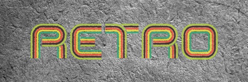
This next part shows how I created the background and is optional as I'm sure you can think of much more creative thing to use for a background. Well firstly I pasted in an Image of cardboard then desaturated it.
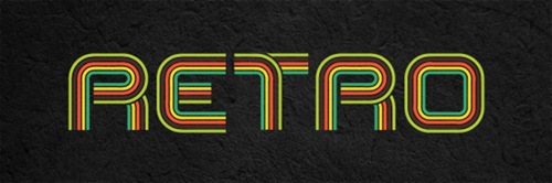
Next I made a very dark radial gradient then set it to 75% multiply.
Step 19
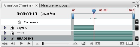
Now go layer>video layer>new video layer from file and choose one of the videos you downloaded. Now go window>animation to bring up the animation panel. You will now have what looks like a histogram of the time, all except one of the layers should have an infinite time, the one that doesn't is your video layer and should be at the top. Move the time slider to the end of this layer, see the image below for reference. You will see that the animation will move, the reason we moved the slider to the end was because if you watch it you will see that the last 10 seconds include every part of the animation.
Step 20
Now hit Ctrl+T to enter free transform mode, a warning should pop up just press convert and it should change to a smart object. Next move, rotate and scle it then put it above part of your text, here I put it above the first R.
Step 21
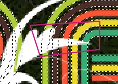
Now we are going to mask it, I used similar techniques to what we used when masking the letters. Note that when you mask a video layer it does this in every frame. Ctrl+click on the text layer to make a selection then get the polygonal lasso tool out, hold Alt+Shift to go to intersect mode then draw roughly round the part you want to hide behind the letters like shown below; the purple line being the selection I made.
Step 22
Now mask the video layer in exactly the same way as in step 14 and 15. Do this for some other parts of the animation.
Step 23
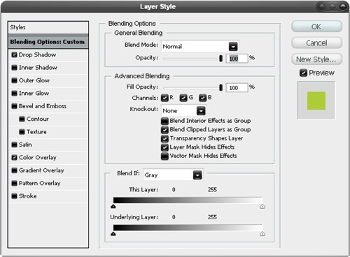
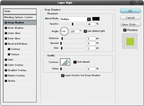
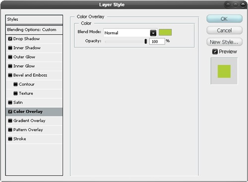
Right click on the video layer then go blending options, that's right you can add layer styles to a video. Use the settings shown below. Make sure that 'Layer Mask Hides Effects' is checked as this will make the shadow more accurate because the shadow won't follow the layer mask at all. For the color overlay, just select the color that the animation merges into with the eyedropper, so here mine merged into the green line.
Step 24
Do exactly the same with the other two movie files and just copy and paste the layer styles by right clicking on the layers then change the color overlay. They should vaguely resemble the image below.
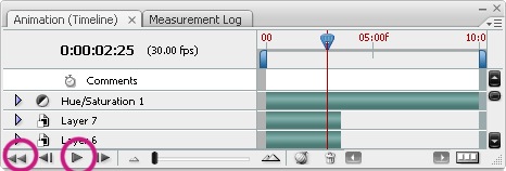
Step 25
Try now playing your animation by clicking the rewind button then the play button in the animation panel.
Step 26
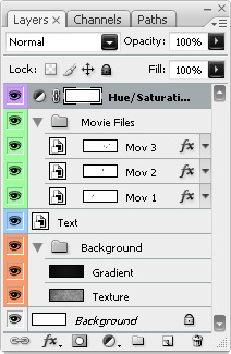
There's a few things you can do with this file, you could save it as an animated gif, export it to flash or save it as a movie file. Here I saved it as a gif by going file>save for web & devices. Depending on what you want to do with the file you can choose your settings. I knew I was going to upload it to this site so wanted it quite low quality, I also found that by cranking the lossy value up you get a grainy effect and a smaller file, I liked this effect so kept the lossy at about 85% then set the colors to 64. Below I've included my final layers panel and also the unanimated image. You may notice that the colors are different here this is because I added a hue/saturation adjustment layer at the top of the layer stack.

Post a Comment