

5:24:00 PM
Learn how to use the 960 Grid System to design a website template in Photoshop. You will be practicing layer styles to for effects and positioning elements based on the 960 Grid System.
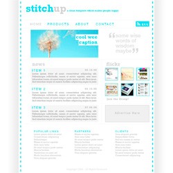
Preview of Final Results

Design a Web Template using the “960 Grid System” Photoshop Tutorial
Step 1
Whenever I'm mocking up a web template in Photoshop I use a generic grid called the '960 Grid System'. This grid system has become very popular in web design, however I still believe that grid systems like this shouldn't be followed too strictly so the main reason I use this system is because the PSD files come with lots of guides set up already which saves a lot of time. So I'd advise downloading the grid system free from here. Once you've downloaded it open the 12 column PSD file in Photoshop and you should have something that looks like the image below.

Step 2
Try turning the guides on if they aren't already; do this by going View>Show>Guides and View>Snap_To>Guides. Below you'll see that I've drawn a rectangle showing the container where all the content will go, you don't need to draw this rectangle as the background will be whit anyway but if it helps then go for it.

Step 3
Create a new layer then select the gradient tool and choose a gradient going from white to black. Holding shift drag horizontally to get a gradient looking like the image below, you may have to try a few times to get it right.

Step 4
Select the rectangular marquee tool and drag from the top left corner down to the bottom and snapping to guide which was at the left side of the box shown in step 2. Now go Layer>Layer Mask>Reveal Selection and you should be left with something that resembles the image below.

Step 5
Repeat the last two step again for the other side and make sure its symmetrical.

Step 6
Create a new layer group by clicking the folder icon in the layers panel. Then drag both these gradient layers within the group then change the opacity of the group to 10%.

Step 7
Next I added some rectangles that look a bit like stitches, If you were doing this in CSS then you could use a dashed border so you don't really need to do this step too accurately. I've got a good tip for doing this; first create a new layer then make one small rectangle then duplicate this layer. Now hit Ctrl+T and move the rectangle down slightly then just hit Ctrl+Shift+Alt+T a few times. What this does is remembers the first transformation then the key combination mentioned duplicates the layer then applies the same transformation. If this seems a bit complicated then just create each one manually. Afterwards merge all the rectangle layers by selecting them then hitting Ctrl+E. You can now just duplicate this layer then move each layer to either side.

Step 8
Now add a title and a tagline, the one that I've used was created using only text and the font, 'Rockwell'. I used the same blue here as the stitches and if you are familiar with swatches then a good idea would be to set a blue and grey swatch that you can use again.

Step 9
Now create the menu by using a sans serif font like Helvetica or Tahoma. Now just type a few words in uppercase using the same blue color. Another thing that I tend to do especially when using all uppercase is to increase the tracking (horizontal letter spacing) of the letters, to do this go Window>Character then highlight the word and change the tracking. I did each of the menu items in a different layer.

Step 10
Now duplicate all these words and change the color of each of them to the grey color. So now you have a set of layers with the menu items in blue and a set of the same menu items in grey. This is just so that you can see what the words would look like if you were to hover over them in the real site. Only make one of each menu item visible at a time.

Step 11
Next I made a custom RSS feed icon which you only really need to add if you were planning to have RSS feeds available on the site. First I drew a rectangle using the blue color then I added the word 'RSS' using the font, 'Rockwell' in white. For the actual feed icon you can download it from here in the 'Developer Kit' and place it into your document. I then put the icon in a new layer group then duplicated the group then changed the blue rectangle to a grey rectangle, again to show what it would look like when hovered over.


Step 12
I thought that a kind of slideshow element would look good on the homepage so to figure out what it would look like I copied in a stock image which matched the color scheme, if you;re interested the image can be downloaded from SXC here. Paste the image into your document then scale it down and position it like so.

Step 13
Select the rectangular marquee tool and drag a selection box over the image (the part which you want to keep) then select the layer with your image in it then go Layer>Layer Mask>Reveal Selection and you should be left with something that resembles the image below.

Step 14
Using the font 'Rockwell' again type a wee caption with the text tool. Next create a new layer and drag the layer below the text then draw two white rectangles behind the words then change the text color to the same blue that we used before.


Step 15
To the right of the slideshow image I left a space for a small quote or maybe a 'welcome to our site' thing. I put in the quote by drawing a text box then typed a a few words in a sans serif font in the grey color. Next I added some oversized quote marks by doing each one in a separate text layer and boosting up the pt size and positioning them accordingly.


Step 16
In the middle of the page I wanted to display some news items in a sort of blog format. First I typed 'news' using the grey color and 'Rockwell' as the font. Next I created a new layer group called 'Item 1' where I would put in all the the elements that make up the first news item. Type the title of the first news item and place it within this group.

Step 17
Next I added some text which would make up the news item then a date at the top right. I put all this within the same news item group.

Step 18
Using a light grey color draw a rectangle around the first news item like shown in the image below.

Step 19
Now right click on the layer group and duplicate it then move it down and change the title. Now do this again so you have three news items then delete the rectangle layer from the second news item.

Step 20
I thought a good use of space in the sidebar would be a Flickr group display which is quite popular in design sites now and can be seen on sites such as psdlearning and Fuel Your Creativity. Firstly put in a suitable title in the same style as the news title. Now add some images with dimensions; 75x75px, If you want you can copy the thumbnails from the sites I mentioned above then paste them in. Now just arrange them like I've shown below.

Step 21
Select all of the thumbnail image layers then hit Ctrl+E to merge them. Now right click on this layer then go to the blending options and add the styles shown below then with another line of text you should have something similar to the bottom image.


Step 22
I added an advertising space box using a simple rectangle with a stroke applied then some text within it. You can personalize this advertising box if you want so I've not gone into much details her.

Step 23
Next I added a footer area which gives some extra information like external links, clients etc. as well as a copyright notice. By know you should know exactly how to put this together so I've just shown a couple of images of it.


Step 24
The last thing I did was to add some thin lines that would act as dividers and make the page look more organized. Create a new layer. Select the line tool and set the weight at 1px and the foreground color to a medium grey. Now draw some lines in the same places that I have, using the image below as a reference, remember to hold shift to get horizontal and vertical lines.

Post a Comment