10:23:00 PM
I thought I’d outline my process of creating ‘clay’ images for showing WIP (Work In Progress) in forums or blogs. Clays are used because they show the model in a basic form which tends to show lumps and bumps which could otherwise be covered up by texturing or shaders. It also allows your peers to criticise your work easily which will help you develop your models faster and to a better standard. Its really useful to post wire frames too but this is often where people become unstuck. This tutorial tackles clay & wireframe renders in Mental Ray & 3ds Max - I have used 3ds Max 2008 but it should be transferable to other versions. 2) Change your background colour to white in the Environment and Effects window. 3) To create the clay material for the car I use a composite material. The base material should have a white diffuse colour with no specular highlight. The 2nd material should be black diffuse colour but make sure ‘wire’ is ticked in the “shader basic parameters” section at the top. You can change the size of the wire to suit your renders by experimenting with different values in extender parameters section. Apply this material to your object - in my case a half modelled car. 4) Lighting: Insert a skylight anywhere you wish - a skylight is omni directional so it doesn’t matter where you place it in your scene. The skylight will give you soft lighting and a soft shadow underneath your object. 5) Now onto setting up Mental Ray. Firstly select Mental Ray as your chosen renderer. Secondly enable Final Gather and use the preset Draft. If you have a fast computer then select a higher option if you want but it will slow down your rendering times and after all this is for a Work In Progress image. 6) Choose how you want your image to look! For WIP images I personally believe its important to show your object unsmoothed, so people can critique your wireframe. Once you’ve done this you can then show a smooth version with or without a wireframe. Using this method you can easily render either of these with just a few tweaks to your settings. To render a smooth version with a smooth wireframe you need to tweak your turbo/mesh smooth settings so that isoline display is ticked and then change the amount of iterations to something suitable. Here’s my settings: Now after posting your wires, you might want to just show you car smoothed to show off your shapes, using this method all you need to do is turn off the wire frame layer in the composite material by unticking it. Each type of image has different uses but I normally only use a smooth clay render without a wireframe and a clay render with wireframe without smoothing. These 2 images will demonstrate my model to others fairly well so they can critique my work. As my work develops I will start to add car paint and a studio lighting but I try to refrain from doing this too early as it can be distracting. To get the mixed image at the top of this tutorial all you need to do is blend one smoothed image with a wire image in photoshop. I hope this tutorial was helpful!

1) Create a large plane in the top viewport and assign a standard white material to it. My plane was 100m by 100m large. I have also chosen to use an off white/grey colour instead of white but that is down to personal preference.


ReadMore...
10:11:00 PM
 This tutorial will show what you can do to previous Cartoon Landscape tutorial. In this tutorial you will learn to add snow effect using material and also create falling snow using Particle Flow. Because this is cartoon style scene, I also create another type of falling snow. Instead of using ordinary snow shape, I will use snowflake image as particle. As you can see later, this scene will be very interesting to put in cartoon fantasy movie like.
Image below show what you can learn from this tutorial
1.First, you need to download scene used in this tutorial here. Use 3ds Max 8 or up to open. If you interested, you can read how to create this scene in Cartoon Landscape tutorial. Image below shows camera view from this scene.
2. First thing to do: Creating snow material. Open Material Editor. There's a Multi/Sub-Object material applied to the scene. Click 'leaves' material. Then click Standard button and change into Composite material. Click OK to keep 'leaves' material as sub-material. Composite is a type of 'layered' material. In case of snow, you can create snow material on top of base material ('leaves' material).
In Composite Basic Parameters, click None button right next to Mat 1. Choose Standard material. This will be our snow material.
In Blinn Basic Parameters, change Diffuse color to white.
3. Scroll down to Maps rollout. We need to specify how much snow covering the base material. Click None button right next to Opacity. In Material/Map Browser window choose Falloff.
4. In Falloff Parameters rollout, switch color between black and white. Use Falloff type=Towards/Away and Falloff Direction=World Z-Axis. In material preview, you should see white color only appear on top.
5. Scroll down and open Output rollout. Activate Clamp and Enable Color Map. Clamp will make material seems brighter. Meanwhile Color Map controls how much snow covering the base material. After you activate Color Map, move leftmost point in graph to -1. Notice the changes in material preview.
6. Click Go to Parent button to go back to Maps rollout. To make more realistic, click None button right next to Bump and choose Smoke. Use Smoke Size=30.
7. Image below shows rendered result so far
9:43:00 PM
Hi friends,
Today we are getting into animation. Actually if you have a little idea about coordinating different utilities available in 3ds Max, animation is very much easy.
We are going to animate a cute butterfly using wire parameters available in 3ds Max, But first we will model the Butterfly, its very easy let me show you how…
- Create a plane for the butterfly wing and adjust the Pivot point of the plane from Hierarchy> Affect pivot only like I shown below


- We will apply the texture using opacity mapping. I think you will be knowing that
- Mirror your Butterfly wing from Tools>Mirror and create a body for your Butterfly thing using Lathe or any other idea u like (I used lathing)


- Now comes the animation part, Enable the Auto key, change time slider to 10 frame and rotate the left wing slightly downwards


- Now we are going to loop the animation, see the picture below. Enable the Curve Editor from Graph editors> Curve Editor, select all the keys from the Graph, go to Parameter Curve Out-of-range type and enable the two buttons of Ping Pong


- Now you can see the Butterfly fluttering only one wing, we had to create the same animation for the second wing also. Let me show you how… Enable the Parameter Wire Dialogue from Animation>Wire Parameters.


- In the window select the ‘Y’ Rotation Parameter for each Wing you created, you can find it in the Object list available in the left and right panels. And then click the “Arrow” marks in the Middle of the panel and click “Connect”. Wow!!! Your Butterfly is Fluttering its wing… Is that EASY?


Note: if its not working try to use the other two Arrows available there
…HAVE A GREAT DAY…
ReadMore...
9:12:00 PM
Curved boxes are straight forward to do in CSS. Here's a quick tutorial of how to achieve curved boxes in CSS and what's to come in CSS 3.
What we want to achieve
Here's a graphic of the final product - a box with curved edges that will expand if the text is enlarged.

To start with we will make the graphics in Photoshop.
Curved Boxes - Making the Graphics
Open Photoshop and choose the rounded rectangle tool (shortcut of U on the keyboard). Decide on the size and colour of your rectangle and then draw a rectangle. You can make the curve bigger or smaller by changing the size of the radius.
Cut the curve out just below the last pixel of the curve. You can make the bottom curve quickly and easily by going to Image > Rotate Canvas > 180 º CW

The Markup
In order to create a cross-browser friendly box we need to attach the image to HTML elements. This method requires at least two elements inside the div. In this case we use the h2 and p tags and apply a background image to each through the CSS.
 <div class="curved-box">

     <h2>This is a curved boxh2>

     <p>This text will resize and not break the box.p>

div>
Applying the CSS
We add the curves through the CSS by accessing the elements and applying a background image. The top one is applied to the h2 and the bottom to the p tag. Make sure the background to the div is the same colour too.
 .curved-box
  {
  width: 298px;
  margin: 10px;
  background-color: #c3d0d4;
}

.curved-box h2
  {
  background: #c3d0d4 url(../images/curve_top.png) no-repeat left top;
  color: #f4fbfd;
  padding: 10px 15px 5px 15px;
}

.curved-box p
  {
  background: #c3d0d4 url(../images/curve_bottom.png) no-repeat left bottom;
  margin: 0px;
  padding: 5px 15px 10px 15px;
  text-align: left;
}
Using this code the text will resize without breaking the box. Have a look at the code in action in the example. Browser support: IE5+, Netscape 6+, Firefox 1+, Safari 1+, Opera 7+, Flock, Camino.
CSS3 will make it even easier
Once CSS3 is finally agreed it will be even easier to curve the edges of boxes. "Border-radius" will curve the corner of the box. For now browser support is not great and indeed browsers have their own proprietary properties:
 -webkit-border-radius: 10px; /* Safari prototype */
-moz-border-radius: 10px; /* Gecko browsers */
border-radius: 10px; /* Everything else - limited support at the moment */
Currently supported in Camino 1+, Firefox 1+, NOT IE. The code degrades gracefully so if it is not supported there will be no curves but it will still render. Check out the example to see it in action.
Some of you may be looking for even further guidance or special programs that will help you through every step of the process. I would love to be there standing behind you pointing to everything you need to do, but that is just not feasible….. yet! Below, you can find a couple programs that I highly recommended. I believe even a couple of them may be using Adobe Indesign to supplement their training videos. I know your question already. If I had to pick one to teach me from step A to step Z, which one would I choose? That choice would be “Total Training”. They are the certified partner of Adobe and have solid training for Adobe. If you want to go from a beginner to an Adobe expert this would be the software. However, if you would just like to get a good hold on Adobe Software then the others would do just fine. Have fun learning as I always have!
Dreamweaver CS3 Online Training from Total TrainingTotal Training provides customers with a Video Training Series that is promoted by a Partnership with Adobe Systems (Worldwide). You can't go wrong with the incredible series of DVD software that this company provides. Total Training provides a one of a kind offer to let you try all of their online products for 2 days with a special guest pass. You will be on your way to being an Adobe expert in no time!


If you would like something that is a bit more contemporary, why not settle down and read a good book. This Adobe Dreamweaver CS3 is written by the Adobe Creative Team. It provides great information for learning the ins and outs of the program. If you have the mindset to read attentively, I personally recommend this book.
ReadMore...
9:04:00 PM
I have to admit it crossed my mind. The new Photoshop arrived and I found myself thinking: "Ah, come on, the old bird must be into her twelfth version by now. That's like 125 in dog years, isn't it? Surely after all this time the well has run dry and she has nought but gimmicks and parlor tricks to try to lure me in this time?"
While that may have been how I went in, I'm pleased to report she still has the ability to surprise and please.
Let's take a closer look.
Content Aware Image Resizing
This is a nice story for Adobe. In August, 2007 there was a ripple of excitement through the graphics community when Shai Avidan and Ariel Shamir demonstrated a new mathematical approach to image resizing—dubbed Content Aware Image Resizing (CAIR). Adobe were quick to recognize the opportunity and immediately added Shai to the Photoshop team. However, finding a good idea and integrating it into a Goliath-like Photoshop are quite different things, and many a "gee whiz, ain't that cool" idea has been warehoused when it all became too hard to make it work in the big wide world. Thankfully that hasn't happened with CAIR, and Adobe have shown some commendable adaptability in the smooth integration of CAIR technology into Photoshop CS4.
If you missed the initial talk on CAIR, it's a fascinating concept. Traditional image-scaling methods stretch and compress all parts of the image equally, with scant regard for the image content. As the example below shows, this gives you nasty and very noticeable image distortion in all but the smallest resizes.

CAIR takes a smarter approach. As the name suggests, Content Aware Image Resizing analyzes the content of your image and then limits all image adjustment to the areas of least visual importance.
For instance, in the example below you can see the application is making its biggest changes to the more nondescript parts of the wall and doors, leaving the important compositional elements (Obama, the switches and bins) virtually untouched.

Adobe's implementation of CAIR is very slick. While some early versions relied on the user cutting marks to protect detail, Photoshop CS4 generally gives you a great result by simply switching on the "Protect Skin Tones" option.
In short, this is one of those rare occasions where you have a new feature that has a serious wow factor and is seriously useful from day one. It's a while since I can remember generating a crowd at my desk while demo-ing a new Adobe feature, but CAIR was able to do that. While it's true that some images will lend themselves to CAIR more than others, I think this is genuinely a killer feature for almost any regular Photoshop user.
Adjustment Layers
Adjustments layers are nothing new, but they've become more powerful and easier to control in CS4.
The first thing you'll notice is that they've been given their own dedicated palette, giving you a fast, one-button click method to apply levels, curves, saturations, and color balances, amongst other adjustments. Clicking a button launches a hidden control subpanel for the adjustment, rather than the traditional popup dialog. This felt a bit weird to me. I suspect you adapt to it quickly, but I can't think of another place where they handle the UI this way (the graphic below illustrates this idea).
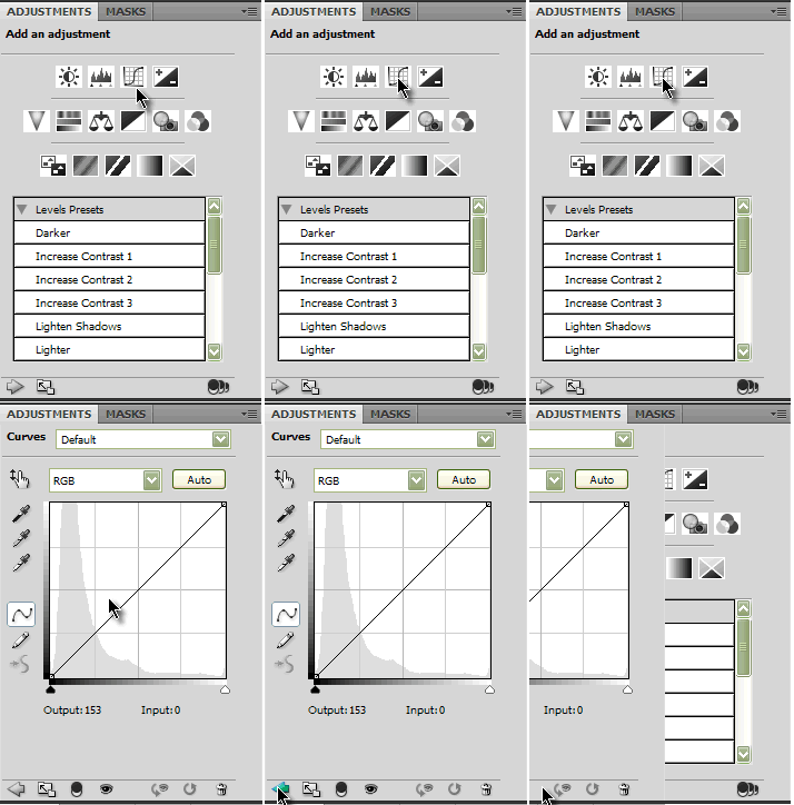
Now, obviously curves have been around forever, but the way they can be applied here is new and, I think, rather cool—the On-screen Adjustment tool. Let's look at a quick example of it in action.
3 Cool Tricks You Can Only Do In Photoshop CS4
To use the tool, you simply apply a curves adjustment layer and click the small hand button, top left of the Curves palette. As you hover over your image you'll see the eyedropper cursor, which shows you where that part of the image falls on the curve line.
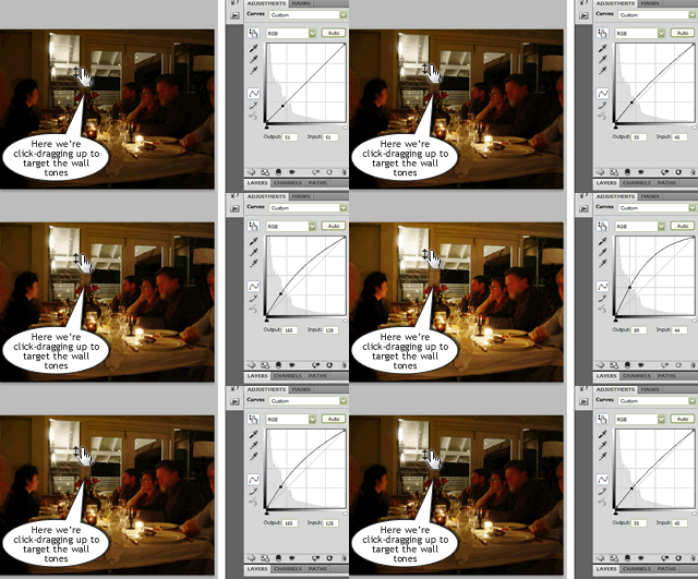
Big deal, right? It's always done that. But try clicking on a specific part of the image you would like to brighten (in the example, the walls) and drag upwards. You'll see those tones immediately lighten and your curve line will reflect that adjustment in real time.
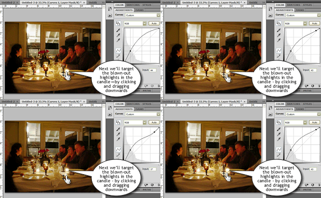
In our example, due to the previous action, the candles have lost some of their brightness. To bring those highlights back, we can target them by simply clicking directly on them and dragging down. Again, the curve reflects your adjustment.
Now, if you're already a whiz with curves, you might not see great appeal in this tool. After all, there are other ways to achieve the same result—as long as you know what you're doing. However, if you're a visual thinker who has perhaps found it difficult to equate what's happening in the graph to what's happening in your image, this is a great connector. Working directly on the image certainly feels more natural to me.
3D Painting
Okay, yes there was 3D in CS3 but let's be honest: it wasn't hugely useful, was it? You jumped out into a separate applet to use a limited set of tools. It was a passable imitation of 3D at best. The new 3D implementation definitely raises the bar significantly.
Firstly, there is no jumping out of the application—all 3D manipulations are performed in the main workspace, side-by-side with the 2D tools. You can open a 3D file directly in Photoshop (U3D, 3DS, OBJ, DAE, and KMZ) or add a 3D layer to an existing project.
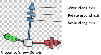
Secondly, the new model controls are a big improvement. While the toolbar now contains 3D Rotate, 3D Move and 3D Scale Tools, Adobe have also added a nice 3D Axis tool that overlays your model, allowing you to orientate it without leaving the workspace.
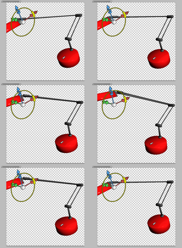
But perhaps most impressive of all is the way Adobe have been able to make their 2D tools operate on 3D surfaces. Grab your Brush Tool, set a color, and start painting. Paint diffusion rates and angles are all controllable.
It doesn't end with flat color either. Switch the Paint Mode and you can paint with Bumps, Glossiness, Opacity, Shininess, Self-illumination, and Reflectivity.
You can even use the Merge Down option in the Layers palette to apply a 2D image (say, a logo) to your 3D object. That's pretty nifty in my book.
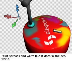
In reality, the new 3D tools in Photoshop probably deserve a dedicated article; however, I think it suffices to say that as of CS4, 3D is a fully-fledged Photoshop citizen, rather than a tacked-on afterthought.
Summary
It's always difficult making the call as to when to upgrade an expensive application like Photoshop—especially if you're shelling it out of your own pocket, rather than your boss's. No doubt your current version worked yesterday and will continue to do so tomorrow.
However, if the question of upgrading is on your mind, with the addition of features like CAIR, there are probably more compelling reasons to take the plunge this time than there's been for a any of the past two or three versions.
ReadMore...
8:41:00 PM
If you have limited access to an Internet connection or a computer, try a print-version of the PowerPoint in the Classroom tutorial. The PowerPoint in the Classroom tutorial is available, free of charge, for reprint purposes to nonprofit educational organizations under the following conditions: No fuss, no muss. Just make sure a printer is properly connected to your computer, then follow these four quick steps:
Conditions
Instructions
ReadMore...
11:41:00 PM
The ability to control the flow of your program, letting it make decisions on what code to execute, is valuable to the programmer. The if statement allows you to control if a program enters a section of code or not based on whether a given condition is true or false. One of the important functions of the if statement is that it allows the program to select an action based upon the user's input. For example, by using an if statement to check a user entered password, your program can decide whether a user is allowed access to the program.
Without a conditional statement such as the if statement, programs would run almost the exact same way every time. If statements allow the flow of the program to be changed, and so they allow algorithms and more interesting code.
Before discussing the actual structure of the if statement, let us examine the meaning of TRUE and FALSE in computer terminology. A true statement is one that evaluates to a nonzero number. A false statement evaluates to zero. When you perform comparison with the relational operators, the operator will return 1 if the comparison is true, or 0 if the comparison is false. For example, the check 0 == 2 evaluates to 0. The check 2 == 2 evaluates to a 1. If this confuses you, try to use a cout statement to output the result of those various comparisons (for example cout<< ( 2 == 1 );)
When programming, the aim of the program will often require the checking of one value stored by a variable against another value to determine whether one is larger, smaller, or equal to the other.
There are a number of operators that allow these checks.
Here are the relational operators, as they are known, along with examples:
It is highly probable that you have seen these before, probably with slightly different symbols. They should not present any hindrance to understanding. Now that you understand TRUE and FALSE in computer terminology as well as the comparison operators, let us look at the actual structure of if statements.
>     greater than              5 > 4 is TRUE
<     less than                 4 < 5 is TRUE
>=    greater than or equal     4 >= 4 is TRUE
<=    less than or equal        3 <= 4 is TRUE
==    equal to                  5 == 5 is TRUE
!=    not equal to              5 != 4 is TRUE
The structure of an if statement is as follows:
To have more than one statement execute after an if statement that evaluates to true, use braces, like we did with the body of a function. Anything inside braces is called a compound statement, or a block.
if ( TRUE )
 Execute the next statement
For example:
There is also the else statement. The code after it (whether a single line or code between brackets) is executed if the if statement is FALSE.
if ( TRUE ) {
 Execute all statements inside the braces
}
It can look like this:
One use for else is if there are two conditional statements that may both evaluate to true, yet you wish only one of the two to have the code block following it to be executed. You can use an else if after the if statement; that way, if the first statement is true, the else if will be ignored, but if the if statement is false, it will then check the condition for the else if statement. If the if statement was true the else statement will not be checked. It is possible to use numerous else if statements.
if ( TRUE ) {
 // Execute these statements if TRUE
}
else {
 // Execute these statements if FALSE
}
Let's look at a simple program for you to try out on your own.
Boolean operators allow you to create more complex conditional statements. For example, if you wish to check if a variable is both greater than five and less than ten, you could use the boolean AND to ensure both var > 5 and var < 10 are true. In the following discussion of boolean operators, I will capitalize the boolean operators in order to distinguish them from normal english. The actual C++ operators of equivalent function will be described further into the tutorial - the C++ symbols are not: OR, AND, NOT, although they are of equivalent function.
#include

using namespace std;

int main()                            // Most important part of the program!
{
 int age;                            // Need a variable...

 cout<<"Please input your age: ";    // Asks for age
 cin>> age;                          // The input is put in age
 cin.ignore();                       // Throw away enter
 if ( age < 100 ) {                  // If the age is less than 100
    cout<<"You are pretty young!\n"; // Just to show you it works...
 }
 else if ( age == 100 ) {            // I use else just to show an example
    cout<<"You are old\n";           // Just to show you it works...
 }
 else {
   cout<<"You are really old\n";     // Executed if no other statement is
 }
 cin.get();
}
When using if statements, you will often wish to check multiple different conditions. You must understand the Boolean operators OR, NOT, and AND. The boolean operators function in a similar way to the comparison operators: each returns 0 if evaluates to FALSE or 1 if it evaluates to TRUE.
NOT: The NOT operator accepts one input. If that input is TRUE, it returns FALSE, and if that input is FALSE, it returns TRUE. For example, NOT (1) evalutes to 0, and NOT (0) evalutes to 1. NOT (any number but zero) evaluates to 0. In C and C++ NOT is written as !. NOT is evaluated prior to both AND and OR.
AND: This is another important command. AND returns TRUE if both inputs are TRUE (if 'this' AND 'that' are true). (1) AND (0) would evaluate to zero because one of the inputs is false (both must be TRUE for it to evaluate to TRUE). (1) AND (1) evaluates to 1. (any number but 0) AND (0) evaluates to 0. The AND operator is written && in C++. Do not be confused by thinking it checks equality between numbers: it does not. Keep in mind that the AND operator is evaluated before the OR operator.
OR: Very useful is the OR statement! If either (or both) of the two values it checks are TRUE then it returns TRUE. For example, (1) OR (0) evaluates to 1. (0) OR (0) evaluates to 0. The OR is written as || in C++. Those are the pipe characters. On your keyboard, they may look like a stretched colon. On my computer the pipe shares its key with \. Keep in mind that OR will be evaluated after AND.
It is possible to combine several boolean operators in a single statement; often you will find doing so to be of great value when creating complex expressions for if statements. What is !(1 && 0)? Of course, it would be TRUE. It is true is because 1 && 0 evaluates to 0 and !0 evaluates to TRUE (ie, 1).
Try some of these - they're not too hard. If you have questions about them, feel free to stop by our forums.
If you find you enjoyed this section, then you might want to look more at Boolean Algebra.
A. !( 1 || 0 )         ANSWER: 0
B. !( 1 || 1 && 0 )    ANSWER: 0 (AND is evaluated before OR)
C. !( ( 1 || 0 ) && 0 )  ANSWER: 1 (Parenthesis are useful)
ReadMore...
11:28:00 PM
Getting set up
C++ is a programming language of many different dialects, similar to the way that each spoken language has many different dialects. In C++, dialects are not because the speakers live in the North or South. Instead, it is because there are many different compilers that support slightly different features. There are several common compilers: in particular, Borland C++, Microsoft C++, and GNU C++. There are also many front-end environments for the different compilers--the most common is Dev-C++ around GNU's G++ compiler. Some, such as G++, are free, while others are not. Please see the compiler listing for more information on how to get a compiler and set it up.Each of these compilers is slightly different. Each one should support the ANSI/ISO standard C++ functions, but each compiler will also have nonstandard functions (these functions are similar to slang spoken in different parts of a country). Sometimes the use of nonstandard functions will cause problems when you attempt to compile source code (the actual C++ written by a programmer and saved as a text file) with a different compiler. These tutorials use ANSI/ISO standard C++ and should not suffer from this problem (with sufficiently modern compilers). Note that if you are using an older compiler, such as TCLite, you should read check out some compatability issues.
If you don't have a compiler, I strongly suggest that you get one. A simple compiler is sufficient for our use, but make sure that you do get one in order to get the most from these tutorials. The page linked above, compilers, lists compilers by operating system.
C++ is a different breed of programming language. A C++ program begins with a function, a collection of commands that do "something". The function that begins a C++ program is called main; this function is always called when the program first executes. From main, we can also call other functions whether they be written by us or by others. To access a standard function that comes with the compiler, you include a header with the #include directive. What this does is effectively take everything in the header and paste it into your program. Let's look at a working program:
Let's look at the elements of the program. The #include is a "preprocessor" directive that tells the compiler to put code from the header called iostream into our program before actually creating the executable. By including header files, you an gain access to many different functions. For example, the cout function requires iostream. Following the include is the statement, "using namespace std;". This line tells the compiler to use a group of functions that are part of the standard library (std). By including this line at the top of a file, you allow the program to use functions such as cout. The semicolon is part of the syntax of C and C++. It tells the compiler that you're at the end of a command. You will see later that the semicolon is used to end most commands in C++.
#include


using namespace std;


int main()

{

cout<<"HEY, you, I'm alive! Oh, and Hello World!\n";  cin.get(); }
The next imporant line is int main(). This line tells the compiler that there is a function named main, and that the function returns an integer, hence int. The "curly braces" ({ and }) signal the beginning and end of functions and other code blocks. If you have programmed in Pascal, you will know them as BEGIN and END. Even if you haven't programmed in Pascal, this is a good way to think about their meaning.
The next line of the program may seem strange. If you have programmed in another language, you might expect that print would be the function used to display text. In C++, however, the cout object is used to display text. It uses the << class="example">
#include
using namespace std;
int main()
{
cout<<"HEY, you, I'm alive! Oh, and Hello World!\n"; cin.get(); return 1; }
You might start playing around with the cout function and get used to writing C++.
Comments are critical for all but the most trivial programs and this tutorial will often use them to explain sections of code. When you tell the compiler a section of text is a comment, it will ignore it when running the code, allowing you to use any text you want to describe the real code. To create a comment use either //, which tells the compiler that the rest of the line is a comment, or /* and then */ to block off everything between as a comment. Certain compiler environments will change the color of a commented area, but some will not. Be certain not to accidentally comment out code (that is, to tell the compiler part of your code is a comment) you need for the program. When you are learning to program, it is useful to be able to comment out sections of code in order to see how the output is affected.
So far you should be able to write a simple program to display information typed in by you, the programmer and to describe your program with comments. That's great, but what about interacting with your user? Fortunately, it is also possible for your program to accept input. The function you use is known as cin, and is followed by the insertion operator >>.
Of course, before you try to receive input, you must have a place to store that input. In programming, input and data are stored in variables. There are several different types of variables; when you tell the compiler you are declaring a variable, you must include the data type along with the name of the variable. Several basic types include char, int, and float.
A variable of type char stores a single character, variables of type int store integers (numbers without decimal places), and variables of type float store numbers with decimal places. Each of these variable types - char, int, and float - is each a keyword that you use when you declare a variable.
Sometimes it can be confusing to have multiple variable types when it seems like some variable types are redundant. Using the right variable size can be important for making your code readable and for efficiency--some variables require more memory than others. For now, suffice it to say that the different variable types will almost all be used!
To declare a variable you use the syntax type
Here are some variable declaration examples:
int x;

int a, b, c, d;

char letter;

float the_float;
While you can have multiple variables of the same type, you cannot have multiple variables with the same name. Moreover, you cannot have variables and functions with the same name.
Here is a sample program demonstrating the use a a variable:
Let's break apart this program and examine it line by line. The keyword int declares thisisanumber to be an integer. The function cin>> reads a value into thisisanumber; the user must press enter before the number is read by the program. cin.ignore() is another function that reads and discards a character. Remember that when you type intput into a program, it takes the enter key too. We don't need this, so we throw it away. Keep in mind that the variable was declared an integer; if the user attempts to type in a decimal number, it will be truncated (that is, the decimal component of the number will be ignored). Try typing in a sequence of characters or a decimal number when you run the example program; the response will vary from input to input, but in no case is it particularly pretty. Notice that when printing out a variable quotation marks are not used. Were there quotation marks, the output would be "You Entered: thisisanumber." The lack of quotation marks informs the compiler that there is a variable, and therefore that the program should check the value of the variable in order to replace the variable name with the variable when executing the output function. Do not be confused by the inclusion of two separate insertion operators on one line. Including multiple insertion operators on one line is perfectly acceptable and all of the output will go to the same place. In fact, you must separate string literals (strings enclosed in quotation marks) and variables by giving each its own insertion operators (<<). Trying to put two variables together with only one <<>, <. The * multiplies, the - subtracts, and the + adds. It is of course important to realize that to modify the value of a variable inside the program it is rather important to use the equal sign. In some languages, the equal sign compares the value of the left and right values, but in C++ == is used for that task. The equal sign is still extremely useful. It sets the left input to the equal sign, which must be one, and only one, variable equal to the value on the right side of the equal sign. The operators that perform mathematical functions should be used on the right side of an equal sign in order to assign the result to a variable on the left side. Here are a few examples:
#include


using namespace std;


int main()

{

int thisisanumber;


cout<<"Please enter a number: ";  cin>> thisisanumber;

cin.ignore();

cout<<"You entered: "<<>
The other form of equal, ==, is not a way to assign a value to a variable. Rather, it checks to see if the variables are equal. It is useful in other areas of C++; for example, you will often use == in such constructions as conditional statements and loops. You can probably guess how <> function. They are greater than and less than operators.
a = 4 * 6; // (Note use of comments and of semicolon) a is 24

a = a + 5; // a equals the original value of a with five added to it

a == 5     // Does NOT assign five to a. Rather, it checks to see if a equals 5.
For example:
a <> 5  // Checks to see if a is greater than five

a == 5 // Checks to see if a equals five, for good measure
ReadMore...
11:23:00 PM
This tutorial uses Photoshop CS2 however it is also suitable for PSCS and PS7 users.
Using a basic circle, this tutorial will demonstrate some of the effects that the Layer Style options is used to create.
This tutorial is large(36 pages) and is available in PDF Format. DOWNLOAD BY CLICKING HERE
You can download Adobe Acrobat Reader for free if required from www.adobe.com
ReadMore...
11:16:00 PM
This tutorial will help you create a basic round glass ornament, just in time for the holidays.
1. Begin by creating a new image in the dimensions you want. Be sure to click Raster Background and Transparent.
2. Activate the Ellipse Tool (Q) and choose a background color you want your ornament to be. Draw a vector circle and center it vertically on your layout using the Object Selection Tool (O).
3. Duplicate the vector circle onto a new layer by right-clicking on the layer containing the circle and choosing Duplicate.
4. Expand the layer containing the duplicated circle by clicking the plus sign located on the left side of the layer.

5. You should now see the sub-layer containing the vector circle.
6. Double-click the sub-layer containing the duplicated circle (be sure you click the sub-layer and not the Vector layer). Once you double-click the sub-layer containing the circle, you should see the following window:
7. Click the fill block on the bottom and choose the Gradient tab. Choose the black-white gradient. Enter 180 for the Angle, Repeats = 0, check Invert, Linear style. Click OK.
8. The duplicated circle should now have changed to the black-white gradient.
9. Change the blend mode for the black-white gradient to Hard Light (try experimenting with different blend modes for various looks).
10. Your ornament should now look like this:
11. Let’s give the ornament a shinier glass look. Create a selection by activating the Object Selection tool (O) and Ctrl+Shift+B. Your circle should now have marching ants surrounding it.
12. Create a new Raster layer (Layers > New Raster Layer > OK).
13. Expand the selection by clicking Selections > Modify > Expand. Expand the selection by 2 pixels. Click OK. The marching ants should now be on the outside of your circle.
14. Create a shiny glass look by clicking on Effects > Artistic Effects > Balls and Bubbles. On the Shape tab, choose the Single ball or bubble and check Maximum possible size.
15. Click the Illumination tab and fill in with the following settings:

16. Click OK. Change the blend mode for this layer to Overlay. You should now have a shinier surface on your ornament.

17. Click on the layer containing your original circle. Then using the Magic Wand tool, click on the outside of the circle, selecting the area surrounding the circle.
18. Click the layer containing the glassy bubble and hit the delete key on your keyboard. Merge visible layers (Layers > Merge > Merge Visible).
19. At this point, you could save the image as a PNG file and use it as is. Or, you can create the metal hanging cap.
20. Choose the Rectangle tool (G). For the background color, choose the Metal steel gradient, linear style, angle = 90, check Invert. Click OK.
21. Draw a small rectangle at the top of the ornament and center it vertically using the Object Selection tool (O).
22. Convert the rectangle into a raster (Layers > Convert to Raster Layer). Apply an inner bevel with the following settings and click OK.
23. Your ornament should now have a metallic cap on top.
24. Create a hanging loop by using the Ellipse tool (Q) and drawing a thin ellipse using the same Metal steel gradient as your stroke color. Move the layer containing the loop below the cap so that it sits behind the cap.

25. Apply an inner bevel to the loop and click OK.
26. Merge all visible layers and save as a PNG file. Your ornament is now ready for “hanging!”
ReadMore...